In a previous post, from way back in August of 2017, we explored the relationship between the VIX and the past, realized volatility of the S&P 500 and reproduced some an interesting work from AQR on the meaning of the VIX.
With the recent market and VIX rollercoaster, this seemed a good time to revisit the old post, update some code and see if we can tweak the data visualizations to shed some light on the recent market activity.
Import prices, calculate returns and rolling volatility
By way of brief reminder, we first want to import data on SP500 and VIX prices since 2010, then calculate the rolling standard deviation of SP500 20-day and 60-day returns. In the previous post, we used the rollapply() function to accomplish this. Today, we will use the roll_sd() function from the RcppRoll package. That will allow us to live in the tibble world instead of the xts world, and it will mean we have a reproducible example from each of those worlds in case we need them for future work.
Let’s get to it.
library(RcppRoll)
library(timetk)
library(tibbletime)
library(tidyquant)
library(tidyverse)
library(broom)
We import prices with the same code as before.
symbols <- c("^GSPC", "^VIX")

prices <-
  getSymbols(symbols, src = 'yahoo', from = "2010-01-01",
             auto.assign = TRUE, warnings = FALSE) %>%
  map(~Ad(get(.))) %>%
  reduce(merge) %>%
  `colnames<-`(c("sp500", "vix"))
Next we convert that object to a tibble using tk_tbl(preserve_index = TRUE, rename_index = "date") from the timetk package. Now we can use dplyr's mutate() function to add a colum for returns with mutate(sp500_returns = (log(sp500) - log(lag(sp500)))), and then a column for the rolling 20-day volatility with mutate(sp500_roll_20 = roll_sd(sp500_returns, 20, fill = NA, align = "right"). I want to annualize the rolling volatility (as the AQR piece did) so will then mutate the 20-day rolling vol with sp500_roll_20 = (round((sqrt(252) * sp500_roll_20 * 100), 2)).
sp500_vix_rolling_vol <-
  prices %>%
  tk_tbl(preserve_index = TRUE, rename_index = "date") %>%
  mutate(sp500_returns = (log(sp500) - log(lag(sp500)))) %>%
  replace_na(list(sp500_returns = 0)) %>%
  mutate(sp500_roll_20 = roll_sd(sp500_returns, 20, fill = NA, align = "right"),
         sp500_roll_20 = (round((sqrt(252) * sp500_roll_20 * 100), 2))) %>%
  na.omit()

head(sp500_vix_rolling_vol)
## # A tibble: 6 x 5
## date sp500 vix sp500_returns sp500_roll_20
## <date> <dbl> <dbl> <dbl> <dbl>
## 1 2010-02-01 1089 22.6 0.0142 15.8
## 2 2010-02-02 1103 21.5 0.0129 16.6
## 3 2010-02-03 1097 21.6 -0.00549 16.6
## 4 2010-02-04 1063 26.1 -0.0316 19.7
## 5 2010-02-05 1066 26.1 0.00289 19.6
## 6 2010-02-08 1057 26.5 -0.00890 19.6Have a quick peek at our new data object and make sure the origin of each column is clear.
Visualizing Realized Vol and Vix
As we did before, let’s start with a scatterplot to show 20-day trailing volatility on the x-axis and the VIX on the y-axis. This is nothing more than updating our July 2017 work with new data through to February of 2018. In other words, we haven’t done anything yet that we couldn’t have accomplished by re-running the old script.
sp500_vix_rolling_vol %>%
  ggplot(aes(x = sp500_roll_20, y = vix)) +
  geom_point(colour = "light blue") +
  geom_smooth(method='lm', se = FALSE, color = "pink", size = .5) +
  ggtitle("Vix versus 20-Day Realized Vol") +
  xlab("Realized vol preceding 20 trading days: 2010 - Present") +
  ylab("Vix") +
  # Add a '%' sign to the axes without having to rescale.
  scale_y_continuous(labels = function(x){ paste0(x, "%") }) +
  scale_x_continuous(labels = function(x){ paste0(x, "%") }) +
  theme(plot.title = element_text(hjust = 0.5))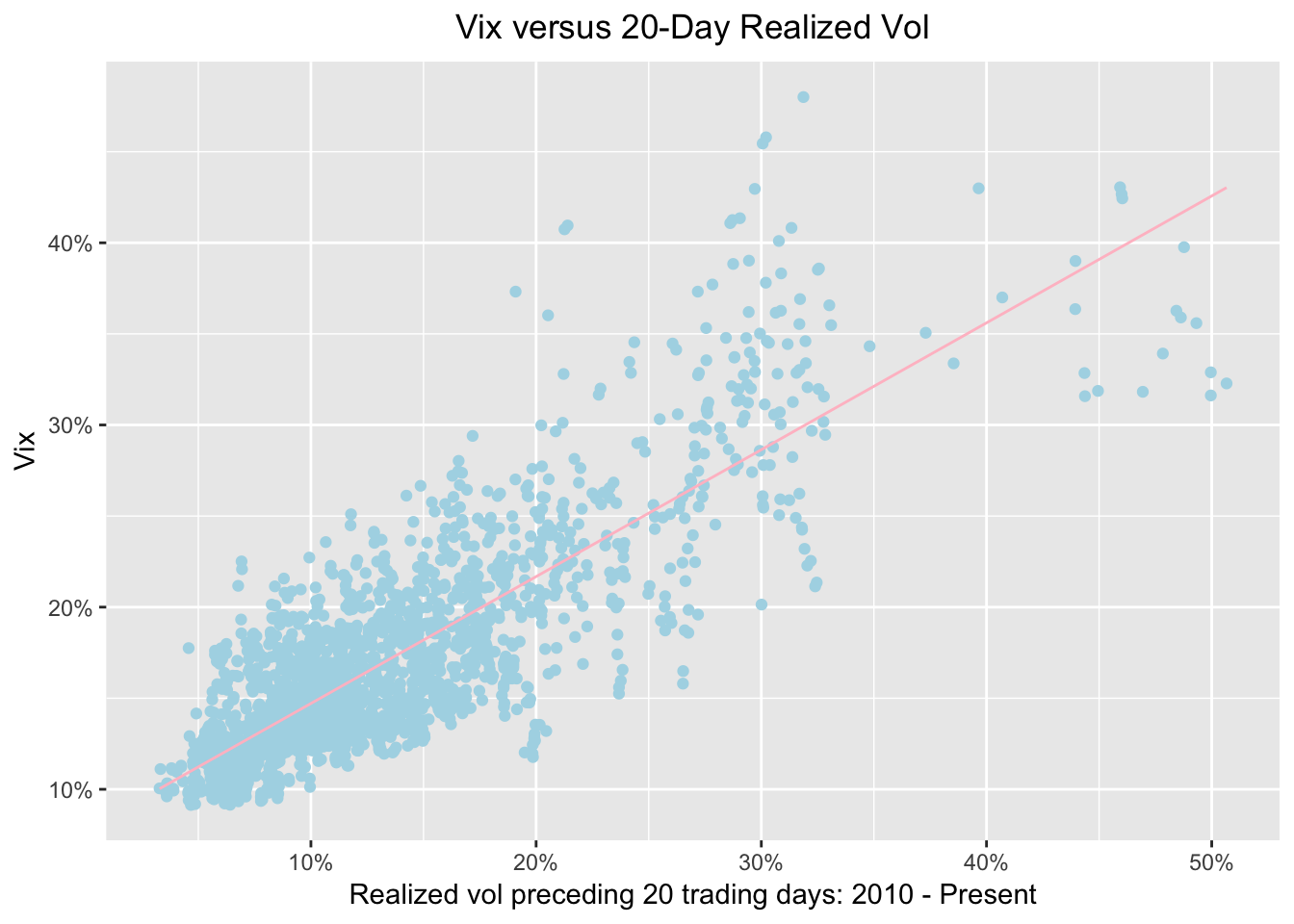
Same as before, we see a strong relationship between preceding volatility and the VIX. Now let’s see how that relationship has looked over the last three months, from November 2017 to February 2018. We do that by adding filter(date >= "2017-11-01").
sp500_vix_rolling_vol %>%
  group_by(date) %>%
  filter(date >= "2017-11-01") %>%
  ggplot(aes(x = sp500_roll_20, y = vix)) +
  geom_point(color = "cornflowerblue") +
  geom_smooth(method='lm', se = FALSE, color = "pink", size = .5) +
  ggtitle("Vix versus 20-Day Realized Vol: Nov 2017 - Present ") +
  xlab("Realized vol preceding 20 trading days") +
  ylab("Vix") +
  scale_y_continuous(labels = function(x){ paste0(x, "%") }) +
  scale_x_continuous(labels = function(x){ paste0(x, "%") }) +
  theme(plot.title = element_text(hjust = 0.5))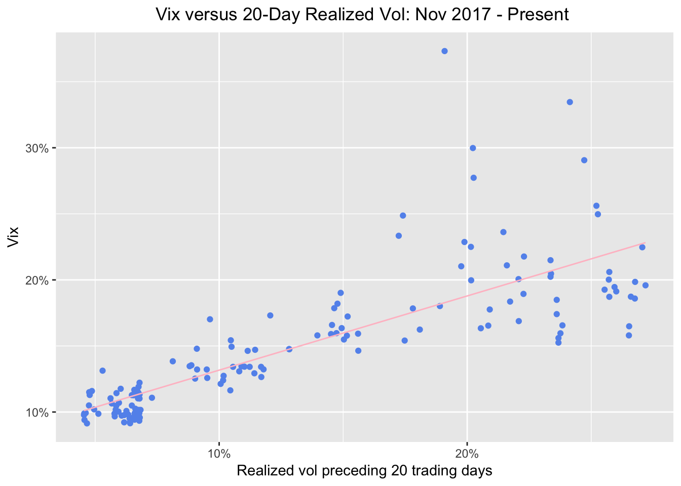
Alright, we can see 5 observations way off to the upper right, where realized 20-day vol and the VIX have spiked to ~20%. Are those data points from the week of February 5th, 2018? We can find out by adding an aesthetic to color the points by date. We do that with ggplot(aes(x = sp500_roll_20, y = vix, color = date)).
sp500_vix_rolling_vol %>%
  group_by(date) %>%
  filter(date >= "2017-11-01") %>%
  ggplot(aes(x = sp500_roll_20, y = vix, color = date)) +
  geom_point() +
  geom_smooth(method='lm', se = FALSE, color = "pink", size = .5) +
  ggtitle("Vix versus 20-Day Realized Vol shaded by date: Nov 2017 - Present") +
  xlab("Realized vol preceding 20 trading days") +
  ylab("Vix") +
  # Add a '%' sign to the axes without having to rescale.
  scale_y_continuous(labels = function(x){ paste0(x, "%") }) +
  scale_x_continuous(labels = function(x){ paste0(x, "%") }) +
  theme(plot.title = element_text(hjust = 0.5))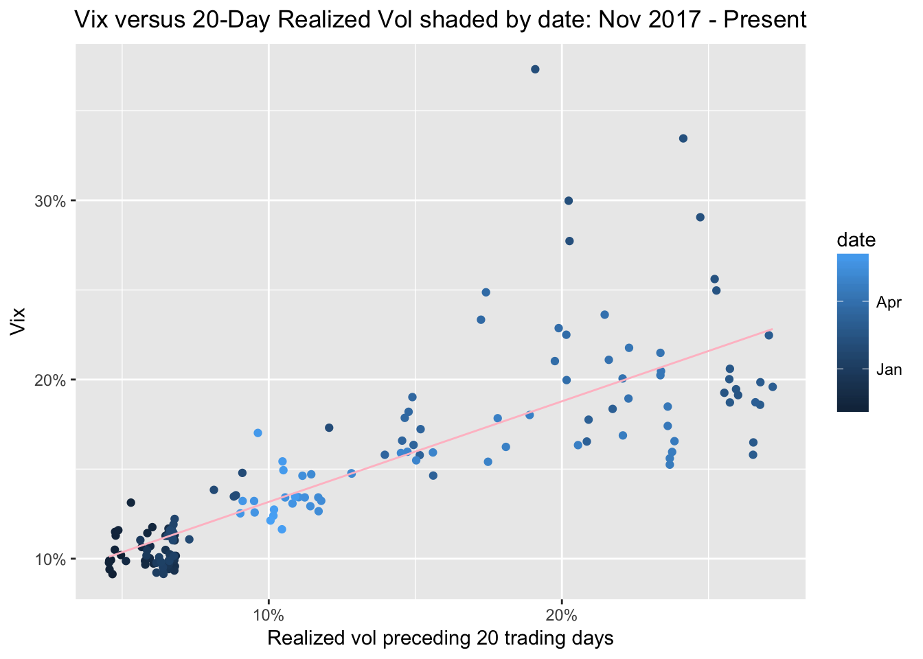
Since we grouped by date and set the points to color by date, the dots are getting a lighter shade of blue as they move toward the present. It shows that in November, all was calm and quiet - look at the dark blue circles. Then, the points start to creep up and to the right - realized vol is increasing and the VIX is increasing. We expect them to move together, though AQR’s original point is that the VIX really is a reflection of past realized volatility, whereas many have hypothesized that the VIX caused market volatility last week. I’ll leave that one to the experts.
Let’s look at one more chart to put last week in perspective. We will look at our data since 2010 and shade the points by date. This should contextualize last week.
sp500_vix_rolling_vol %>%
  group_by(date) %>%
  ggplot(aes(x = sp500_roll_20, y = vix, color = date)) +
  geom_point() +
  geom_smooth(method='lm', se = FALSE, color = "pink", size = .5) +
  ggtitle("Vix versus 20-Day Realized Vol shaded by date ") +
  xlab("Realized vol preceding 20 trading days") +
  ylab("Vix") +
  scale_y_continuous(labels = function(x){ paste0(x, "%") }) +
  scale_x_continuous(labels = function(x){ paste0(x, "%") }) +
  theme(plot.title = element_text(hjust = 0.5))
Ok, the light blue dots, those from 2017 and 2018 are still quite clustered at the low VIX low realized vol part of the chart, though some are indeed beginning to explore riskier territory. Our most extreme readings are darker blue - they are from 2011-2013. If we wish to isolate just one year - say, 2012 - we can do so with filter(date >= "2011-12-31" & date <= "2013-01-01").
sp500_vix_rolling_vol %>%
  group_by(date) %>%
  filter(date >= "2011-12-31" & date <= "2013-01-01") %>%
  ggplot(aes(x = sp500_roll_20, y = vix, color = date)) +
  geom_point() +
  geom_smooth(method='lm', se = FALSE, color = "pink", size = .5) +
  ggtitle("Vix versus 20-Day Realized Vol: 2012") +
  xlab("Realized vol preceding 20 trading days") +
  ylab("Vix") +
  # Add a '%' sign to the axes without having to rescale.
  scale_y_continuous(labels = function(x){ paste0(x, "%") }) +
  scale_x_continuous(labels = function(x){ paste0(x, "%") }) +
  theme(plot.title = element_text(hjust = 0.5))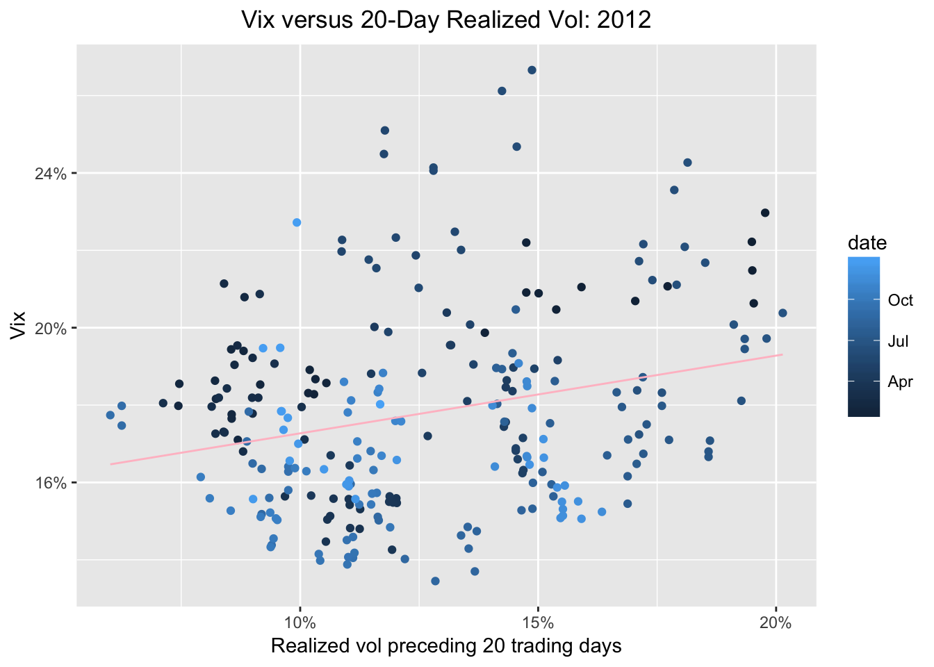
Finally, let’s rerun our regression of the VIX on 20-day trailing volatility and peek at the results.
  sp500_vix_rolling_vol %>%
  do(model_20 = lm(vix ~ sp500_roll_20, data = .)) %>%
  tidy(model_20)
## term estimate std.error statistic p.value
## 1 (Intercept) 7.7470688 0.15719690 49.28258 0
## 2 sp500_roll_20 0.6964677 0.01045893 66.59075 0sp500_vix_rolling_vol %>%
do(model_20 = lm(vix ~ sp500_roll_20, data = .)) %>%
glance(model_20) %>%
select(r.squared)## r.squared
## 1 0.6785165We can see a coefficient of .71 and an R-squared of .69, which is the same as we observed back in July 2017, and consistent with the original AQR research that got us started.
That’s all for today - thanks for reading!