In a previous post, we examined the returns of portfolios constructed by investing in IPOs each year. This is a brief addendum on how to compare those portfolios to a benchmark.
Recall that we saved the following object as both an RDS file and as a pin on RStudio Connect. That object contains the time series of monthly closing prices, monthly returns, tickers, ipo year and sector. Here’s a peek.
ipo_riingo_prices_pins %>%
  group_by(ticker) %>%
  select(ticker, date, close, ipo.year, sector, monthly_returns) %>%
  slice(2) %>%
  head()
# A tibble: 6 x 6
# Groups: ticker [6]
ticker date close ipo.year sector monthly_returns
<chr> <dttm> <dbl> <dbl> <chr> <dbl>
1 AAOI 2013-10-31 00:00:00 12.7 2013 Technology 0.268
2 ABR 2004-05-31 00:00:00 19.0 2004 Consumer Servi… -0.0252
3 ACC 2004-09-30 00:00:00 18.6 2004 Consumer Servi… 0.0486
4 ACHN 2006-12-29 00:00:00 16.1 2006 Health Care 0.143
5 ACOR 2006-03-31 00:00:00 5.22 2006 Health Care -0.158
6 ACRX 2011-03-31 00:00:00 3.43 2011 Health Care -0.0525In the previous post, we passed that object to the following function in order to calculate returns of portfolios constructed by investing equally in each IPO in each year.
ipo_by_year_portfolios <- function(year, show_growth = F){

  ipo_riingo_prices_pins %>%
  select(ticker, date, monthly_returns, ipo.year) %>%
  filter(ipo.year == year) %>%
  tq_portfolio(assets_col  = ticker,
               returns_col = monthly_returns,
               col_rename  = paste(year, "_port_returns", sep = ""),
               wealth.index = show_growth,
               rebalance_on = "months")

}
We then mapped that function across the ipo_riingo_prices_pins object:
years_numeric <- seq(2004, 2014, by = 1)

returns_each_year_ipo_portfolios <-
map(years_numeric, ipo_by_year_portfolios) %>%
  reduce(left_join)
And here is the resulting object of portfolio returns:
returns_each_year_ipo_portfolios %>%
  tail()
# A tibble: 6 x 12
date `2004_port_retu… `2005_port_retu… `2006_port_retu…
<dttm> <dbl> <dbl> <dbl>
1 2019-05-31 00:00:00 -0.101 -0.0575 0.261
2 2019-06-28 00:00:00 0.382 0.0635 0.0533
3 2019-07-31 00:00:00 0.00659 0.0185 0.0346
4 2019-08-30 00:00:00 -0.0229 -0.0317 -0.00789
5 2019-09-30 00:00:00 0.0256 0.00545 -0.00539
6 2019-10-31 00:00:00 0.0347 0.0180 0.0233
# … with 8 more variables: `2007_port_returns` <dbl>,
# `2008_port_returns` <dbl>, `2009_port_returns` <dbl>,
# `2010_port_returns` <dbl>, `2011_port_returns` <dbl>,
# `2012_port_returns` <dbl>, `2013_port_returns` <dbl>,
# `2014_port_returns` <dbl>Now let’s calculate the returns of a benchmark portfolio so we can compare those IPO portfolios to something besides themselves. We will use SPY as the benchmark and start by importing monthly prices since 2004. I’ll also go ahead and calculate monthly returns in the same piped flow.
spy_benchmark <-
  "SPY" %>%
  riingo_prices(start_date = "2004-01-01", end_date = "2019-10-31",  resample_frequency = "monthly") %>%
  select(ticker, date, close) %>%
  mutate(spy_monthly_returns = close/lag(close) -  1) %>%
  na.omit()

spy_benchmark %>%
  head()
# A tibble: 6 x 4
ticker date close spy_monthly_returns
<chr> <dttm> <dbl> <dbl>
1 SPY 2004-02-27 00:00:00 115. 0.0136
2 SPY 2004-03-31 00:00:00 113. -0.0167
3 SPY 2004-04-30 00:00:00 111. -0.0189
4 SPY 2004-05-31 00:00:00 113. 0.0171
5 SPY 2004-06-30 00:00:00 115. 0.0148
6 SPY 2004-07-30 00:00:00 111. -0.0322From here, it’s straightforward to compare these benchmark returns to those of the 2004 IPO portfolio. First we line up the two columns of returns.
returns_each_year_ipo_portfolios %>%
  select(date, `2004_port_returns`) %>%
  add_column(benchmark = spy_benchmark$spy_monthly_returns) %>%
  tail()
# A tibble: 6 x 3
date `2004_port_returns` benchmark
<dttm> <dbl> <dbl>
1 2019-05-31 00:00:00 -0.101 -0.0638
2 2019-06-28 00:00:00 0.382 0.0644
3 2019-07-31 00:00:00 0.00659 0.0151
4 2019-08-30 00:00:00 -0.0229 -0.0167
5 2019-09-30 00:00:00 0.0256 0.0148
6 2019-10-31 00:00:00 0.0347 0.0221Then we pivot_longer() and apply the SharpeRatio() function, same as we did last time.
returns_each_year_ipo_portfolios %>%
  select(date, `2004_port_returns`) %>%
  add_column(benchmark = spy_benchmark$spy_monthly_returns) %>%
  pivot_longer(-date, names_to = "portfolio", values_to = "monthly_return") %>%
  group_by(portfolio) %>%
  arrange(portfolio, date) %>%
  filter(!is.na(monthly_return)) %>%
  tq_performance(Ra = monthly_return,
                 performance_fun = SharpeRatio,
                 Rf = 0,
                 FUN= "StdDev")
# A tibble: 2 x 2
# Groups: portfolio [2]
portfolio `StdDevSharpe(Rf=0%,p=95%)`
<chr> <dbl>
1 2004_port_returns 0.234
2 benchmark 0.153Here’s the result piped straight to ggplot().
returns_each_year_ipo_portfolios %>%
  select(date, `2004_port_returns`) %>%
  add_column(benchmark = spy_benchmark$spy_monthly_returns) %>%
  pivot_longer(-date, names_to = "portfolio", values_to = "monthly_return") %>%
  group_by(portfolio) %>%
  arrange(portfolio, date) %>%
  filter(!is.na(monthly_return)) %>%
  tq_performance(Ra = monthly_return,
                 performance_fun = SharpeRatio,
                 Rf = 0,
                 FUN= "StdDev") %>%
  `colnames<-`(c("portfolio", "port_sharpe")) %>%
  ggplot(aes(x = portfolio, y = port_sharpe, fill = portfolio)) +
  geom_col(width = .2)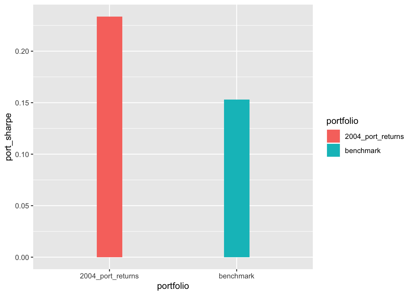
Our IPO portfolio has a higher Sharpe Ratio, but remember that we built this without regard to survivorship bias, we didn’t invest in any companies that haven’t survived to 2019.
Now we want to compare the benchmark to all of our IPO portfolios, but that gets a little trickier because we need to treat each year as the beginning of a new SPY portfolio.
There’s a couple ways to approach this. I’m going to calculate the Sharpes for all of our IPO portfolios, same as we did last time.
port_sharpes <-
  returns_each_year_ipo_portfolios %>%
  pivot_longer(-date, names_to = "portfolio_by_year", values_to = "monthly_return") %>%
  group_by(portfolio_by_year) %>%
  arrange(portfolio_by_year, date) %>%
  filter(!is.na(monthly_return)) %>%
  tq_performance(Ra = monthly_return,
                 performance_fun = SharpeRatio,
                 Rf = 0,
                 FUN= "StdDev") %>%
  `colnames<-`(c("portfolio_by_year", "port_sharpe"))%>%
  add_column(year = years_numeric)

port_sharpes
# A tibble: 11 x 3
# Groups: portfolio_by_year [11]
portfolio_by_year port_sharpe year
<chr> <dbl> <dbl>
1 2004_port_returns 0.234 2004
2 2005_port_returns 0.192 2005
3 2006_port_returns 0.249 2006
4 2007_port_returns 0.190 2007
5 2008_port_returns 0.142 2008
6 2009_port_returns 0.220 2009
7 2010_port_returns 0.279 2010
8 2011_port_returns 0.152 2011
9 2012_port_returns 0.309 2012
10 2013_port_returns 0.182 2013
11 2014_port_returns 0.218 2014And now let’s calculate the Sharpe Ratio for the benchmark for each year. That means we will build or organize 11 different return streams, each starting in a year from 2004 to 2014, and then calculate the Sharpes for each of those 11 return streams.
Here’s how we do it for just 2004.
start_year <- "2004"

start_date <- ymd(parse_date(start_year, format = "%Y"))

spy_benchmark %>%
filter(date >= start_date) %>%
tq_performance(Ra = spy_monthly_returns,
                 performance_fun = SharpeRatio,
                 Rf = 0,
                 FUN= "StdDev")
# A tibble: 1 x 1
`StdDevSharpe(Rf=0%,p=95%)`
<dbl>
1 0.153This looks like a good candidate for a function that accepts one argument, the start_year.
spy_sharpe_function <- function(start_year){

start_date <- ymd(parse_date(start_year, format = "%Y"))

spy_benchmark %>%
filter(date >= start_date) %>%
tq_performance(Ra = spy_monthly_returns,
                 performance_fun = SharpeRatio,
                 Rf = 0,
                 FUN = "StdDev")  %>%
  `colnames<-`("spy_sharpe") %>%
  mutate(year = as.numeric(start_year))
}

spy_sharpe_function("2004")
# A tibble: 1 x 2
spy_sharpe year
<dbl> <dbl>
1 0.153 2004Same as we did before, let’s map across different years
years_character <- as.character(years_numeric)

spy_sharpes <-
  map_dfr(years_character, spy_sharpe_function)

spy_sharpes
# A tibble: 11 x 2
spy_sharpe year
<dbl> <dbl>
1 0.153 2004
2 0.150 2005
3 0.152 2006
4 0.139 2007
5 0.141 2008
6 0.258 2009
7 0.253 2010
8 0.263 2011
9 0.310 2012
10 0.300 2013
11 0.229 2014That worked! Let’s join our data together for ease of comparison.
port_sharpes %>%
  left_join(spy_sharpes, by = "year")
# A tibble: 11 x 4
# Groups: portfolio_by_year [11]
portfolio_by_year port_sharpe year spy_sharpe
<chr> <dbl> <dbl> <dbl>
1 2004_port_returns 0.234 2004 0.153
2 2005_port_returns 0.192 2005 0.150
3 2006_port_returns 0.249 2006 0.152
4 2007_port_returns 0.190 2007 0.139
5 2008_port_returns 0.142 2008 0.141
6 2009_port_returns 0.220 2009 0.258
7 2010_port_returns 0.279 2010 0.253
8 2011_port_returns 0.152 2011 0.263
9 2012_port_returns 0.309 2012 0.310
10 2013_port_returns 0.182 2013 0.300
11 2014_port_returns 0.218 2014 0.229And pipe straight to ggplot()
port_sharpes %>%
  left_join(spy_sharpes, by = "year") %>%
  # select(-portfolio_by_year) %>%
  pivot_longer(c(-year, -portfolio_by_year), names_to = "port_type", values_to = "sharpe") %>%
  ggplot(aes(x = year, y = sharpe, fill = port_type)) +
  geom_col(position = position_dodge2(padding = .2)) +
  scale_x_continuous(breaks = scales::pretty_breaks(n = 10))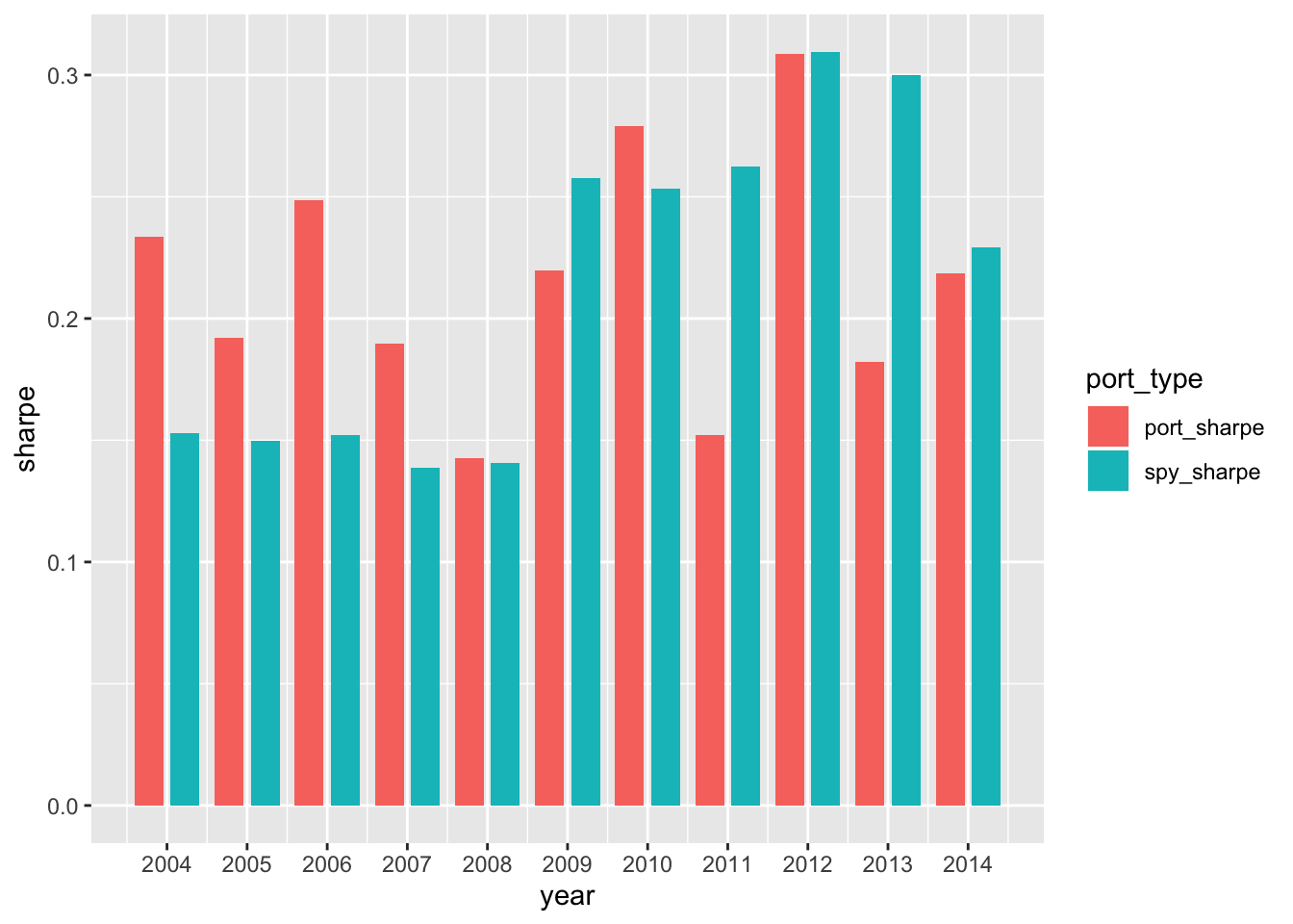
It looks like our IPO portfolios outperformed in the years 2004-2007. That might be due to our survivorship bias since we’re only investing in companies that we know, with hindsight, have survived to 2019.
That’s all for today’s addendum.
If you like this sort of code through check out my book, Reproducible Finance with R.
Not specific to finance but I’ve been using tons of code learned at Business Science University course.
I’m also going to be posting weekly code snippets on linkedin, connect with me there if you’re keen for some R finance stuff.
Thanks for reading and see you next time!