In today’s Reproducible Finance post, we will explore state-level unemployment claims which get released every Thursday. The last few weeks have shown huge spikes in those claims, of course, due to the coronavirus and statewide lockdown orders, and it got me wondering how these times will look to data scientists in the future.
Let’s start by importing unemployment insurance claims data for Georgia. This is a data series that’s reported by all 50 states.
We can grab this data from FRED using tq_get() from the tidyquant package. The FRED code for Georgia unemployment claims is GAICLAIMS.
ga_claims <-
  "GAICLAIMS" %>%
  tq_get(get = "economic.data",
         from = "1999-01-01") %>%
  rename(claims = price)
ga_claims %>%
  slice(1, n())
# A tibble: 2 x 2
date claims
<date> <int>
1 1999-01-02 9674
2 2020-04-18 247003For now, a quick visualization reveals what looks like a season pattern, with regular spikes in unemployment claims.
(
ga_claims %>%
  ggplot(aes(x = date, y = claims)) +
  geom_line(color = "cornflowerblue")  +
  labs(
    x = "",
    y = "",
    title = "Georgia Unemployment Claims",
    subtitle = str_glue("{min(ga_claims$date)} through {max(ga_claims$date)}")
  ) +
  theme_minimal() +
  scale_y_continuous(labels = scales::comma)
) %>% ggplotly()
Let’s investigate this a bit further and look for a trend in average monthly claims by creating a series of faceted density plots. Notice how we can use str_glue() to pass in the dates for the subtitle, a nice trick learned from a Business Science Learning Lab that I use in almost all my plots now, either for titles, subtitles or hover text in plotly.
ga_claims %>%
  mutate(
    year = year(date),
    month =  month(date, label = T, abbr  = T),
    week = week(date)
  ) %>%
  group_by(year, month) %>%
  filter(n() >= 4) %>%
  summarise(avg_claims = mean(claims)) %>%
  ggplot(aes(x = avg_claims)) +
  geom_density(aes(fill = as_factor(month))) +
  facet_grid(rows = vars(as_factor(month))) +
  guides(fill = guide_legend(title = "")) +
  labs(
    title = "Distribution of Avg Monthly Claims",
    subtitle = str_glue("{min(ga_claims$date)} through {max(ga_claims$date)}"),
    y = "",
    x = ""
  ) +
  theme(axis.text.y = element_blank(),
        axis.ticks.y = element_blank()) +
  scale_x_continuous(labels = scales::comma)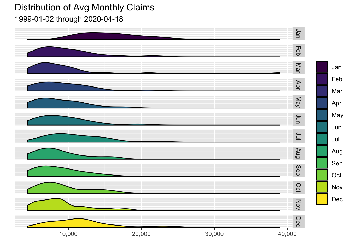
January and December appear to have the density distribution most skewed to the right, meaning those months that have tended to show the highest number of unemployment claims.
Now let’s build a heat map to investigate months by year.
We’ll first create a column to hold the year and month for each observation.
ga_claims %>%
  mutate(year = year(date),
         month=  month(date, label = T, abbr  = T)) %>%
  head()
# A tibble: 6 x 4
date claims year month
<date> <int> <dbl> <ord>
1 1999-01-02 9674 1999 Jan
2 1999-01-09 19455 1999 Jan
3 1999-01-16 20506 1999 Jan
4 1999-01-23 12932 1999 Jan
5 1999-01-30 10871 1999 Jan
6 1999-02-06 7997 1999 Feb Next, we calculate the average number of claims for each month of each year. We start with a group_by(year, month) before a call to summarise().
ga_claims %>%
  mutate(year = year(date),
         month=  month(date, label = T, abbr  = T)) %>%
  group_by(year, month) %>%
  summarise(avg_claims = mean(claims)) %>%
  head()
# A tibble: 6 x 3
# Groups: year [1]
year month avg_claims
<dbl> <ord> <dbl>
1 1999 Jan 14688.
2 1999 Feb 7871.
3 1999 Mar 6095.
4 1999 Apr 6522.
5 1999 May 5451.
6 1999 Jun 5987.That’s the data we want to chart but I want to add one more column with a slightly different format, one that uses a k for the thousands place, so we can stick these numbers into a chart. That is, instead of 14687.60, I’d like to display 14.7K.
We can use the number_format() function from the scales package to accomplish this. We set the accuracy to .1 to indicate that we want to round off and show the .1 decimal. We set scale to 1/1000 to indicate the scaling factor and choose k as the suffix.
ga_claims %>%
  mutate(year = year(date),
         month =  month(date, label = T, abbr  = T)) %>%
  group_by(year, month) %>%
  summarise(avg_claims = mean(claims)) %>%
  mutate(
    avg_claims_labels = scales::number_format(
      accuracy = .1,
      scale = 1 / 1000,
      suffix = "k",
      big.mark = ","
    )(avg_claims)
  ) %>%
  head()
# A tibble: 6 x 4
# Groups: year [1]
year month avg_claims avg_claims_labels
<dbl> <ord> <dbl> <chr>
1 1999 Jan 14688. 14.7k
2 1999 Feb 7871. 7.9k
3 1999 Mar 6095. 6.1k
4 1999 Apr 6522. 6.5k
5 1999 May 5451. 5.5k
6 1999 Jun 5987. 6.0k I called the new column avg_claims_labels because it’s a character column for display on the chart, not for any numerical use.
Here’s a first crack at the heat map. I’m going to put the months on the x-axis and years on the y-axis, and I want to fill according to avg_claims. Next we add a geom_tile().
ga_claims %>%
mutate(year = year(date),
month = month(date, label = T, abbr = T)) %>%
group_by(year, month) %>%
filter(n() >= 4) %>%
summarise(avg_claims = mean(claims)) %>%
mutate(
avg_claims_labels = scales::number_format(
accuracy = 1,
scale = 1 / 1000,
suffix = "k",
big.mark = ","
)(avg_claims)
) %>%
ggplot(aes(
x = month,
y = year,
fill = avg_claims,
label = avg_claims_labels
)) +
geom_tile() 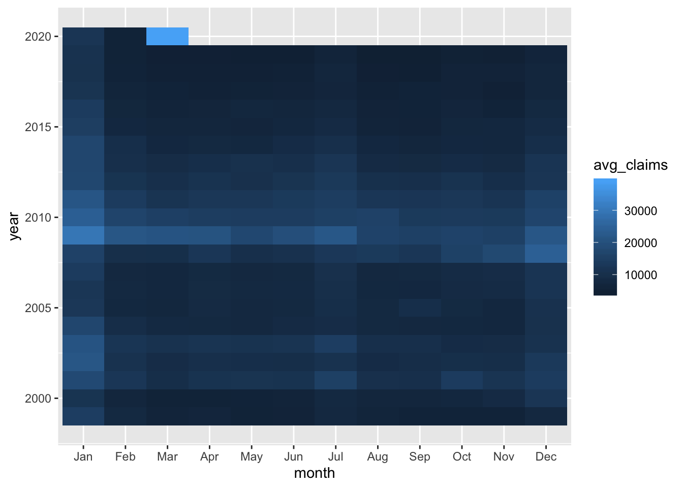 That gives us a sense that January has been the worst month in most years, and that 2009 was no picnic coming off the financial crisis. Let’s do a bit more cleanup by adding
color = "white", size = .8, aes(height = 1) to geom_tile().
ga_claims %>%
mutate(year = year(date),
month = month(date, label = T, abbr = T)) %>%
group_by(year, month) %>%
filter(n() >= 4) %>%
summarise(avg_claims = mean(claims)) %>%
mutate(
avg_claims_labels = scales::number_format(
accuracy = 1,
scale = 1 / 1000,
suffix = "k",
big.mark = ","
)(avg_claims)
) %>%
ggplot(aes(
x = month,
y = year,
fill = avg_claims,
label = avg_claims_labels
)) +
geom_tile(color = "white", size = .8, aes(height = 1)) 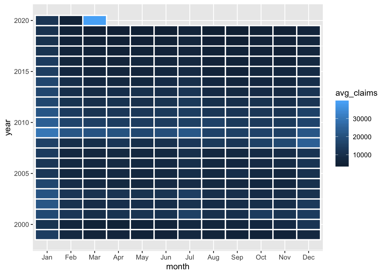 We’re not done yet! I don’t love the shades of blue contrast here as it doesn’t really hammer home how bad a month March of 2020 was (Did your eye even get drawn to it? Mine didn’t initially), and we have not made use of our labels created with
 number_format().
Let’s add our own fill colors with scale_fill_gradient(low = "blue", high = "red", labels = scales::comma). If you’re wondering why I included labels = scales::comma when creating a gradient, it’s because I want the commas to show up in the legend.
We add our text labels with geom_text(), which picks up our lable = avg_claims_labels aesthetic. Let’s also add a text() aesthetic with str_glue() and pass the object to ggplotly() for interactivity.
(
  ga_claims %>%
    mutate(
      year = year(date),
      month =  month(date, label = T, abbr  = T)
    ) %>%
    group_by(year, month) %>%
    filter(n() >= 4) %>%
    summarise(avg_claims = mean(claims)) %>%
    mutate(
      avg_claims_labels = scales::number_format(
        accuracy = 1,
        scale = 1 / 1000,
        suffix = "k",
        big.mark = ","
      )(avg_claims)
    ) %>%
    ggplot(
      aes(
        x = month,
        y = year,
        fill = avg_claims,
        label = avg_claims_labels,
        text = str_glue("average claims:
                        {scales::comma(avg_claims)}")
      )
    ) +
    geom_tile(color = "white", size = .8, aes(height = 1)) +
    scale_fill_gradient(
      low = "blue",
      high = "red",
      labels = scales::comma
    ) +
    geom_text(color = "white" , size = 3.5) +
    theme_minimal() +
    theme(
      plot.caption = element_text(hjust = 0),
      panel.grid.major.y = element_blank(),
      legend.key.width = unit(1, "cm"),
      panel.grid = element_blank()
    ) +
    labs(
      y  = "",
      title = "Heatmap of Monthly Avg Unemployment Insurance Claims",
      fill = "Avg Claims",
      x = ""
    ) +
    scale_y_continuous(breaks =  scales::pretty_breaks(n = 18))
) %>% ggplotly(tooltip = "text")
We can see that January is a terrible month, but March of 2020 is the worst month we’ve had in 20 years (though note I’m not adjusting for population growth in Georgia). We can use that hover text to embed whatever data we wish - for me, the magic of str_glue() has been a game changer.
We have done some work on monthly averages, but our recent experience might motivate us to dig in at the weekly level. For example, in each year since 1999, what has been the worst week of the year for unemployment claims? In the chart below, we’ll grab the worst week for each year, plotting it as a column whose height is equal to the number of claims, and coloring it by month.
(
  ga_claims %>%
    mutate(
      month = month(date, label = TRUE, abbr = FALSE),
      year = year(date)
    ) %>%
    group_by(year) %>%
    mutate(
      max_claims = max(claims),
      max_week_color = case_when(claims == max_claims ~ as.character(date),
                                 TRUE ~ "NA")
    ) %>%
    filter(max_week_color != "NA") %>%
    ggplot(aes(
      x = max_week_color,
      y = claims,
      fill = month,
      text = str_glue("{date}
                      claims: {scales::comma(claims)}")
    )) +
    geom_col(width = .5) +
    labs(
      x = "",
      title = str_glue("Highest Unemployment Claims Week, by Year
                                in Georgia"),
      y = ""
    ) +
    scale_y_continuous(
      labels = scales::comma,
      limits = c(0, NA),
      breaks = scales::pretty_breaks(n = 6)
    ) +
    scale_fill_brewer(palette = "Dark2") +
    theme_minimal() +
    theme(
      axis.text.x = element_text(angle = 45),
      plot.title = element_text(hjust = .5)
    )
) %>% ggplotly(tooltip = "text")
2020 is the only year in which we see a month other than January or December as the worst week of the year. That surprised me, as I thought we might see unusual behavior during the Global Financial Crisis that spanned roughly mid-2007 to early-2009. Here’s a chart of that period, with the worst unemployment claims of each month displayed.
(
  ga_claims %>%
    mutate(
      month = month(date, label = TRUE, abbr = FALSE),
      year = year(date)
    ) %>%
    filter(between(
      date, ymd("2007-05-01"), ymd("2009-05-01")
    )) %>%
    group_by(year, month) %>%
    mutate(
      max_claims = max(claims),
      max_week_color = case_when(claims == max_claims ~ as.character(date),
                                 TRUE ~ "NA")
    ) %>%
    filter(max_week_color != "NA") %>%
    ggplot(aes(
      x = max_week_color,
      y = claims,
      fill = month,
      text = str_glue("{date}
                      claims: {scales::comma(claims)}")
    )) +
    geom_col(width = .5) +
    labs(
      x = "",
      title = str_glue("Worst Unemployment Claims Week of Each Month
                                mid-2007 to mid-2009"),
      y = "",
      fill = ""
    ) +
    scale_y_continuous(
      labels = scales::comma,
      limits = c(0, NA),
      breaks = scales::pretty_breaks(n = 6)
    ) +
    theme_minimal() +
    theme(
      axis.text.x = element_text(angle = 45),
      plot.title  = element_text(hjust = .5)
    )
) %>% ggplotly(tooltip = "text")
The worst weeks during this period were December and January of 2008 and 2009, with 35,000 and 41,000 claims. As if we needed more evidence, we are currently living strange times, here’s that same chart for the last 2 years.
(
  ga_claims %>%
    mutate(
      month = month(date, label = TRUE, abbr = FALSE),
      year = year(date)
    ) %>%
    filter(between(
      date, ymd("2018-04-01"), ymd("2020-05-01")
    )) %>%
    group_by(year, month) %>%
    mutate(
      max_claims = max(claims),
      max_week_color = case_when(claims == max_claims ~ as.character(date),
                                 TRUE ~ "NA")
    ) %>%
    filter(max_week_color != "NA") %>%
    ggplot(aes(
      x = max_week_color,
      y = claims,
      fill = month,
      text = str_glue("{date}
                      claims: {scales::comma(claims)}")
    )) +
    geom_col(width = .5) +
    labs(
      x = "",
      title = str_glue("Worst Unemployment Claims Week of Each Month
                                mid-2018 to mid-2020"),
      y = "",
      fill = ""
    ) +
    scale_y_continuous(
      labels = scales::comma,
      limits = c(0, NA),
      breaks = scales::pretty_breaks(n = 6)
    ) +
    theme_minimal() +
    theme(
      axis.text.x = element_text(angle = 45),
      plot.title  = element_text(hjust = .5)
    )
) %>% ggplotly(tooltip = "text")
The last week of March 2020 comes in at 133,000 claims for Georgia, a number we never even got close to approaching during the financial crisis. And the first week of April is at 390,000.
If we like some of these visualizations, we can expand our analysis out to all 50 states.
Just as Georgia’s data is available from FRED using the code GAICLAIMS, any state’s data can be access with the state’s abbreviation appended to ICLAIMS. Luckily, the core R datasets package comes with a data set of abbreviations called state.abb.
datasets::state.abb %>%
  head()
[1] "AL" "AK" "AZ" "AR" "CA" "CO"We want to write a function that loops through these 50 abbreviations, pulls data from FRED for each state and saves them as a tibble. We can use str_glue() inside a custom function and map_dfr as the looping engine to accomplish this.
First, let’s create the function and just test the creation of the FRED code.
all_state_claims_importer <- function(state_abbreviation){
  fred_code <- str_glue("{state_abbreviation}ICLAIMS")

  fred_code %>%
    tibble()
}
all_state_claims_importer("GA")
# A tibble: 1 x 1
.
<glue>
1 GAICLAIMSWhat happens when we apply this to the state.abb data set.
map_dfr(state.abb, all_state_claims_importer) %>%
  head()
# A tibble: 6 x 1
.
<chr>
1 ALICLAIMS
2 AKICLAIMS
3 AZICLAIMS
4 ARICLAIMS
5 CAICLAIMS
6 COICLAIMSWe get the FRED code for all fifty states.
The hard part is done. Now we pass those codes to tq_get(), and use map_dfr() to iteratively pass each abbreviation to FRED. the _dfr will bind our results together, row wise, into a `tibble.
all_state_claims_importer <- function(state_abbrevation) {
  fred_code <- str_glue("{state_abbrevation}ICLAIMS")

  fred_code %>%
    tq_get(get = "economic.data",
           from = "1999-01-01") %>%
    mutate(state = state_abbrevation) %>%
    rename(claims = price) %>%
    select(date, state, claims)
}
all_state_claims_tibble <-
map_dfr(state.abb, all_state_claims_importer)
all_state_claims_tibble %>%
  group_by(state) %>%
  slice(1, n())
# A tibble: 100 x 3
# Groups: state [50]
date state claims
<date> <chr> <int>
1 1999-01-02 AK 2234
2 2020-04-18 AK 12201
3 1999-01-02 AL 9899
4 2020-04-18 AL 66432
5 1999-01-02 AR 9477
6 2020-04-18 AR 25404
7 1999-01-02 AZ 1534
8 2020-04-18 AZ 72457
9 1999-01-02 CA 47297
10 2020-04-18 CA 528360
# … with 90 more rowsWe can recreate any of those previous visualizations for the state of our choice, by using filter(state == "state of choice"). Let’s take a look at one of the charts for Florida.
(
  all_state_claims_tibble %>%
    filter(state == "FL") %>%
    mutate(
      month = month(date, label = TRUE, abbr = FALSE),
      year = year(date)
    ) %>%
    group_by(year) %>%
    mutate(
      max_claims = max(claims),
      max_week_color = case_when(claims == max_claims ~ as.character(date),
                                 TRUE ~ "NA")
    ) %>%
    filter(max_week_color != "NA") %>%
    ggplot(aes(
      x = max_week_color,
      y = claims,
      fill = month,
      text = str_glue("{date}
                      claims: {scales::comma(claims)}")
    )) +
    geom_col(width = .5) +
    labs(
      x = "",
      title = str_glue("Highest Unemployment Claims Week, by Year
                                in Florida"),
      y = ""
    ) +
    scale_y_continuous(
      labels = scales::comma,
      limits = c(0, NA),
      breaks = scales::pretty_breaks(n = 6)
    ) +
    scale_fill_brewer(palette = "Dark2") +
    theme_minimal() +
    theme(
      axis.text.x = element_text(angle = 45),
      plot.title = element_text(hjust = .5)
    )
) %>% ggplotly(tooltip = "text")
Interesting to see that Florida does not display that same concentration of high unemployment weeks in January. July is the month that most frequently has the worst week for unemployment claims. I imagine that’s because summer is the big tourist season in Florida and things start to slow down after July. Whatever the explanation, this has some big implications as we hopefully emerge from our crisis. We can imagine Georgia and Florida having very different recovery paths as we are already approaching what is traditionally Florida’s big tourist season. Summer in Georgia is not the same as summer in Florida when it comes to employment trends.
Let’s end on a more positive note and examine the months in Florida when claims are at their lowest, which is the most positive for the employment situation. We can tweak the code flow above by replacing max with min in a few places.
(
  all_state_claims_tibble %>%
    filter(state == "FL") %>%
    mutate(
      month = month(date, label = TRUE, abbr = FALSE),
      year = year(date)
    ) %>%
    group_by(year) %>%
    mutate(
      min_claims = min(claims),
      min_week_color = case_when(claims == min_claims ~ as.character(date),
                                 TRUE ~ "NA")
    ) %>%
    filter(min_week_color != "NA") %>%
    ggplot(aes(
      x = min_week_color,
      y = claims,
      fill = month,
      text = str_glue("{date}
                      claims: {scales::comma(round(claims, digits = 0))}")
    )) +
    geom_col(width = .5) +
    labs(
      x = "",
      title = str_glue("Lowest Unemployment Claims Week, by Year
                                in Florida"),
      y = ""
    ) +
    scale_y_continuous(
      labels = scales::comma,
      limits = c(0, NA),
      breaks = scales::pretty_breaks(n = 6)
    ) +
    scale_fill_brewer(palette = "Dark2") +
    theme_minimal() +
    theme(
      axis.text.x = element_text(angle = 45),
      plot.title = element_text(hjust = .5)
    )
) %>% ggplotly(tooltip = "text")
November, December and January tend to contain the best week in each year in Florida, yet we still saw that summer tendency for the max claims.
That’s all for today, thanks for reading the latest Reproducible Finance post. Next time we’ll move on to part 2 and explore how some social data can be layered onto these charts. In the future, we can hope to extend this work to look at how quickly we have recovered and started to see unemployment claims drop there.