Attention econ students, professors and aficianados - an awesome new R package has arrived for the fall semester. It’s called wooldridge and as you might expect, it’s a companion R package to the Bible of econometrics popular Wooldridge text used in lots of econometrics classes. Thanks to [@justinmshea](https://www.linkedin.com/in/justinmshea/) for building and contributing to CRAN!
The vignette has a nice summary and worked example from every chapter of the book - here’s an excerpt:
This vignette contains examples from every chapter of Introductory Econometrics: A Modern Approach by Jeffrey M. Wooldridge. Each example illustrates how to load data, build econometric models, and compute estimates with R. Economics students new to both econometrics and R may find the introduction to both a bit challenging. In particular, the process of loading and preparing data prior to building one’s first econometric model can present challenges. The wooldridge data package aims to lighten this task.
Honestly, the best thing to do is head straight to the vignette but below is a quick worked example from Chapter 10 on time series.
library(tidyverse)
library(broom)
library(wooldridge)

# Load up the data for Chapter 10, example 10.2 and take a look at the summary
data("intdef")
summary(intdef)
## year i3 inf rec
## Min. :1948 Min. : 0.950 Min. :-1.200 Min. :14.40
## 1st Qu.:1962 1st Qu.: 2.893 1st Qu.: 1.675 1st Qu.:17.48
## Median :1976 Median : 4.735 Median : 3.050 Median :17.80
## Mean :1976 Mean : 4.908 Mean : 3.884 Mean :17.92
## 3rd Qu.:1989 3rd Qu.: 6.515 3rd Qu.: 5.425 3rd Qu.:18.50
## Max. :2003 Max. :14.030 Max. :13.500 Max. :20.90
##
## out def i3_1 inf_1
## Min. :11.60 Min. :-4.600 Min. : 0.950 Min. :-1.200
## 1st Qu.:18.57 1st Qu.: 0.300 1st Qu.: 2.975 1st Qu.: 1.650
## Median :19.45 Median : 1.450 Median : 4.810 Median : 3.100
## Mean :19.52 Mean : 1.602 Mean : 4.979 Mean : 3.913
## 3rd Qu.:21.23 3rd Qu.: 2.950 3rd Qu.: 6.570 3rd Qu.: 5.450
## Max. :23.50 Max. : 6.100 Max. :14.030 Max. :13.500
## NA's :1 NA's :1
## def_1 ci3 cinf cdef
## Min. :-4.600 Min. :-3.340000 Min. :-9.3000 Min. :-3.2000
## 1st Qu.: 0.300 1st Qu.:-0.605000 1st Qu.:-1.1500 1st Qu.:-0.8500
## Median : 1.400 Median : 0.120000 Median : 0.2000 Median : 0.1000
## Mean : 1.569 Mean :-0.000364 Mean :-0.1055 Mean : 0.1455
## 3rd Qu.: 2.900 3rd Qu.: 0.920000 3rd Qu.: 1.1000 3rd Qu.: 1.2000
## Max. : 6.100 Max. : 2.970000 Max. : 6.6000 Max. : 4.4000
## NA's :1 NA's :1 NA's :1 NA's :1
## y77
## Min. :0.0000
## 1st Qu.:0.0000
## Median :0.0000
## Mean :0.4821
## 3rd Qu.:1.0000
## Max. :1.0000
## Now let’s run example 10.2 and examine the effects of inflation and deficits on interest rates.
The variable i3 is the three-month Treasury-bill rate, inf is the annual inflation rate based on the consumer price index (CPI), and def is the federal budget deficit as a percentage of GDP. The equation to be estimated is:
\[\hat{i3_{t}}=\beta_0 + \beta_1inf_{t} + \beta_2def_{t} + e\] We will run the same regression as the book and the vignette. The only wrinkle is that we will use the broom package to the clean up the results and visualize predicted values.
# Run regression
tbill_model <- lm(i3 ~ inf + def, data = intdef)

# tidy the results
tidy(tbill_model)
## term estimate std.error statistic p.value
## 1 (Intercept) 1.7332658 0.43196700 4.012496 1.897506e-04
## 2 inf 0.6058659 0.08213481 7.376481 1.117901e-09
## 3 def 0.5130579 0.11838406 4.333843 6.572384e-05We can glance at our results and use dplyr’s select verb to choose a handful of columns for viewing.
glance(tbill_model) %>%
  select( r.squared, adj.r.squared, sigma)
## r.squared adj.r.squared sigma
## 1 0.6020677 0.5870514 1.843163Let’s round out our use of broom and tinker with the augment function, which will augment our original data set with fitted/predicted values and residuals from the model.
intdef_augmented <- augment(tbill_model, intdef)

head(intdef_augmented)
## year i3 inf rec out def i3_1 inf_1 def_1 ci3
## 1 1948 1.04 8.1 16.2 11.6 -4.6000004 NA NA NA NA
## 2 1949 1.10 -1.2 14.5 14.3 -0.1999998 1.04 8.1 -4.6000004 0.06000006
## 3 1950 1.22 1.3 14.4 15.6 1.2000008 1.10 -1.2 -0.1999998 0.12000000
## 4 1951 1.55 7.9 16.1 14.2 -1.9000006 1.22 1.3 1.2000008 0.32999992
## 5 1952 1.77 1.9 19.0 19.4 0.3999996 1.55 7.9 -1.9000006 0.22000003
## 6 1953 1.93 0.8 18.7 20.4 1.6999989 1.77 1.9 0.3999996 0.15999997
## cinf cdef y77 .fitted .se.fit .resid .hat .sigma
## 1 NA NA 0 4.2807132 0.8770291 -3.2407132 0.22641254 1.789275
## 2 -9.3 4.400001 0 0.9036153 0.5129939 0.1963848 0.07746346 1.860585
## 3 2.5 1.400001 0 3.1365612 0.3255787 -1.9165612 0.03120215 1.841105
## 4 6.6 -3.100001 0 5.5447960 0.6066185 -3.9947960 0.10831876 1.765902
## 5 -6.0 2.300000 0 3.0896339 0.3208423 -1.3196339 0.03030092 1.851498
## 6 -1.1 1.299999 0 3.0901562 0.3543082 -1.1601563 0.03695174 1.853566
## .cooksd .std.resid
## 1 0.3898648026 -1.9990429
## 2 0.0003444265 0.1109308
## 3 0.0119815965 -1.0564339
## 4 0.2133166776 -2.2952289
## 5 0.0055060468 -0.7270616
## 6 0.0052616616 -0.6413996Now we can visualize the predicted or .fitted versus actual i3 values.
intdef_augmented %>%
  ggplot(aes(x = year)) +
  geom_line(aes(y = i3, color = "i3")) +
  geom_line(aes(y = .fitted, color = "predicted"))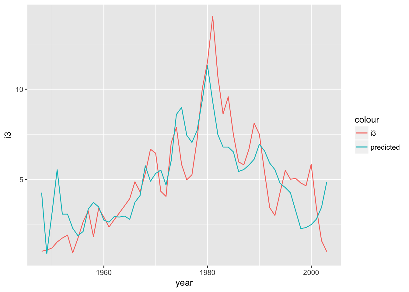
Let’s add in our predictors as well and see if anything jumps out as interesting.
intdef_augmented %>%
  ggplot(aes(x = year)) +
  geom_line(aes(y = i3, color = "i3")) +
  geom_line(aes(y = .fitted, color = "predicted")) +
  geom_line(aes(y = inf, color = "inflation")) +
  geom_line(aes(y = def, color = "deficit"))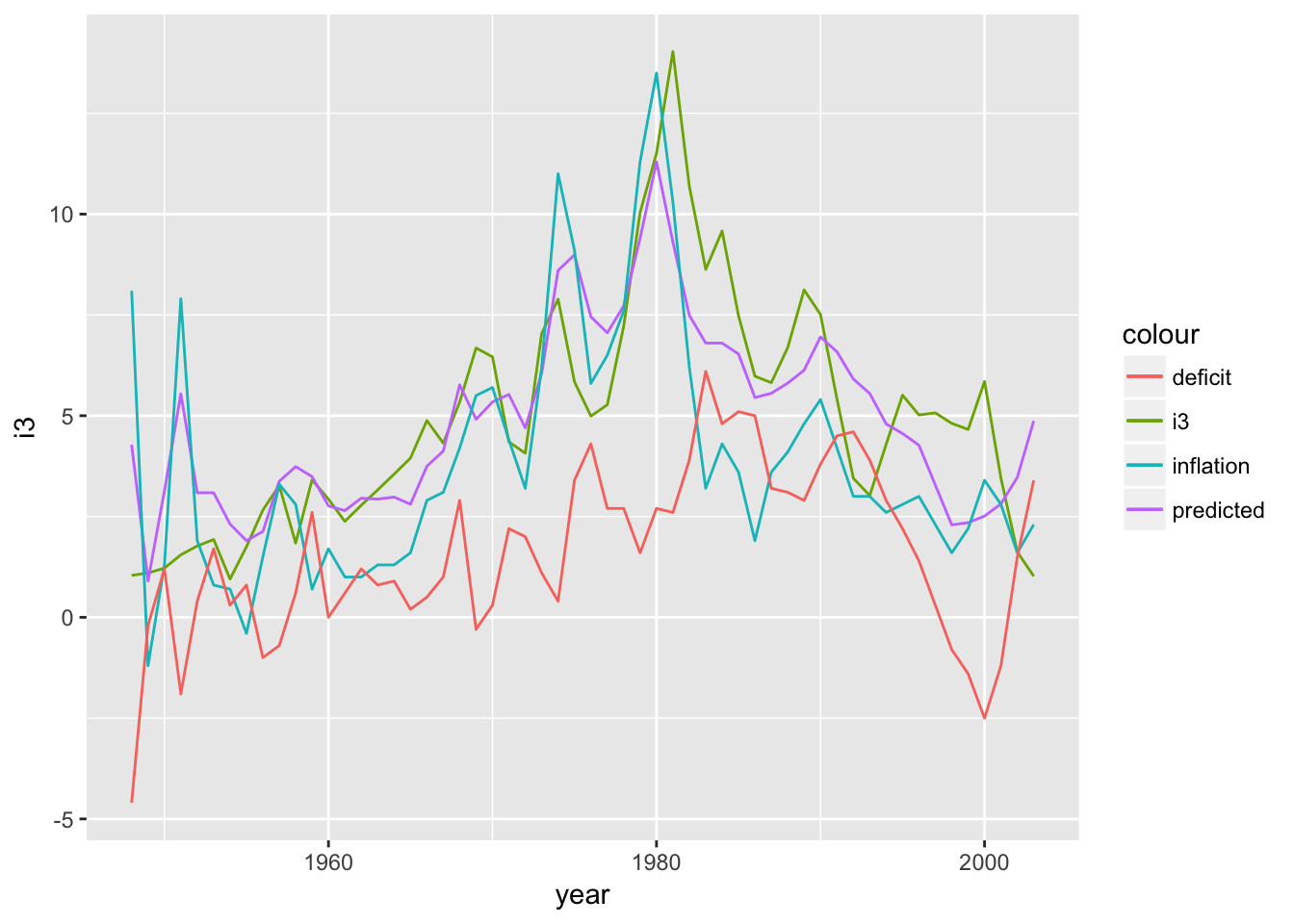
Since 2000, interest rates have been decreasing, while the deficit as percent of GDP has been increasing. Remember that our model returned a positive beta for the def variable: an increasing deficit should lead to increasing interest rates and here’s some background on the causal link. That relationship hasn’t held since 2000 and the predictions are suffering for it.
That’s all for today. Thanks again to justinmshea for the new fantastically useful wooldridge package. Happy econometricsing!