In our previous post, we constructed a portfolio and calculated the Sortino Ratio. Today we continue that project and visualize various pieces of the Sortino process. We will also make use of the tools we developed when visualizing asset returns.
By way of reminder, we are using the following portfolio and Minimum Acceptable Rate (MAR):
Assets and Weights
+ SPY (S&P500 fund) weighted 25%
+ EFA (a non-US equities fund) weighted 25%
+ IJS (a small-cap value fund) weighted 20%
+ EEM (an emerging-mkts fund) weighted 20%
+ AGG (a bond fund) weighted 10%
Minimum Acceptable Rate
+ MAR = .008 or .8%Let’s load up our packages and get to it.
# first install the packages if they are not already installed in your environment.
# install.packages("tidyverse")
# install.packages("tidyquant")
# install.packages("timetk")
knitr::opts_chunk$set(message=FALSE, warning=FALSE)
library(tidyverse)
library(tidyquant)
library(timetk)
library(highcharter)The code chunk below is a copy/paste from last time to import prices, transform to portfolio returns and calculate Sortino for our chosen MAR of .8%.
# The symbols vector holds our tickers.
symbols <- c("SPY","EFA", "IJS", "EEM","AGG")

# The prices object will hold our daily price data.
prices <-
  getSymbols(symbols, src = 'yahoo', from = "2005-01-01",
             auto.assign = TRUE, warnings = FALSE) %>%
  map(~Ad(get(.))) %>%
  reduce(merge) %>%
  `colnames<-`(symbols)

w <- c(0.25, 0.25, 0.20, 0.20, 0.10)

MAR <- .008

# XTS world

prices_monthly <- to.monthly(prices, indexAt = "last", OHLC = FALSE)
asset_returns_xts <- na.omit(Return.calculate(prices_monthly, method = "log"))

portfolio_returns_xts <- Return.portfolio(asset_returns_xts, weights = w)

# XTS object
sortino_xts <-
  SortinoRatio(portfolio_returns_xts, MAR = MAR) %>%
  `colnames<-`("ratio")

# Tidyverse method, to long, tidy format
asset_returns_long <-
  prices %>%
  to.monthly(indexAt = "last", OHLC = FALSE) %>%
  tk_tbl(preserve_index = TRUE, rename_index = "date") %>%
  gather(asset, returns, -date) %>%
  group_by(asset) %>%
  mutate(returns = (log(returns) - log(lag(returns))))

portfolio_returns_tidy <-
  asset_returns_long %>%
  tq_portfolio(assets_col = asset,
               returns_col = returns,
               weights = w,
               col_rename = "returns")
When we originally calculated Sortino by-hand in the tidy world, we used summarise to create one new cell for our end result. The code was summarise(ratio = mean(returns - MAR)/sqrt(sum(pmin(returns - MAR, 0)^2)/nrow(.))).
Today, we will make two additions to assist in our data visualization. We will add a column for returns that follow below MAR with mutate(returns_below_MAR = ifelse(returns < MAR, returns, NA)) and add a column for returns above MAR with mutate(returns_above_MAR = ifelse(returns > MAR, returns, NA)). This is not necessary for calculating the Sortino, but we will see how it makes our ggplotting a bit easier and it illustrates a benefit of doing things by-hand with dplyr: if we want to extract or create certain data transformations, we can add it to the piped code flow.
# Tibble object
sortino_byhand <-
  portfolio_returns_tidy %>%
  slice(-1) %>%
  mutate(ratio = mean(returns - MAR)/sqrt(sum(pmin(returns - MAR, 0)^2)/nrow(.))) %>%
  # Add two new columns to help with ggplot.
  mutate(returns_below_MAR = ifelse(returns < MAR, returns, NA)) %>%
  mutate(returns_above_MAR = ifelse(returns > MAR, returns, NA))
We now have two objects in our global environment, sortino_xts and sortino_byhand.
Let’s work with sortino_byhand and start with a scatter plot of returns using ggplot.
The goal is to quickly grasp how many of our returns are above the MAR and how many are below the MAR. When we calculated the Sortino above, we created new columns for returns_above_MAR and returns_below_MAR columns. It makes this visualization a straightforward construct.
We will create green points for returns above MAR with geom_point(aes(y = returns_above_MAR), colour = "green") and red points for returns below MAR with geom_point(aes(y = returns_below_MAR), colour = "red").
I’m always curious how portfolios have performed since the election so we’ll add a blue vertical line at November of 2016. We will also include a horizontal purple dotted line at the MAR.
sortino_byhand %>%
  ggplot(aes(x = date)) +
  geom_point(aes(y = returns_below_MAR), colour = "red") +
  geom_point(aes(y = returns_above_MAR), colour = "green") +
  geom_vline(xintercept = as.numeric(as.Date("2016-11-30")), color = "blue") +
  geom_hline(yintercept = MAR, color = "purple", linetype = "dotted") +
  annotate(geom="text", x=as.Date("2016-11-30"),
           y = -.15, label = "Election", fontface = "plain",
           angle = 90, alpha = .5, vjust =  1.5) +
  ylab("percent monthly returns")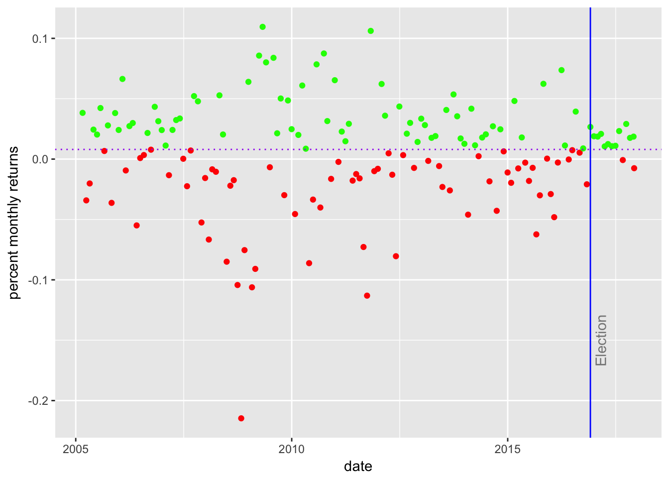
It appears that about half of our returns fall below the MAR. Do we consider that to be a successful portfolio? This is not a rigorous test - what strikes us from the number of red dots and where they fall? Do we notice a trend? A period with consistently below or above MAR returns?
Since the election in 2016, there has been only one monthly return below the MAR and that will lead to a large Sortino since November.
Next we will build a histogram of the distribution of returns with geom_histogram(alpha = 0.25, binwidth = .01, fill = "cornflowerblue"). We will again add a line for the MAR.
sortino_byhand %>%
  ggplot(aes(x = returns)) +
  geom_histogram(alpha = 0.25, binwidth = .01, fill = "cornflowerblue") +
  geom_vline(xintercept = MAR, color = "green") +
  annotate(geom = "text", x = MAR,
    y = 22, label = "MAR", fontface = "plain", angle = 90, alpha = .5, vjust =  1)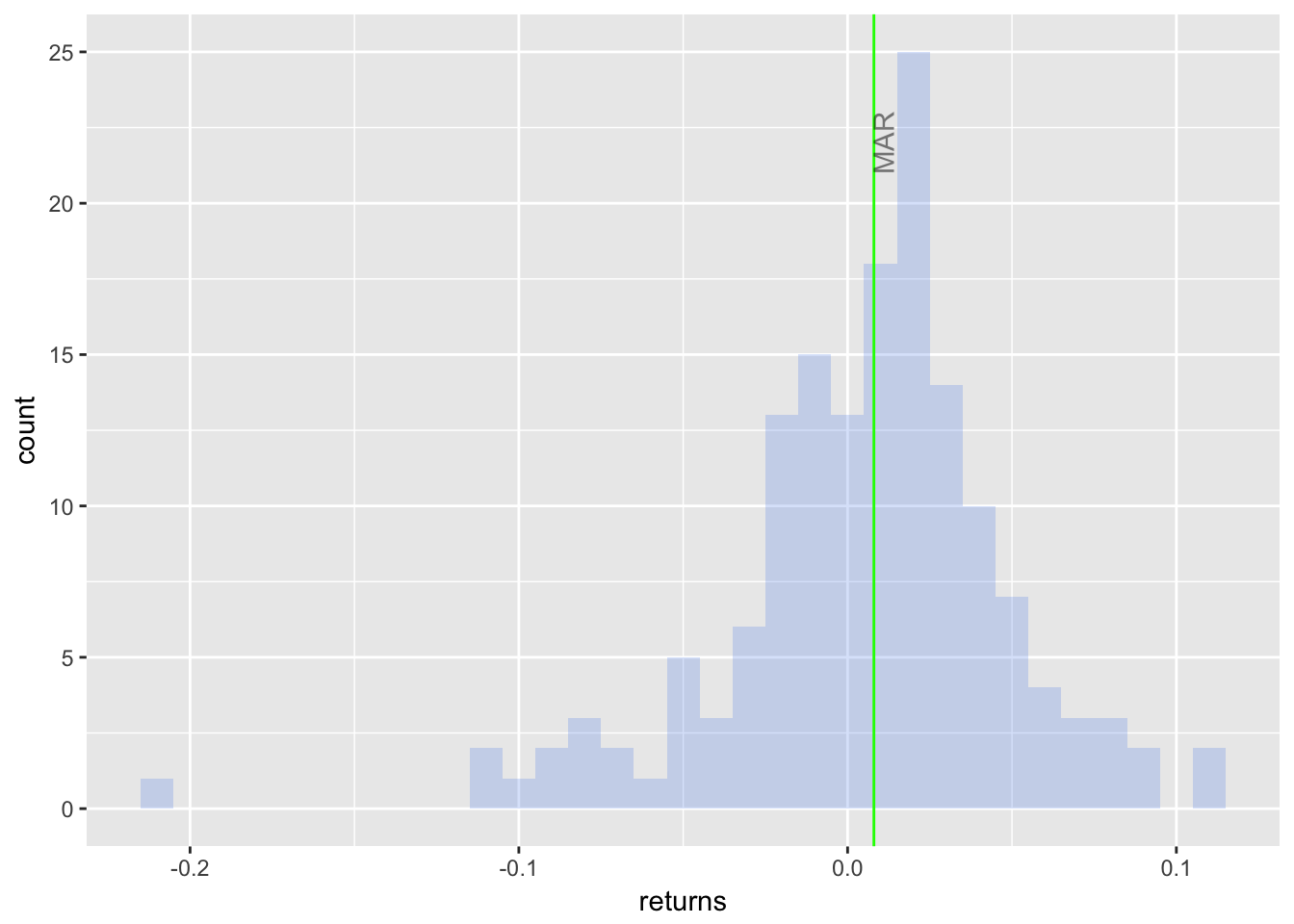
I notice a slight negative skew and a mode that is above MAR - some good motivation to take note that the mean monthly return is 0.006, which is below our MAR of 0.008. We already had a sense for this since the Sortino Ratio is negative.
The Sortino Ratio and portfolio returns in general are usually accompanied by a density plot and we’ll build one now. First, we will start simple with stat_density(geom = "line", size = 1, color = "cornflowerblue") to create a ggplot object called sortino_density_plot.
sortino_density_plot <- sortino_byhand %>%
  ggplot(aes(x = returns)) +
  stat_density(geom = "line", size = 1, color = "cornflowerblue")

sortino_density_plot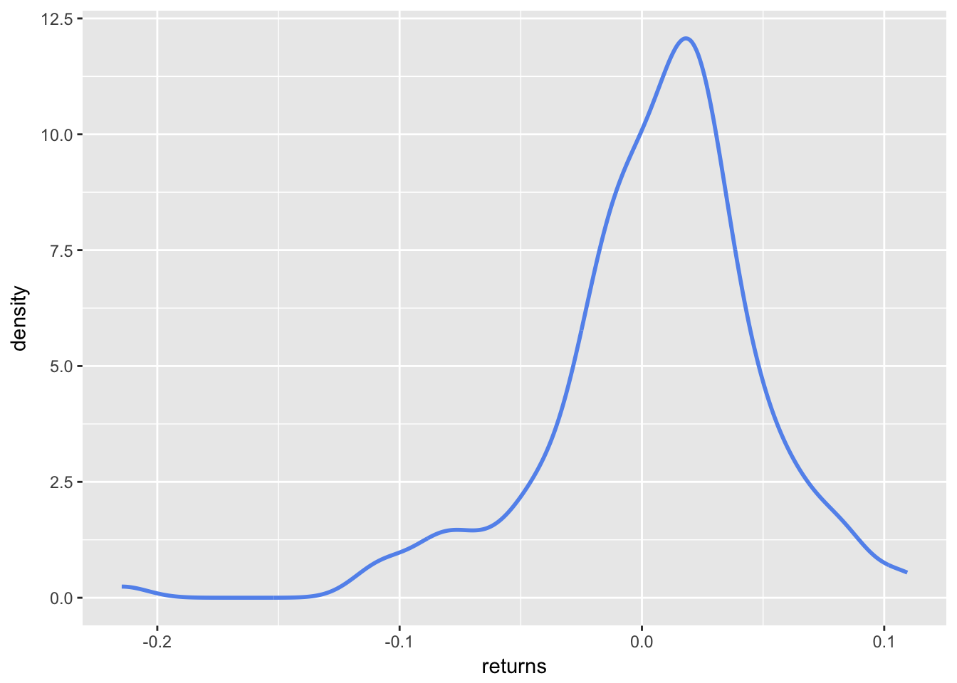
The slight negative skew is a bit more evident here. It would be nice to shade the area that falls below the MAR. To do that, let’s create an object called shaded_area using ggplot_build(p)$data[[1]] %>% filter(x < MAR). That snippet will take our original ggplot object and create a new object filtered for x values less than MAR. Then we use geom_area to add the shaded area to sortino_density_plot.
# use ggplot_build to get the p object; it returns a list of 1 data frame, not a dataframe
# so to access the dataframe we need to call [[1]]

shaded_area_data <- ggplot_build(sortino_density_plot)$data[[1]] %>%
  filter(x < MAR)

sortino_density_plot_shaded <- sortino_density_plot +
  geom_area(data = shaded_area_data, aes(x = x, y = y), fill="pink", alpha = 0.5)

sortino_density_plot_shaded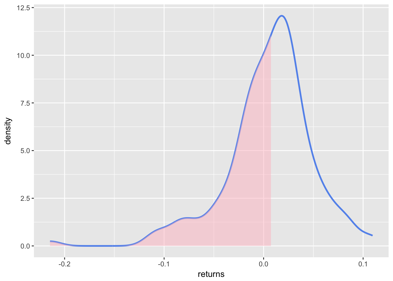
Let’s add a vertical line label at the exact MAR and an arrow to tell people where downside volatility resides. Note how we can keep adding layers to the sortino_density_plot_shaded object from above, which is one of great features of ggplot. It allows experimentation with aesthetics without changing the core plot with each iteration.
sortino_density_plot_shaded +
  geom_segment(aes(x = 0, y = 1, xend = -.05, yend = 1),
  arrow = arrow(length = unit(0.5, "cm"))) +
  geom_segment(data = shaded_area_data, aes(x = MAR, y = 0, xend = MAR, yend = y),
               color = "red", linetype = "dotted") +
  annotate(geom = "text", x = MAR, y = 5, label = "MAR = 0.8%",
           fontface = "plain", angle = 90, alpha = .8, vjust =  -1) +
  annotate(geom = "text", x = -.02, y = .1, label = "Downside",
           fontface = "plain", alpha = .8, vjust =  -1)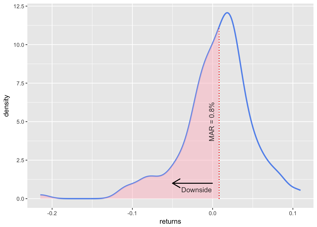
As with our scatter plot, we have not been shy about aesthetic layering but one goal here is to explore ggplot tools, which gives us license to be over inclusive.
We have done some good work for visualizing the portfolio’s returns and how they are distributed relative to the MAR, and how the MAR separates part of the the returns to downside risk. That gives us some intuition about the Sortino Ratio.
We have not, however, touched the actual Sortino Ratio yet. We will do so now.
The ratio itself is one number: -0.068. That doesn’t allow much by way of dynamic visualization. So, we will visualize the Sortino Ratio over time and to do that we will need to calculate the rolling ratio. There is a slight wrinkle though - remember that we exclude above MAR returns from the denominator. If our rolling window is too small, we might end up with a denominator that includes 1 or 2 or 0 downside deviations. That would accurately reflect that the portfolio has done well in that small window but it might report a misleadingly huge number for the rolling window. The rolling 6 month demonstrates this.
First, we need to calculate the rolling 6-month Sortino with rollapply(portfolio_returns_xts, 6, function(x) SortinoRatio(x)). Then we can visualize with highcharter.
# calculate 6-month rolling Sortino
sortino_roll_6 <-
  rollapply(portfolio_returns_xts, 6,function(x) SortinoRatio(x, MAR = MAR)) %>%
  `colnames<-`("6-rolling")

sortino_roll_6[20:24]
## 6-rolling
## 2006-09-29 -0.2532249
## 2006-10-31 -0.1668856
## 2006-11-30 2.8959877
## 2006-12-29 7.3540117
## 2007-01-31 176.7018822Take a quick peek at the rolling 6-month for the dates September of 2006 through January of 2007. What happened to cause that spike to 176! When we calculate Sortino over short time periods, strange results can occur.
Let’s chart with highcharter and investigate other unusual occurrences when we slice the data.
# Pass to highcharter
highchart(type = "stock") %>%
  hc_title(text = "Rolling Sortino") %>%
  hc_add_series(sortino_roll_6, name = "Sortino", color = "blue") %>%
  hc_navigator(enabled = FALSE) %>%
  hc_scrollbar(enabled = FALSE)
The rolling 6-month has so many bizarre spikes, e.g. a reading of 176 on January 31, 2007 and a reading of 9 on September 30, 2009 before breaching 100 in 2016! It nicely emphasizes how we need to be careful with the Sortino Ratio, short time periods and rolling applications.
Let’s see how the rolling 24-month compares.
sortino_roll_24 <- rollapply(portfolio_returns_xts, 24,
                           function(x) SortinoRatio(x, MAR = MAR))

highchart(type = "stock") %>%
  hc_title(text = "Rolling Sortino") %>%
  hc_add_series(sortino_roll_24, name = "Sortino 24", color = "green") %>%
  hc_navigator(enabled = FALSE) %>%
  hc_scrollbar(enabled = FALSE)
Ah, much better. We can see the movements and how the Sortino has changed through the life of this portfolio, but within a reasonable range of .6 to -0.4.
The spikes and plunges are good markers for further investigation. The trough in 2009 is reflective of the credit crunch. What about the free fall at February of 2016? And the roller coaster from May of 2013 to May of 2014?
Rolling Sortinos need to be handled with care but there are a few nice payoffs First, these charts force us and our end users to reflect on how time periods can affect Sortino to extremes. Be skeptical if someone reports a fantastic 6-month Sortino. Second, as an exploratory device, the rolling ratios highlight time periods deserving of more investigation. Third, with Sortino (and Sharpe) Ratios, there’s a temptation to look at the final number for a portfolio’s life and judge it ‘good’ or ‘bad’. These rolling visualizations can help reframe the analysis and look at how the portfolio behaved in different economic and market regimes.
That’s all for today. Thanks for reading and see you next time when we head to Shiny.