Today we will take a look at the GDP data that is released every quarter or so by the Bureau of Economic Analysis BEA. Before we get started, a big thank you to the BEA who work very hard to gather and clean this data, and then make it publicly available to us dataphiles. We are lucky to live in these data-rich times. I know it’s a government agency and tax-funded, but I’m saying thank you anyway.
Let’s get to the fun stuff. Today, we will become familiar with the BEA API (see the documentation here) and then explore the components of GDP. For a nice read about those components by an excellent writer, check out this post by JPMC’s @DavidKelly. For a primer on GDP in general, BEA publishes this guide.
To access the BEA API, we will need two packages, httr and jsonlite.
library(tidyverse)
library(tidyquant)
library(httr)
library(jsonlite)
We also need to know the API address and parameters to get. That information can be found in the API documentation referenced above. We supply our API key, the name of the data set as NIPA, the table name as T10101, which holds GDP data, and a quarterly frequency with Q.
"https://apps.bea.gov/api/data/?&UserID=Your-API-Key Here&method=GetData&DataSetName=NIPA&TableName=T10101&Frequency=Q&Year=ALL&ResultFormat=JSON"We will pass that API string to the fromJSON() function to access the API, and include simplifyDataFrame = FALSE and simplifyMatrix = FALSE to turn off some of the builtin data chops.
  bea_gdp_api <-
  fromJSON("https://apps.bea.gov/api/data/?&UserID=084F6B76-36BE-431F-8F2A-54429DF5E04C&method=GetData&DataSetName=NIPA&TableName=T10101&Frequency=Q&Year=ALL&ResultFormat=JSON",
  simplifyDataFrame = FALSE,
  simplifyMatrix = FALSE)

str(bea_gdp_api, max=3)
List of 1
$ BEAAPI:List of 2
..$ Request:List of 1
.. ..$ RequestParam:List of 8
..$ Results:List of 5
.. ..$ Statistic : chr "NIPA Table"
.. ..$ UTCProductionTime: chr "2018-08-29T17:29:13.933"
.. ..$ Dimensions :List of 9
.. ..$ Data :List of 7125
.. ..$ Notes :List of 1That worked but the returned data is a monster (remove that max = 3 argument and see what happens)!
Let’s use pluck() to extract the data we want by calling
pluck("BEAAPI","Results","Data"). That command plucks the list called BEAAPI, then the list called Results, then the list called Data.
bea_gdp_api <-
  fromJSON("https://apps.bea.gov/api/data/?&UserID=084F6B76-36BE-431F-8F2A-54429DF5E04C&method=GetData&DataSetName=NIPA&TableName=T10101&Frequency=Q&Year=ALL&ResultFormat=JSON",
  simplifyDataFrame = FALSE,
  simplifyMatrix = FALSE) %>%
  pluck("BEAAPI","Results","Data")

str(bea_gdp_api[1])
List of 1
$ :List of 9
..$ TableName : chr "T10101"
..$ SeriesCode : chr "A191RL"
..$ LineNumber : chr "1"
..$ LineDescription: chr "Gross domestic product"
..$ TimePeriod : chr "1947Q2"
..$ METRIC_NAME : chr "Fisher Quantity Index"
..$ CL_UNIT : chr "Percent change, annual rate"
..$ UNIT_MULT : chr "0"
..$ DataValue : chr "-1.0"Okay, we’re getting somewhere now - a list of 7125 lists of 9 elements. Looking at those 9 elements, we want the TimePeriod, the LineDescription, the DataValue and for reasons we’ll see later, the SeriesCode. So, we want 4 items from each of those 7125 lists and ideally we would like to convert them to a tibble.
We can use map_df() from purrr to apply the extract() function from magrittr and select just the list elements we want and convert the results to a tibble. By appending _df we are telling map to return a data frame.
bea_gdp_api <-
  fromJSON("https://apps.bea.gov/api/data/?&UserID=084F6B76-36BE-431F-8F2A-54429DF5E04C&method=GetData&DataSetName=NIPA&TableName=T10101&Frequency=Q&Year=ALL&ResultFormat=JSON",
  simplifyDataFrame = FALSE,
  simplifyMatrix = FALSE) %>%
  pluck("BEAAPI","Results","Data") %>%
  map_df(magrittr::extract, c("LineDescription", "TimePeriod",
                              "SeriesCode", "DataValue"))

str(bea_gdp_api)
Classes 'tbl_df', 'tbl' and 'data.frame': 7125 obs. of 4 variables:
$ LineDescription: chr "Gross domestic product" "Gross domestic product" "Gross domestic product" "Gross domestic product" ...
$ TimePeriod : chr "1947Q2" "1947Q3" "1947Q4" "1948Q1" ...
$ SeriesCode : chr "A191RL" "A191RL" "A191RL" "A191RL" ...
$ DataValue : chr "-1.0" "-0.8" "6.4" "6.2" ...Much, much better. We now have a tibble, with 4 columns and 7125 rows. Let’s do some cleanup with rename() for bettter column names and then make sure that the percent_change and quarter column are in a good format.
bea_gdp_api <-
  bea_gdp_api %>%
  group_by(LineDescription) %>%
  rename(account = LineDescription, quarter = TimePeriod, percent_change = DataValue) %>%
  mutate(percent_change = as.numeric(percent_change),
         quarter = yq(quarter))
bea_gdp_api is now a tibble that holds the quarterly percentage change for each of the GDP accounts used by the BEA, including total GDP change. Let’s take a closer look at each of the accounts whose data we have.
bea_gdp_api %>%
  count()
# A tibble: 21 x 2
# Groups: account [21]
account n
<chr> <int>
1 Durable goods 285
2 Equipment 285
3 Exports 285
4 Federal 285
5 Fixed investment 285
6 Goods 855
7 Government consumption expenditures and gross investment 285
8 Gross domestic product 285
9 Gross domestic product, current dollars 285
10 Gross private domestic investment 285
# ... with 11 more rowsWe have 21 accounts or groups. Note there is both Gross domestic product and Gross domestic product, current dollars, in case that matters to your use case. What are the other 19 groups? They are the sub accounts that comprise GDP. Note that n = 855 for the Goods account and the Services account, but we have only 285 quarters of data. That’s because there are 3 accounts called Goods and Services (we’ll look at these three below).
We can look at the Goods accounts by SeriesCode.
bea_gdp_api %>%
  group_by(SeriesCode) %>%
  slice(1) %>%
  select(account, SeriesCode) %>%
  filter(account == "Goods")
# A tibble: 3 x 2
# Groups: SeriesCode [3]
account SeriesCode
<chr> <chr>
1 Goods A253RL
2 Goods A255RL
3 Goods DGDSRL This is why we grabbed the series codes, too. We need a way to figure out the true account for these three things labeled as Goods.
Some googling reveals that A253RL is for Real Exports of Goods (a third level account), A255RL is for Real Imports of Goods (a third level account) and DGDSRL is a second level account and the Goods component of Real Personal Consumption and Expenditure (PCE).
Let’s add better account/group names by with case_when().
bea_gdp_api %>%
  ungroup() %>%
  mutate(account = case_when(SeriesCode == "A253RL" ~ "Export Goods",
                         SeriesCode == "A255RL" ~ "Import Goods",
                         SeriesCode == "DGDSRL" ~ "Goods",
                         TRUE ~ .$account)) %>%
  group_by(account) %>%
  count()
# A tibble: 23 x 2
# Groups: account [23]
account n
<chr> <int>
1 Durable goods 285
2 Equipment 285
3 Export Goods 285
4 Exports 285
5 Federal 285
6 Fixed investment 285
7 Goods 285
8 Government consumption expenditures and gross investment 285
9 Gross domestic product 285
10 Gross domestic product, current dollars 285
# ... with 13 more rowsWe repeat that process for Services, which also had 3 accounts smooshed into one label.
bea_gdp_api %>%
  group_by(SeriesCode) %>%
  slice(1) %>%
  select(account, SeriesCode) %>%
  filter(account == "Services")
# A tibble: 3 x 2
# Groups: SeriesCode [3]
account SeriesCode
<chr> <chr>
1 Services A646RL
2 Services A656RL
3 Services DSERRL Similar to with goods, DSERRL is the services component of PCE and is a second level account. A656RL is imports of services (a third level account) and A646RL is exports of services.
Let’s make our changes to both goods and services in the data. I’m also going to replace a few other accounts with shorter names, e.g. I will use “Govt” for “Government consumption expenditures and gross investment”.
bea_gdp_wrangled <-
  bea_gdp_api %>%
  ungroup() %>%
  mutate(account = case_when(SeriesCode == "A253RL" ~ "Export Goods",
                         SeriesCode == "A255RL" ~ "Import Goods",
                         SeriesCode == "DGDSRL" ~ "Goods",
                         SeriesCode == "DSERRL" ~ "Services",
                         SeriesCode == "A656RL" ~ "Import Services",
                         SeriesCode == "A646RL" ~ "Export Services",
                         SeriesCode == "A822RL" ~ "Govt",
                         SeriesCode == "A006RL" ~ "Investment",
                         SeriesCode == "DPCERL" ~ "PCE",
                         TRUE ~ .$account)) %>%
  group_by(account) %>%
  select(-SeriesCode)

bea_gdp_wrangled %>%
  count()
# A tibble: 25 x 2
# Groups: account [25]
account n
<chr> <int>
1 Durable goods 285
2 Equipment 285
3 Export Goods 285
4 Export Services 285
5 Exports 285
6 Federal 285
7 Fixed investment 285
8 Goods 285
9 Govt 285
10 Gross domestic product 285
# ... with 15 more rowsWe now have 25 accounts, each with 285 observations.
Let’s move to some visualization and check out how GDP has changed on a quarterly basis since 2008
bea_gdp_wrangled %>%
filter(quarter > "2008-01-01") %>%
filter(account == "Gross domestic product") %>%
mutate(col_blue =
           if_else(percent_change > 0,
                  percent_change, as.numeric(NA)),
         col_red =
           if_else(percent_change < 0,
                  percent_change, as.numeric(NA))) %>%
  ggplot(aes(x = quarter)) +
  geom_col(aes(y = col_red),
               alpha = .85,
               fill = "pink",
               color = "pink") +
  geom_col(aes(y = col_blue),
               alpha = .85,
               fill = "cornflowerblue",
               color = "cornflowerblue") +
  ylab("Quarterly Change (percent)") +
  scale_x_date(breaks = scales::pretty_breaks(n = 20)) +
  labs(title = "Quarterly GDP Growth",
       subtitle = "since 2008",
       x = "",
       caption = "more here: www.bea.gov/newsreleases/national/gdp/gdpnewsrelease.htm") +
  theme_minimal() +
  theme(axis.text.x = element_text(angle = 90, hjust = 1),
        plot.title = element_text(hjust = 0.5),
        plot.subtitle = element_text(hjust = 0.5),
        plot.caption=element_text(hjust=0))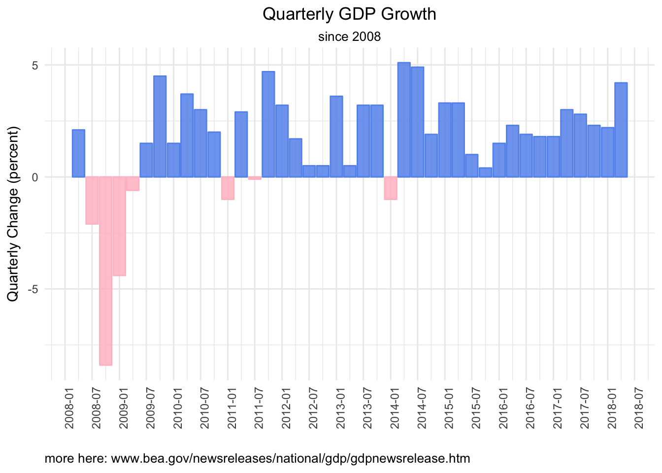
That’s a nice look at GDP quarterly change since 2008, but let’s go a bit deeper and visualize the 4 top level components of GDP, which are personal consumption, net exports (or imports and exports), private investment and government spending. Here is how each changed in Q2 2018.
bea_gdp_wrangled %>%
  filter((
         account == "PCE" |
         account == "Investment" |
         account == "Exports" |
         account == "Imports" |
         account == "Govt") &
        quarter == last(quarter)) %>%
   mutate(col_blue =
           if_else(percent_change > 0,
                  percent_change, as.numeric(NA)),
         col_red =
           if_else(percent_change < 0,
                  percent_change, as.numeric(NA))) %>%
  ggplot(aes(x = reorder(account, percent_change))) +
  geom_col(aes(y = col_red),
               alpha = .85,
               fill = "pink",
               color = "pink",
               width = .5) +
  geom_col(aes(y = col_blue),
               alpha = .85,
               fill = "cornflowerblue",
               color = "cornflowerblue",
               width = .5) +
  labs(title = paste(last(bea_gdp_api$quarter),
                     "GDP Change",
                     sep = " "),
       subtitle = "by account, and total",
       x = "account",
       y = "change last quarter") +
  theme_minimal() +
  theme(axis.text.x = element_text(angle = 90, hjust = 1),
        plot.title = element_text(hjust = 0.5),
        plot.subtitle = element_text(hjust = 0.5)) +
  scale_y_continuous(breaks = scales::pretty_breaks(n = 10))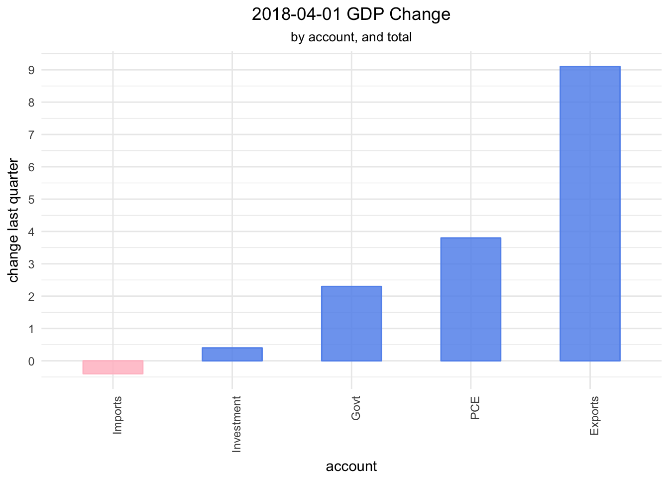
We can chart how each account has changed over time as well.
bea_gdp_wrangled %>%
filter(quarter > "2008-01-01") %>%
filter(
         account == "PCE" |
         account == "Investment" |
         account == "Exports" |
         account == "Imports" |
         account == "Govt") %>%
mutate(col_blue =
           if_else(percent_change > 0,
                  percent_change, as.numeric(NA)),
         col_red =
           if_else(percent_change < 0,
                  percent_change, as.numeric(NA))) %>%
  ggplot(aes(x = quarter)) +
  geom_col(aes(y = col_red),
               alpha = .85,
               fill = "pink",
               color = "pink") +
  geom_col(aes(y = col_blue),
               alpha = .85,
               fill = "cornflowerblue",
               color = "cornflowerblue") +
  ylab("Quarterly Change (percent)") +
  scale_x_date(breaks = scales::pretty_breaks(n = 5)) +
  labs(title = "Quarterly GDP Growth",
       subtitle = "since 2008",
       x = "",
       caption = "more here: www.bea.gov/newsreleases/national/gdp/gdpnewsrelease.htm") +
  theme_minimal() +
  theme(axis.text.x = element_text(angle = 90, hjust = 1),
        plot.title = element_text(hjust = 0.5),
        plot.subtitle = element_text(hjust = 0.5),
        plot.caption=element_text(hjust=0)) +
  facet_wrap(~account)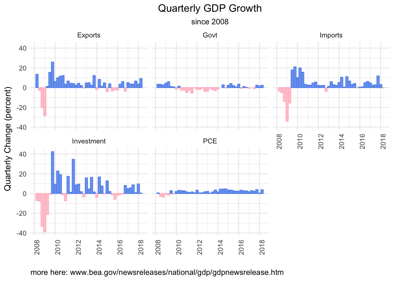
Note that these charts are showing the percent change of each account on an absolute basis, not how each has contributed to GDP change.
Since we might be interested in that sort of thing, let’s use another API call to get a different data set: how each component of GDP has contributed to quarterly change over time. We will use the same flow as above, except specify a different data set with T10102.
bea_gdp_contributions <-
  fromJSON("https://apps.bea.gov/api/data/?&UserID=084F6B76-36BE-431F-8F2A-54429DF5E04C&method=GetData&DataSetName=NIPA&TableName=T10102&Frequency=Q&Year=ALL&ResultFormat=JSON",
  simplifyDataFrame = FALSE,
  simplifyMatrix = FALSE) %>%
  pluck("BEAAPI","Results","Data") %>%
  map_df(magrittr::extract, c("LineDescription", "TimePeriod",
                              "SeriesCode", "DataValue")) %>%
  group_by(LineDescription)  %>%
  rename(account = LineDescription, quarter = TimePeriod, percent_change = DataValue) %>%
  mutate(percent_change = as.numeric(percent_change),
         quarter = yq(quarter))
Have a quick look at what we just imported.
bea_gdp_contributions %>%
  count()
# A tibble: 22 x 2
# Groups: account [22]
account n
<chr> <int>
1 Change in private inventories 285
2 Durable goods 285
3 Equipment 285
4 Exports 285
5 Federal 285
6 Fixed investment 285
7 Goods 855
8 Government consumption expenditures and gross investment 285
9 Gross domestic product 285
10 Gross private domestic investment 285
# ... with 12 more rowsWe have the same naming problem with the Goods and Services accounts, and note that Change in private inventories is included now.
Let’s wrangle as we did before, using the new series codes. We will break up goods and services into three accounts, and do some renaming.
bea_gdp_contributions_wrangled <-
  bea_gdp_contributions %>%
  ungroup() %>%
  mutate(account = case_when(
                         SeriesCode == "A253RY" ~ "Export Goods",
                         SeriesCode == "A191RL" ~ "GDP",
                         SeriesCode == "A255RY" ~ "Import Goods",
                         SeriesCode == "DGDSRY" ~ "Goods",
                         SeriesCode == "DSERRY" ~ "Services",
                         SeriesCode == "A656RY" ~ "Import Services",
                         SeriesCode == "A646RY" ~ "Export Services",
                         SeriesCode == "A019RY" ~ "Net Exports",
                         SeriesCode == "A822RY" ~ "Govt",
                         SeriesCode == "A006RY" ~ "Investment",
                         SeriesCode == "DPCERY" ~ "PCE",
                         SeriesCode == "A014RY" ~ "Inventories",
                         SeriesCode == "Y001RY" ~ "IP",
                         TRUE ~ .$account)) %>%
  group_by(account)
Now we are ready to visualize how the various components contributed to the most recent change in GDP.
First, let’s take a look at how the 4 top level components - net exports, consumption, govt spending and investment - contributed to the most recent change in GDP. We start with ggplot.
bea_gdp_contributions_wrangled %>%
  filter(
    (account == "GDP" |
    account == "PCE" |
    account == "Investment" |
    account == "Govt" |
    account == "Net Exports") &
    quarter == last(quarter)) %>%
   mutate(col_blue =
           if_else(percent_change > 0,
                  percent_change, as.numeric(NA)),
         col_red =
           if_else(percent_change < 0,
                  percent_change, as.numeric(NA))) %>%
  ggplot(aes(x = reorder(account, percent_change))) +
  geom_col(aes(y = col_red),
               alpha = .85,
               fill = "pink",
               color = "pink",
               width = .5) +
  geom_col(aes(y = col_blue),
               alpha = .85,
               fill = "cornflowerblue",
               color = "cornflowerblue",
               width = .5) +
  labs(title = paste(last(bea_gdp_contributions_wrangled$quarter),
                     "GDP Change Top Level",
                     sep = " "),
       subtitle = "by account, and total",
       x = "",
       y = "contribution") +
  theme_minimal() +
  theme(axis.text.x = element_text(angle = 90, hjust = 1),
        plot.title = element_text(hjust = 0.5),
        plot.subtitle = element_text(hjust = 0.5)) +
  scale_y_continuous(breaks = scales::pretty_breaks(n = 10),
                     labels = function(x) paste0(x, "%"))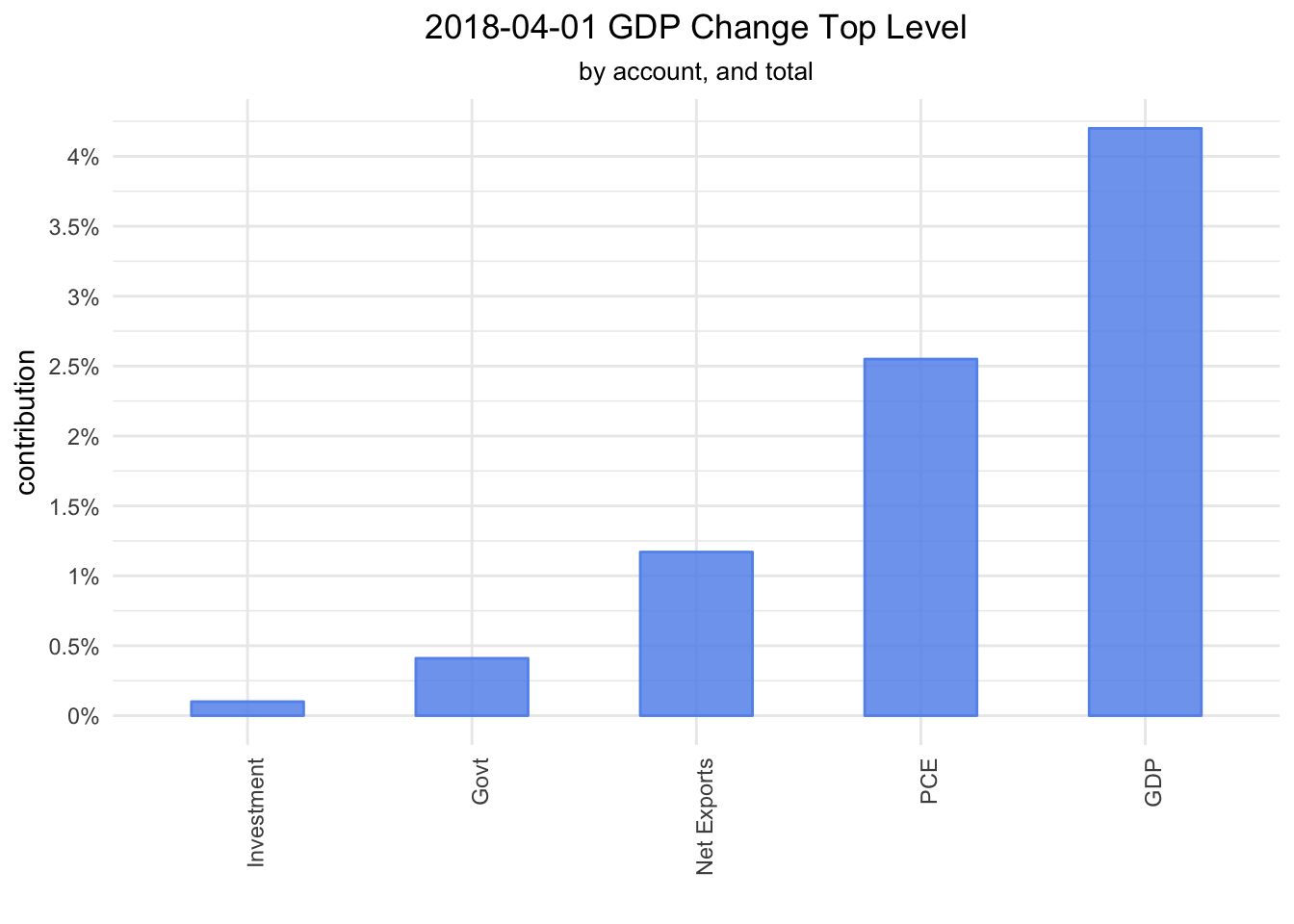
We see that consumption and next exports led the way in Q2. Let’s delve one level deeper. Consumption is comprised of Goods and Services, Investment is comprised of Fixed investment and Inventories, Government is comprised of Federal and State and local, and Net Exports is comprised of Exports and Imports. We will filter to include just those second level accounts.
bea_gdp_contributions_wrangled %>%
  filter(
    (account == "GDP" |
       # PCE
       account == "Goods" |
       account == "Services" |
       # Investment
       account == "Fixed investment" |
       account == "Inventories" |
       # Government
       account == "Federal" |
       account == "State and local" |
       # Net Exports
       account == "Exports" |
       account == "Imports") &
      quarter == last(quarter)) %>%
   mutate(col_blue =
           if_else(percent_change > 0,
                  percent_change, as.numeric(NA)),
         col_red =
           if_else(percent_change < 0,
                  percent_change, as.numeric(NA))) %>%
  ggplot(aes(x = reorder(account, percent_change))) +
  geom_col(aes(y = col_red),
               alpha = .85,
               fill = "pink",
               color = "pink",
               width = .5) +
  geom_col(aes(y = col_blue),
               alpha = .85,
               fill = "cornflowerblue",
               color = "cornflowerblue",
               width = .5) +
  labs(title = paste(last(bea_gdp_contributions_wrangled$quarter),
                     "GDP Change Second Level",
                     sep = " "),
       subtitle = "by account, and total",
       x = "account",
       y = "contribution") +
  theme_minimal() +
  theme(axis.text.x = element_text(angle = 90, hjust = 1),
        plot.title = element_text(hjust = 0.5),
        plot.subtitle = element_text(hjust = 0.5)) +
  scale_y_continuous(breaks = scales::pretty_breaks(n = 10),
                     labels = function(x) paste0(x, "%"))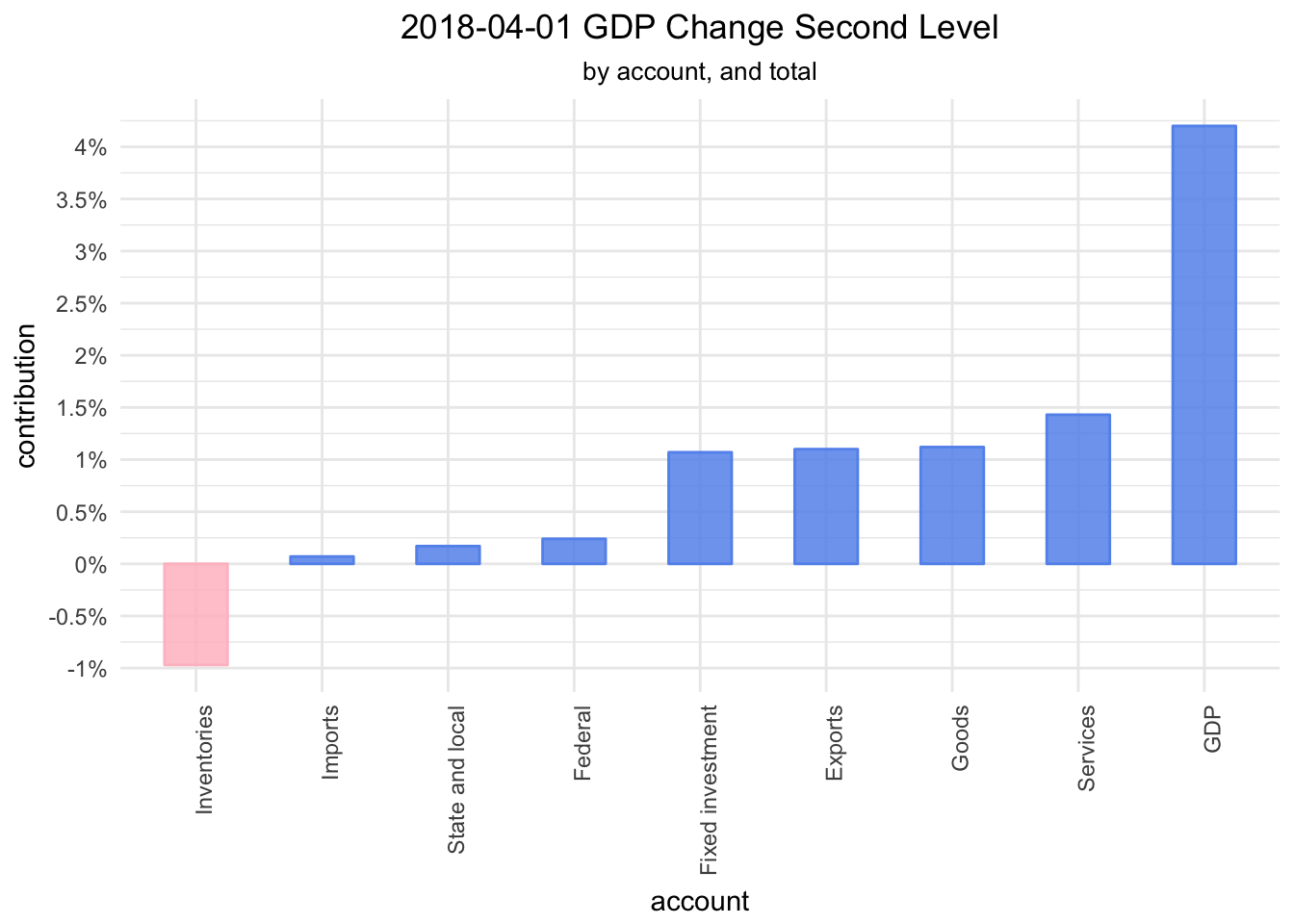
A quick glance makes it seem that change in inventories was the only drag on GDP last quarter, while fixed investment, exports, goods and services led the way.
Why stop now - let’s break things down to the next level.
  bea_gdp_contributions_wrangled %>%
  filter(
    (account == "GDP" |
       # PCE goods
       account == "Durable goods" |
       account == "Nondurable goods" |
       account == "Services" |
       # Investment Fixed
       # account == "Residential" |
       account == "Structures" |
       account == "Equipment" |
       account == "IP" |
       account == "Nonresidential" |
       account == "Inventories" |
       # Government Federal
       account == "National defense" |
       account == "Nondefense" |
       account == "State and local" |
       #Exports Imports
       account == "Export goods" |
       account == "Export services" |
       account == "Import goods" |
       account == "Import services") &
      quarter == last(quarter)) %>%
   mutate(col_blue =
           if_else(percent_change > 0,
                  percent_change, as.numeric(NA)),
         col_red =
           if_else(percent_change < 0,
                  percent_change, as.numeric(NA))) %>%
  ggplot(aes(x = reorder(account, percent_change))) +
  geom_col(aes(y = col_red),
               alpha = .85,
               fill = "pink",
               color = "pink",
               width = .5) +
  geom_col(aes(y = col_blue),
               alpha = .85,
               fill = "cornflowerblue",
               color = "cornflowerblue",
               width = .5) +
  labs(title = paste(last(bea_gdp_contributions_wrangled$quarter),
                     "GDP Change Third Level",
                     sep = " "),
       subtitle = "by account, and total",
       x = "account",
       y = "contribution") +
  theme_minimal() +
  theme(axis.text.x = element_text(angle = 90, hjust = 1),
        plot.title = element_text(hjust = 0.5),
        plot.subtitle = element_text(hjust = 0.5)) +
  scale_y_continuous(breaks = scales::pretty_breaks(n = 10),
                     labels = function(x) paste0(x, "%"))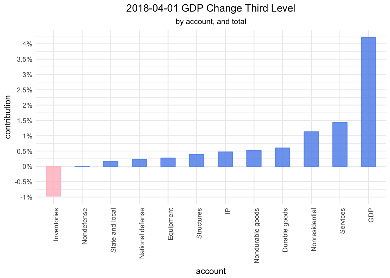
Next time we will look at GDP change and contributions over time, before porting these visualizations over to highcharter. Thanks for reading!