In a previous post, we examined the relationship between the VIX and the past, realized volatility of the S&P 500.
Today, we’ll think about how/whether the VIX predicts future volatility and we’ll be reproducing some visualizations from this Bloomberg piece.
Once again, the substance and ideas here are 100% attributable to Bloomberg - my goal is to reproduce and add to our R toolkit, and learn something about volatility.
First, we grab the price history of the VIX and SP500, convert to returns, and calculate the rolling 20-day volatility of the SP500.
symbols <- c("^GSPC", "^VIX")

prices <-
  getSymbols(symbols, src = 'yahoo', from = "1990-01-01",
             auto.assign = TRUE, warnings = FALSE) %>%
  map(~Cl(get(.)))

# get daily, cont compounded returns
sp500_returns <- na.omit(ROC(GSPC$GSPC.Close, 1, type = "continuous"))


sp500_rolling_sd_20 <- rollapply(sp500_returns,
                             20,
                             function(x) StdDev(x))

sp500_rolling_sd_annualized_20 <- (round((sqrt(252) * sp500_rolling_sd_20 * 100), 2))

vol_vix_xts <- merge.xts(VIX$VIX.Close, sp500_rolling_sd_annualized_20)
We have VIX prices and rolling 20-day SP500 volatility. We want to reproduce the visualizations that illuminate how the VIX predicts realized volatility. In other words, is the VIX reading on 2017-01-01 telling us anything about realized volatility 20 days from 2017-01-01?
The data wrangling challenge here is all about the dates. We need to compare the VIX reading on 2017-01-01 to the realized volatility that occurs over the 20 days after 2017-01-01. It’s not hard to understand this in our heads, it’s a little tricky to line the data up correctly (full disclosure: I had to go to a whiteboard and draw out 20 cells with arrows for what need to go where from the data frame.)
First, we’ll set a start date as the first date index of sp500_rolling_sd_annualized_20 and an end date for the date index that is 19 days before end of sp500_rolling_sd_annualized_20.
start.date <- index(sp500_rolling_sd_annualized_20[1])

end.date <- index(sp500_rolling_sd_annualized_20[nrow(sp500_rolling_sd_annualized_20) - 19])
OK, we will start on 1990-01-03 and end on 2018-01-09.
Now let’s grab the SP500 rolling volatility data between those dates. Note we use the coredata() function because we don’t need the time index, just the data.
# Extract the data, not the time index since we're adding to a tibble.
future_sp500_vol <- tibble::as_tibble   (coredata(sp500_rolling_sd_annualized_20[20:nrow(sp500_rolling_sd_annualized_20), ]))
Now we want to get the VIX data for those same dates and combine them into one tibble. We will get the VIX data with VIX$VIX.Close[paste(start.date, end.date, sep = "::")].
vix_sp500_future_vol <-
  # Get VIX data
  VIX$VIX.Close[paste(start.date, end.date, sep = "::")] %>%
  # Add a date column.
  tk_tbl(preserve_index = TRUE, rename_index = "date") %>%
  select(date, everything()) %>%
  # Add the SP500 data with bind_cols - important line of code here!
  bind_cols(future_sp500_vol[1]) %>%
  rename(vix = VIX.Close, Spy.future = GSPC.Close)

tail(vix_sp500_future_vol)
## # A tibble: 6 x 3
## date vix Spy.future
## <date> <dbl> <dbl>
## 1 2018-01-02 9.77 9.10
## 2 2018-01-03 9.15 8.88
## 3 2018-01-04 9.22 8.81
## 4 2018-01-05 9.22 12.1
## 5 2018-01-08 9.52 19.1
## 6 2018-01-09 10.1 20.2Take a peek at the result. We now have a tibble with a column for the VIX price on date t, and a column for realized, future volatility 20 days after date t.
Now it’s on to ggplot to recreate the visualizations from Bloomberg.
line_future_vol20 <-
  # Plot vix on the x axis and future vol on the y axis
  ggplot(vix_sp500_future_vol, aes(date)) +
  geom_line(aes(y = Spy.future, colour = "SP500")) +
  geom_line(aes(y = vix, colour = "Vix")) +
  scale_color_manual(values = c(SP500 = 'maroon', Vix = 'cornflowerblue')) +
  # The remaining lines are aesthetic, title, axis labels.
  ggtitle("Vix and SP500 Volatility 20 Trading Days Hence") +
  xlab("date") +
  ylab("percent") +
  scale_y_continuous(labels = function(x){ paste0(x, "%") },
                     breaks = scales::pretty_breaks(n=10)) +
  theme(plot.title = element_text(hjust = 0.5))

line_future_vol20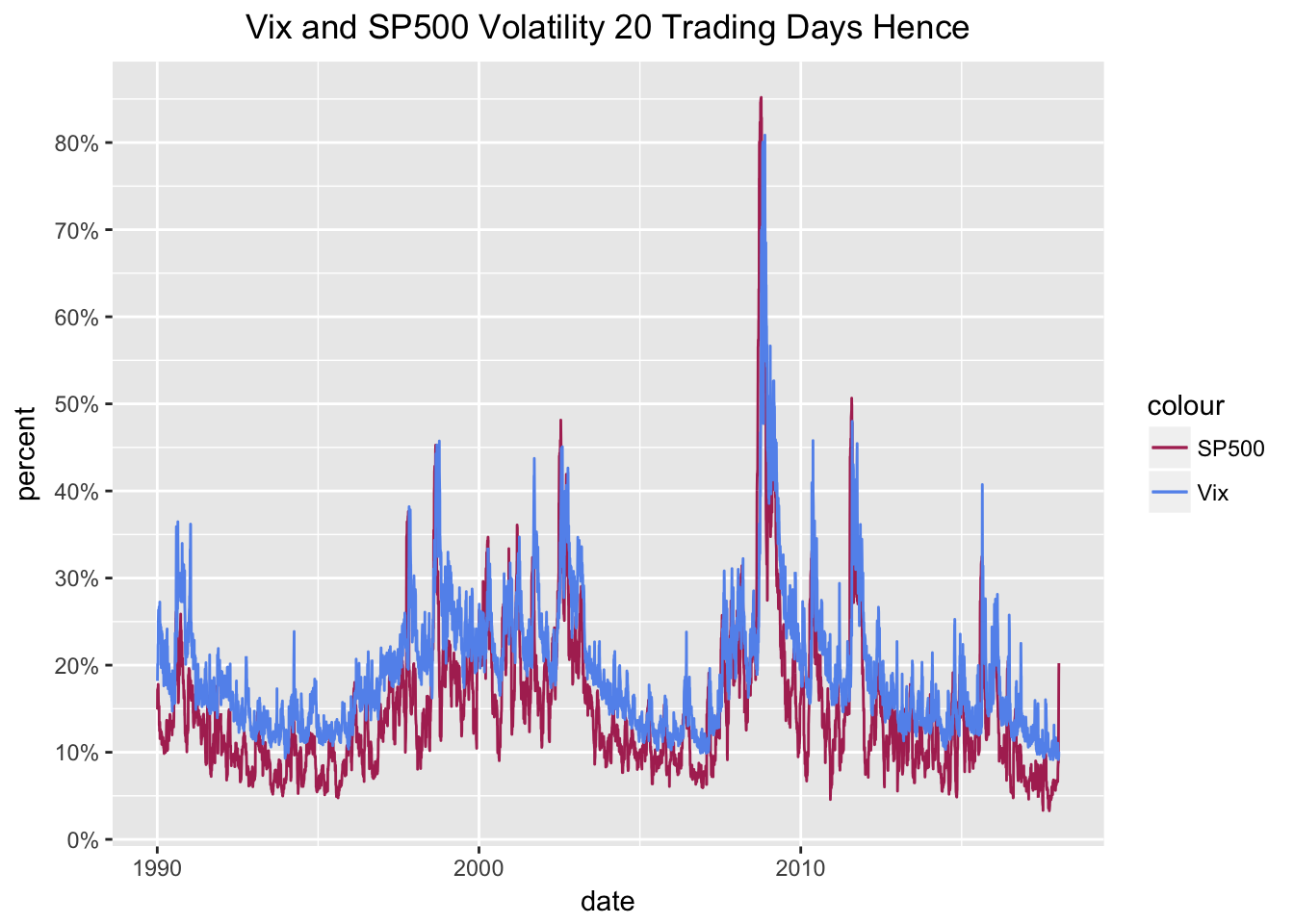
I can’t eyeball much from that chart so let’s move to a scatter plot. We want to have a different color and shape scheme for different dates so we’ll use nested if/else statements to create three eras: pre-historic, Obama, Trump.
vix_sp500_future_vol$era <-
  ifelse(vix_sp500_future_vol$date <= "2008-11-03", 'pre-historic',
         ifelse(vix_sp500_future_vol$date >"2008-11-04" &
                  vix_sp500_future_vol$date <=  "2016-11-08", 'Obama', 'Trump'))
By creating that era column, we can pass it to aes() for a nicer chart and legend.
scatter_future_vol20 <-
  ggplot(vix_sp500_future_vol, aes(vix, Spy.future, color = era, shape = era)) +
  geom_point() +
  scale_color_manual(values=c("maroon", "cornflowerblue", "green")) +
  scale_shape_manual(values = c(17, 15, 18)) +
  geom_line(aes(vix, vix), color = "black") +
  # The remaining lines are aesthetic, title, axis labels.
  ggtitle("Vix v. Subsequent Volatility") +
  xlab("Vix") +
  ylab("Realized vol 20 subsequent trading days") +
  scale_y_continuous(labels = function(x){ paste0(x, "%") },
                     breaks = scales::pretty_breaks(n=10)) +
  scale_x_continuous(labels = function(x){ paste0(x, "%") },
                     breaks = scales::pretty_breaks(n=10)) +
  theme(plot.title = element_text(hjust = 0.5))

scatter_future_vol20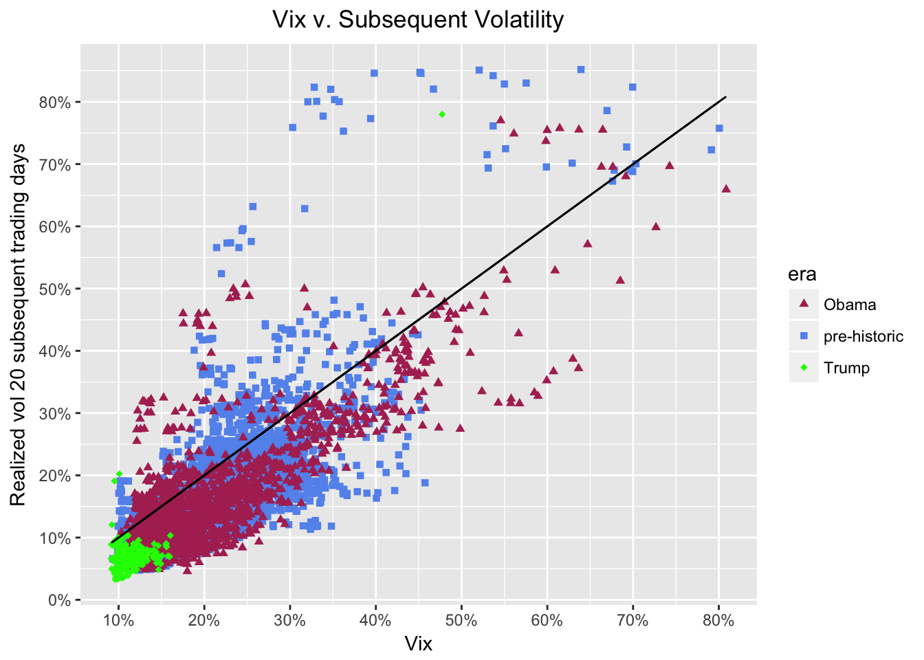
That diagonal black line is the volatility predicted by the VIX and we can see that actual volatility tends to be a bit lower than predicted. The maroon diamonds are the observations during the Obama administration. The green triangles are the observations since November 8, 2016. Over the last ~9 years, realized volatility has generally been lower than what the VIX was predicting. Indeed, it’s hard to look at those green diamonds and worry too much about a volatility spike right now.
Another interesting note: realized one-month volatility has not reached 20% when the VIX was below 12% (add a vertical line at 12% to see this more clearly). As long as the VIX stays below 12%, it’s hard to get too worried about subsequent volatility.
For the well-articulated insights and theory, have a look at the original piece on Bloomberg.