In a previous post, from way back in August of 2017, we explored the relationship between the VIX and the past, realized volatility of the S&P 500 and reproduced some interesting work from AQR on the meaning of the VIX.
With the recent market and VIX rollercoaster, this seemed a good time to revisit the old post, update some code and see if we can tweak the data visualizations to shed some light on the recent market activity.
Import prices, calculate returns and rolling volatility
By way of brief reminder, we first want to import data on SP500 and VIX prices since 2010, then calculate the rolling standard deviation of SP500 20-day eturns. In the previous post, we used the rollapply() function to accomplish this. Today, we will use the roll_sd() function from the RcppRoll package. That will allow us to live in the tibble world instead of the xts world, and it will mean we have a reproducible example from each of those worlds in case we need them for future work.
Let’s get to it.
We import prices with tq_get() and start at 1990.
symbols <- c("^GSPC", "^VIX")


prices_tq <-
  symbols %>%
  tq_get(get = "stock.prices", from = "1990-01-01")
Now we can use dplyr's mutate() function to add a colum for returns with
mutate(sp500_returns = gspc/lag(gspc, 1) - 1), and then a column for the rolling 20-day volatility with
mutate(sp500_roll_20 = roll_sd(sp500_returns, 20, fill = NA, align = "right"). I want to annualize the rolling volatility (as the AQR piece did) so will then mutate the 20-day rolling vol with
sp500_roll_20_annualized = (round((sqrt(252) * sp500_roll_20 * 100), 2)).
sp500_vix_rolling_vol <-
  prices_tq %>%
  select(symbol, date, close) %>%
  spread(symbol, close) %>%
  clean_names() %>%
  mutate(sp500_returns = gspc/lag(gspc, 1) - 1,
         sp500_roll_20 = RcppRoll::roll_sd(sp500_returns, 20, fill = NA, align = "right"),
         sp500_roll_20_annualized = (round((sqrt(252) * sp500_roll_20 * 100), 2))) %>%
  na.omit()
Have a quick peek at our new data object and make sure the origin of each column is clear.
Visualizing Realized Vol and Vix
As we did before, let’s start with a scatterplot to show 20-day trailing volatility on the x-axis and the VIX on the y-axis. This is nothing more than updating our July 2017 work with new data through to August of 2019. In other words, we haven’t done anything yet that we couldn’t have accomplished by re-running the old script.
sp500_vix_rolling_vol %>%
  ggplot(aes(x = sp500_roll_20_annualized, y = vix)) +
  geom_point(colour = "light blue") +
  geom_smooth(method = 'lm', se = FALSE, color = "pink", size = .5) +
  ggtitle("Vix versus 20-Day Realized Vol") +
  xlab("Realized vol preceding 20 trading days") +
  ylab("Vix") +
  # Add a '%' sign to the axes without having to rescale.
  scale_y_continuous(labels = function(x){ paste0(x, "%") }) +
  scale_x_continuous(labels = function(x){ paste0(x, "%") }) +
  theme(plot.title = element_text(hjust = 0.5))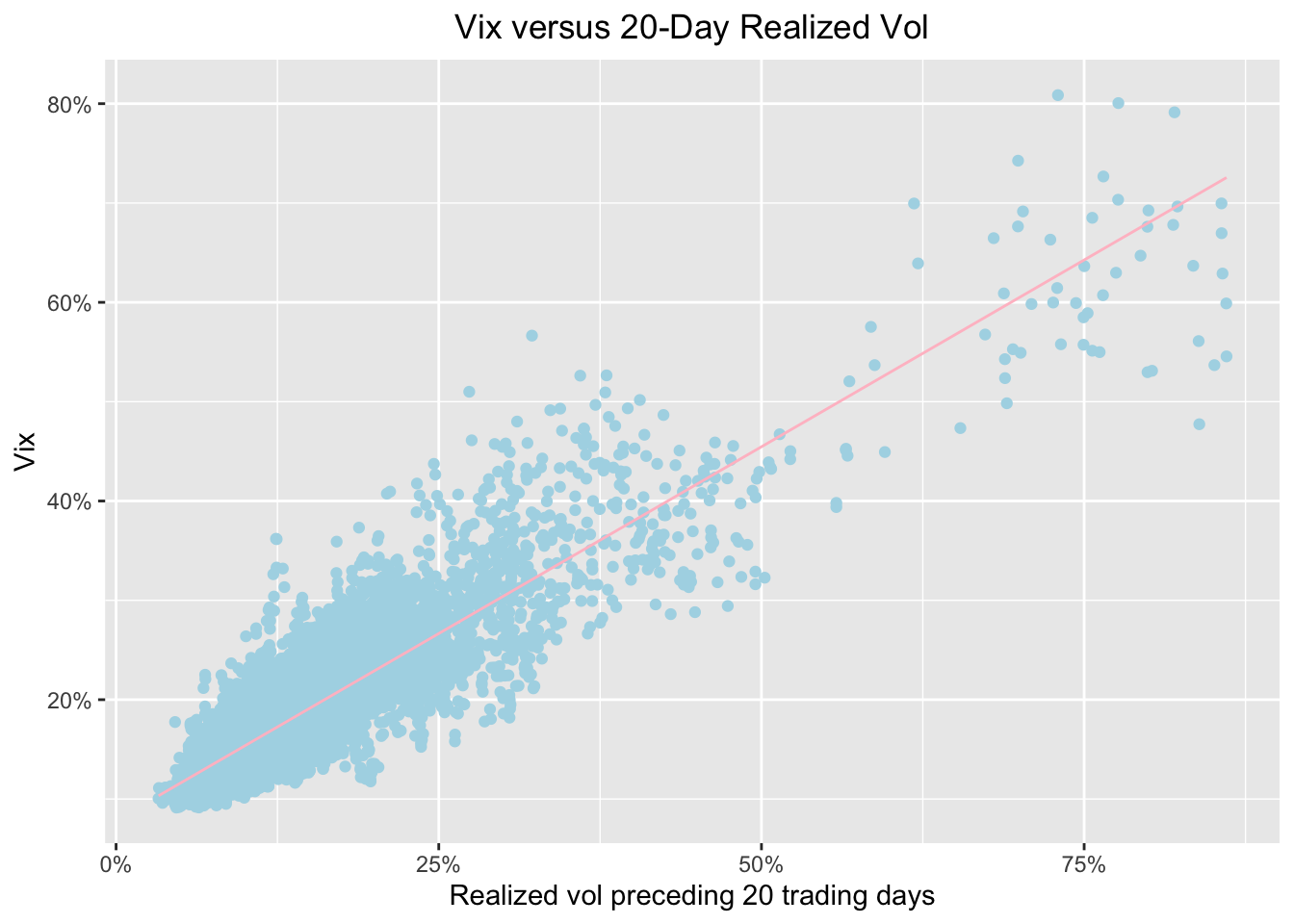
Same as before, we see a strong relationship between preceding volatility and the VIX. Now let’s see how that relationship has look over the last three months, from May 2019 to today. We do that by adding
filter(date >= S).
sp500_vix_rolling_vol %>%
  group_by(date) %>%
  filter(date >= Sys.Date() - months(3)) %>%
  ggplot(aes(x = sp500_roll_20_annualized, y = vix)) +
  geom_point(color = "cornflowerblue") +
  geom_smooth(method='lm', se = FALSE, color = "pink", size = .5) +
  ggtitle("Vix versus 20-Day Realized Vol") +
  xlab("Realized vol preceding 20 trading days") +
  ylab("Vix") +
  # Add a '%' sign to the axes without having to rescale.
  scale_y_continuous(labels = function(x){ paste0(x, "%") }) +
  scale_x_continuous(labels = function(x){ paste0(x, "%") }, breaks = scales::pretty_breaks(n=10)) +
  theme(plot.title = element_text(hjust = 0.5))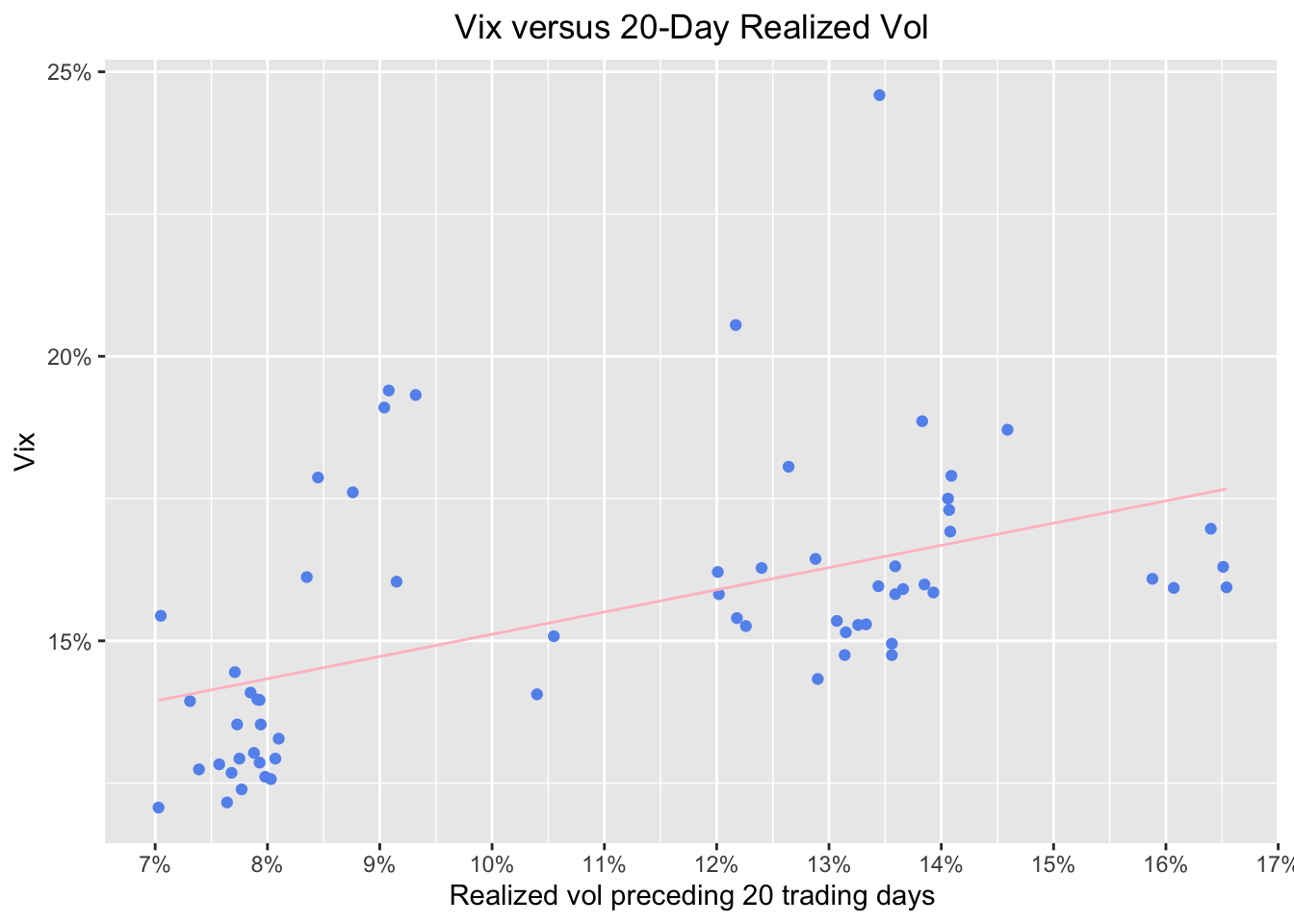
Hmmm, this is kind of interesting. We can see that realised trailing volatility has a couple of loose clusters around 7.5% and 13.5%. Let’s see if those are all around the same dates. We do that with ggplot(aes(x = sp500_roll_20_annualized, y = vix, color = date)).
sp500_vix_rolling_vol %>%
  group_by(date) %>%
  filter(date >= Sys.Date() - months(3)) %>%
  ggplot(aes(x = sp500_roll_20_annualized, y = vix, color = date)) +
  geom_point() +
  geom_smooth(method='lm', se = FALSE, color = "pink", size = .5) +
  ggtitle("Vix versus 20-Day Realized Vol shaded by date ") +
  xlab("Realized vol preceding 20 trading days") +
  ylab("Vix") +
  # Add a '%' sign to the axes without having to rescale.
  scale_y_continuous(labels = function(x){ paste0(x, "%") }) +
  scale_x_continuous(labels = function(x){ paste0(x, "%") }) +
  theme(plot.title = element_text(hjust = 0.5))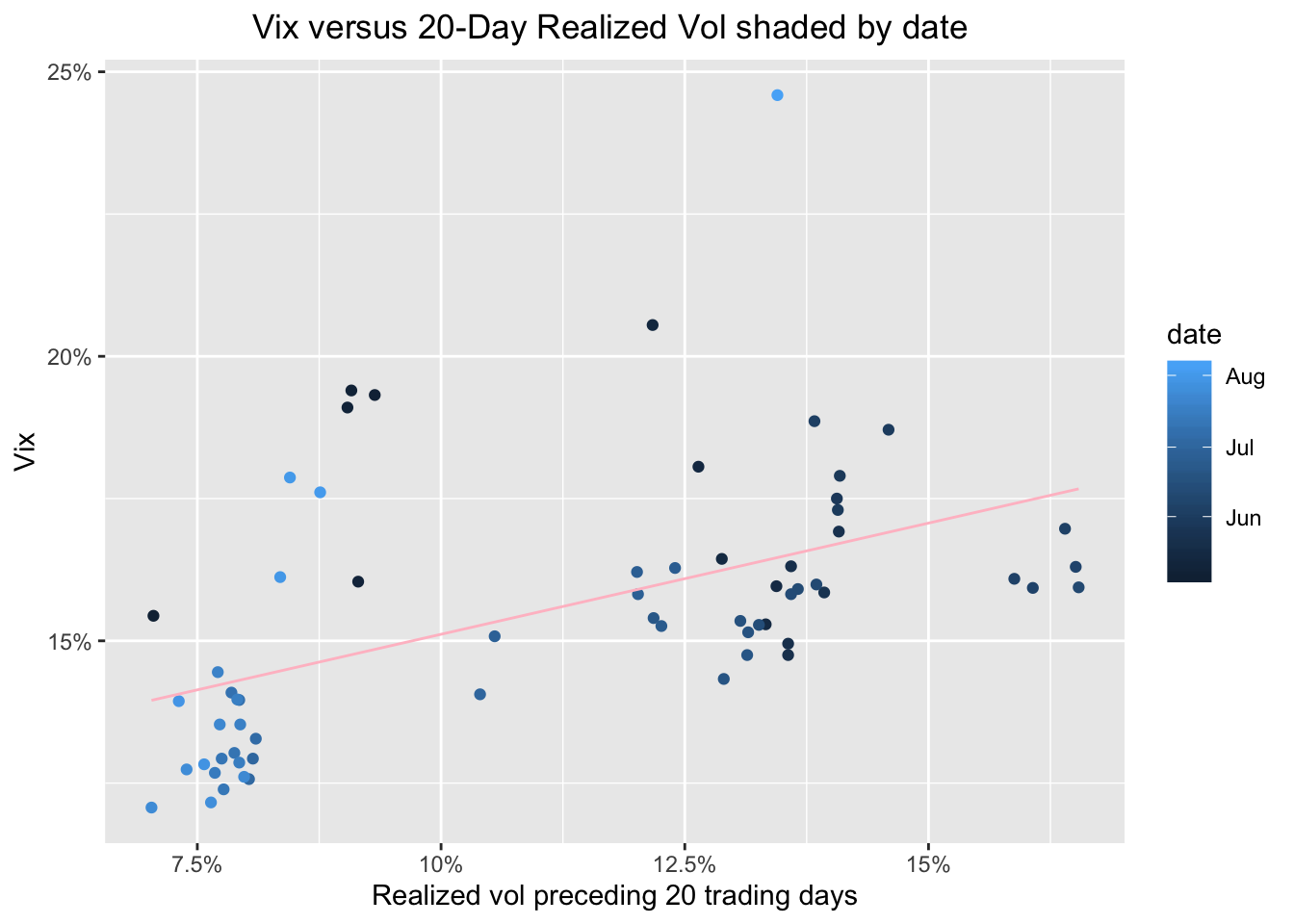
Very interesting - the darker circles are June and into July. They tend to be showing higher preceding vol and a higher VIX. Late July and into early August had been a time of relative calm. Until this week, I s’pose.
Let’s look at one more chart to put this week in perspective (of course, I’m writing this on Tuesday, try re-running this on Friday and see the results). We will look at our data since 2009 and shade the points by date. This should contextualize last week.
sp500_vix_rolling_vol %>%
  group_by(date) %>%
  filter(date > "2009-12-31") %>%
  ggplot(aes(x = sp500_roll_20_annualized, y = vix, color = date)) +
  geom_point() +
  geom_smooth(method='lm', se = FALSE, color = "pink", size = .5) +
  ggtitle("Vix versus 20-Day Realized Vol shaded by date:  ") +
  xlab("Realized vol preceding 20 trading days") +
  ylab("Vix") +
  scale_y_continuous(labels = function(x){ paste0(x, "%") }) +
  scale_x_continuous(labels = function(x){ paste0(x, "%") }) +
  theme(plot.title = element_text(hjust = 0.5))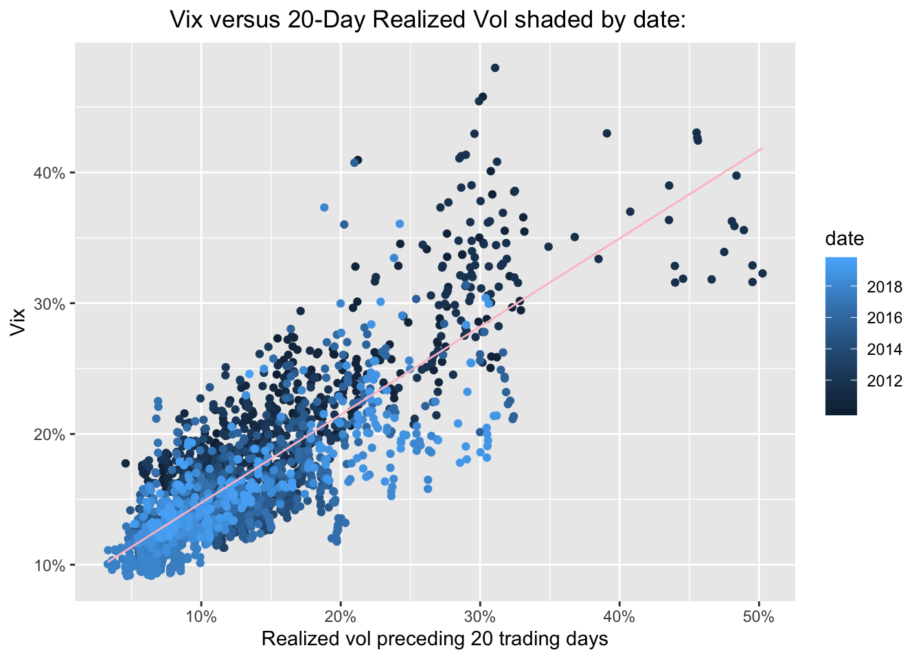
Ok, the light blue dots, those from 2018 and 2019 are still quite clustered at the low VIX low realized vol part of the chart, though some are indeed beginning to explore riskier territory. Our most extreme readings are darker blue - they are from 2011-2013. If we wish to isolate just one year - say, 2019 - we can do so with filter(date >= "2018-12-31" & date < Sys.Date() - days(7)). That will give us all of 2019, except for the last 10 days. We can rerun this every week.
sp500_vix_rolling_vol %>%
group_by(date) %>%
filter(date >= "2018-12-31" & date < Sys.Date() - days(10)) %>%
ggplot(aes(x = sp500_roll_20_annualized, y = vix, color = date)) +
geom_point() +
geom_smooth(method='lm', se = FALSE, color = "pink", size = .5) +
ggtitle("Vix versus 20-Day Realized Vol: 2012") +
xlab("Realized vol preceding 20 trading days") +
ylab("Vix") +
# Add a '%' sign to the axes without having to rescale.
scale_y_continuous(labels = function(x){ paste0(x, "%") }) +
scale_x_continuous(labels = function(x){ paste0(x, "%") }) +
theme(plot.title = element_text(hjust = 0.5))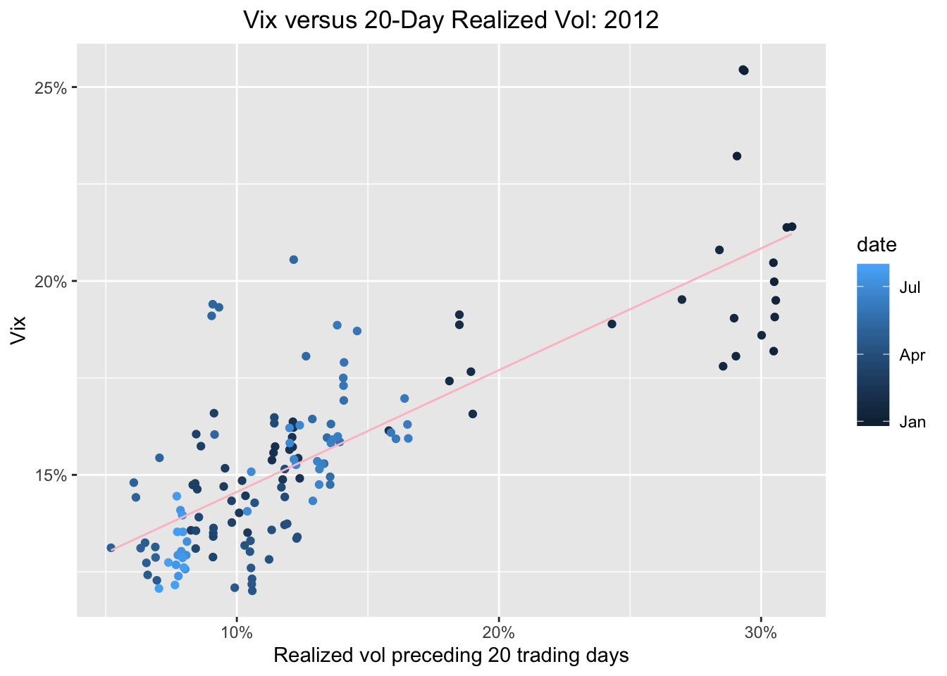 Whoa, all the highest reading are shaded dark blue, meaning they occurred at the beginning of the year. Let’s do the opposite and plot just the last 10 days.
sp500_vix_rolling_vol %>%
  group_by(date) %>%
  filter(date >= Sys.Date() - days(10)) %>%
  ggplot(aes(x = sp500_roll_20_annualized, y = vix, color = date)) +
  geom_point() +
  geom_smooth(method='lm', se = FALSE, color = "pink", size = .5) +
  ggtitle("Vix versus 20-Day Realized Vol: 2012") +
  xlab("Realized vol preceding 20 trading days") +
  ylab("Vix") +
  # Add a '%' sign to the axes without having to rescale.
  scale_y_continuous(labels = function(x){ paste0(x, "%") }) +
  scale_x_continuous(labels = function(x){ paste0(x, "%")}, breaks = scales::pretty_breaks(n = 10)) +
  theme(plot.title = element_text(hjust = 0.5))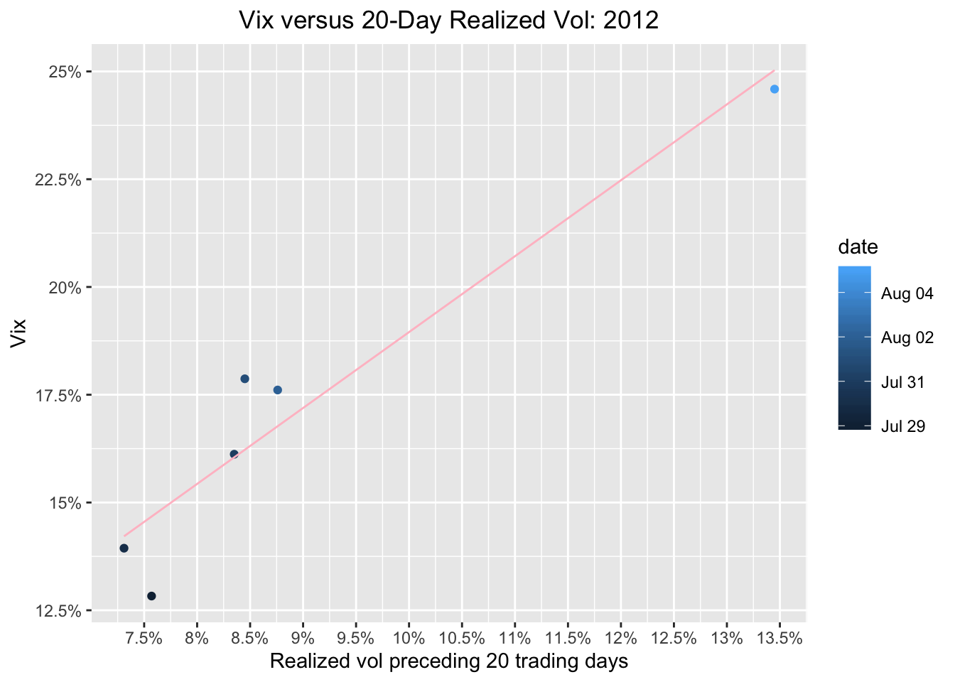
Whoa, check out that lightest blue dot, yesterday’s reading!
Now let’s chart this entire year, and give the most recent 10 days a special color, say, crimson red.
sp500_vix_rolling_vol %>%
  group_by(date) %>%
  filter(date >= "2018-12-31") %>%
  mutate(date_color = case_when(date < Sys.Date() - days(10) ~ "cornflowerblue",
                                TRUE ~ "darkred")) %>%
  ggplot(aes(x = sp500_roll_20_annualized, y = vix, color = date_color)) +
  geom_point() +
  geom_smooth(method = 'lm', se = FALSE, color = "pink", size = .5) +
  ggtitle(paste("Vix versus 20-Day Realized Vol", year(Sys.Date()), sep = " ")) +
  geom_text_repel(aes(label = ifelse(date == max(date), as.character(date), ''))) +
  xlab("Realized vol preceding 20 trading days") +
  ylab("Vix") +
  # Add a '%' sign to the axes without having to rescale.
  scale_y_continuous(labels = function(x){ paste0(x, "%") }) +
  scale_x_continuous(labels = function(x){ paste0(x, "%") }, breaks = scales::pretty_breaks(n = 10)) +
  theme(plot.title = element_text(hjust = 0.5)) +
  scale_colour_identity()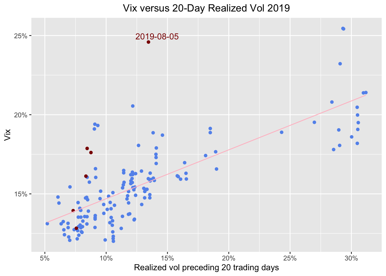
Finally, let’s make this interactive with a call to plotly.
ggplotly(
sp500_vix_rolling_vol %>%
  group_by(date) %>%
  filter(date >= "2018-12-31") %>%
  mutate(date_color = case_when(date < Sys.Date() - days(10) ~ "cornflowerblue",
                                TRUE ~ "darkred")) %>%
  ggplot(aes(x = sp500_roll_20_annualized, y = vix, color = date_color)) +
  geom_point() +
  geom_smooth(method = 'lm', se = FALSE, color = "pink", size = .5) +
  ggtitle(paste("Vix versus 20-Day Realized Vol", year(Sys.Date()), sep = " ")) +
  geom_text(aes(label = ifelse(date == max(date), as.character(date), '')), nudge_y = .2) +
  xlab("Realized vol preceding 20 trading days") +
  ylab("Vix") +
  # Add a '%' sign to the axes without having to rescale.
  scale_y_continuous(labels = function(x){ paste0(x, "%") }) +
  scale_x_continuous(labels = function(x){ paste0(x, "%") }) +
  theme(plot.title = element_text(hjust = 0.5)) +
  scale_colour_identity()
)
The legend is showing the names of the colors and the tooltip is as well and that’s not exactly what we want.
ggplotly(
sp500_vix_rolling_vol %>%
  group_by(date) %>%
  filter(date >= "2018-12-31") %>%
  mutate(period = case_when(date < Sys.Date() - days(10) ~ "rest_of_year",
                                TRUE ~ "past_10_days"),
         info = paste(date,
                  '<br>vix:', vix,
                  '<br>sp500_roll_20_annualized:', sp500_roll_20_annualized)) %>%
  ggplot(aes(x = sp500_roll_20_annualized,
             y = vix,
             color = period,
             label_tooltip = info)) +
  geom_point() +
  #geom_smooth(method = 'lm', se = FALSE, color = "pink", size = .5) +
  ggtitle(paste("Vix versus 20-Day Realized Vol", year(Sys.Date()), sep = " ")) +
  geom_text(aes(label = ifelse(date == max(date), as.character(date), '')), nudge_y = .29) +
  xlab("Realized vol preceding 20 trading days") +
  ylab("Vix") +
  # Add a '%' sign to the axes without having to rescale.
  scale_y_continuous(labels = function(x){ paste0(x, "%") }) +
  scale_x_continuous(labels = function(x){ paste0(x, "%") }) +
  theme(plot.title = element_text(hjust = 0.5)) +
  scale_color_manual(values = c("darkred",
                                "cornflowerblue" ),
                     labels = c("past 10 days",
                                "rest of year")),
tooltip = "label_tooltip"
)
And for completeness let’s run a quick model on prededing volatility and the VIX.
  sp500_vix_rolling_vol %>%
  do(model_20 = lm(vix ~ sp500_roll_20_annualized, data = .)) %>%
  tidy(model_20)
# A tibble: 2 x 5
term estimate std.error statistic p.value
<chr> <dbl> <dbl> <dbl> <dbl>
1 (Intercept) 7.85 0.0824 95.3 0
2 sp500_roll_20_annualized 0.752 0.00468 161. 0sp500_vix_rolling_vol %>%
do(model_20 = lm(vix ~ sp500_roll_20_annualized, data = .)) %>%
glance(model_20) %>%
select(r.squared)# A tibble: 1 x 1
r.squared
<dbl>
1 0.777We can see a coefficient of .76 and an R-squared of .76, which is the ~same as we observed back in July 2017, and consistent with the original AQR research that got us started.
That’s all for today - thanks for reading!
If you like this sort of code through check out my book, Reproducible Finance with R.
Not specific to finance but several of the stringr and ggplot tricks in this post came from this awesome Business Science University course.
I’m also going to be posting weekly code snippets on linkedin, connect with me there if you’re keen for some R finance stuff.