In a previous post, we explored the dividend history of stocks included in the SP500. Today we’ll extend that anlaysis to cover the Nasdaq because, well, because in the previous post I said I would do that. We’ll also explore a different source for dividend data, do some string cleaning and check out ways to customize a tooltip in plotly. Bonus feature: we’ll get into some animation too. We have a lot to cover, so let’s get to it.
We need to load up our packages for the day.
library(tidyverse)
library(tidyquant)
library(janitor)
library(plotly)
First we need all the companies listed on the Nasdaq. Not so long ago, it wasn’t easy to import that information into R. Now we can use tq_exchange("NASDAQ") from the tidyquant package.
nasdaq <-
  tq_exchange("NASDAQ")

nasdaq %>%
  head()
# A tibble: 6 x 7
symbol company last.sale.price market.cap ipo.year sector industry
<chr> <chr> <dbl> <chr> <dbl> <chr> <chr>
1 YI 111, Inc. 2.69 $219.66M 2018 Health… Medical/N…
2 PIH 1347 Prope… 4.85 $29.16M 2014 Finance Property-…
3 PIHPP 1347 Prope… 25.7 $17.96M NA Finance Property-…
4 TURN 180 Degree… 2.09 $65.04M NA Finance Finance/I…
5 FLWS 1-800 FLOW… 15.3 $983.42M 1999 Consum… Other Spe…
6 BCOW 1895 Banco… 9.33 $45.5M 2019 Finance Banks Notice how the market.cap column is of type character? Let’s coerce it to a dbl with as.numeric and while we’re at it, let’s remove the periods in all the column numes with clean_names from the janitor package.
nasdaq %>%
  clean_names() %>%
  mutate(market_cap = as.numeric(market_cap)) %>%
  select(symbol, market_cap) %>%
  head()
# A tibble: 6 x 2
symbol market_cap
<chr> <dbl>
1 YI NA
2 PIH NA
3 PIHPP NA
4 TURN NA
5 FLWS NA
6 BCOW NANot exactly what we had in mind. The presence of those M, B and $ characters are causing as.numeric() to coerce the column to NAs. If we want to do any sorting by market cap, we’ll need to clean that up and it’s a great chance to explore some stringr. Let’s start with str_remove_all and remove those non-numeric characters. The call is market_cap %>% str_remove_all("\\$|M|B"), and then an arrange(desc(market_cap)) so that the largest cap company is first.
nasdaq %>%
  clean_names() %>%
  mutate(market_cap = market_cap %>% str_remove_all("\\$|M|B") %>% as.numeric()) %>%
  arrange(desc(market_cap)) %>%
  head()
# A tibble: 6 x 7
symbol company last_sale_price market_cap ipo_year sector industry
<chr> <chr> <dbl> <dbl> <dbl> <chr> <chr>
1 CIVBP Civista B… 66 667920 NA Finance Major Banks
2 ASRVP AmeriServ… 29.6 621600 NA Finance Major Banks
3 ESGRP Enstar Gr… 26.6 425920 NA Finance Property-C…
4 AGNCN AGNC Inve… 26.0 337870 NA Consum… Real Estat…
5 SBFGP SB Financ… 15.8 237221. NA Finance Major Banks
6 ESGRO Enstar Gr… 26.4 115984 NA Finance Property-C…Well, that wasn’t too bad!
Wait, that looks weird, where’s AMZN and MSFT shouldn’t they be at the top of the market cap? Look closely at market_cap and notice it’s been coerced to a numeric value as we intended but we didn’t account for the fact that those M and B letters were abbreviating values and standing place for a whole bunch of zeroes. The first symbol above, CIVBP, didn’t have an M or B because it’s market cap is low, so it didn’t have any zeroes lopped off of it.
We need a way to remove the M and the B account for those zeroes that got removed. Here’s how I chose to tackle this.
Find all the cells that do not have an
Mor aB, remove the$sign, convert to numeric and divide by 1000. We do that withif_else(str_detect(market_cap, "M|B", negate = TRUE), str_remove_all(market_cap, "\\$") %>% as.numeric() %>%/(1000).Find all the cells that have a
B, remove theBand the$sign, convert to numeric and multiply by 1000. We do that withif_else(str_detect(market_cap, "B"), str_remove_all(market_cap, "\\$|B") %>% as.numeric() %>%*(1000).Find all the cells that have an
M, remove theMand the$sign, convert to numeric and don’t multiply or divide. We do that withstr_remove_all(market_cap, "\\$|M") %>% as.numeric())).
Here’s the full call:
nasdaq %>%
  clean_names() %>%
  mutate(market_cap =
          if_else(str_detect(market_cap, "M|B", negate = TRUE),
                  str_remove_all(market_cap, "\\$") %>% as.numeric() %>% `/`(1000),
          if_else(str_detect(market_cap, "B"),
                  str_remove_all(market_cap, "\\$|B") %>% as.numeric() %>% `*`(1000),
          str_remove_all(market_cap, "\\$|M") %>% as.numeric()))) %>%
  arrange(desc(market_cap))
# A tibble: 3,547 x 7
symbol company last_sale_price market_cap ipo_year sector industry
<chr> <chr> <dbl> <dbl> <dbl> <chr> <chr>
1 MSFT Microsof… 133. 1018490 1986 Techno… Computer S…
2 AAPL Apple In… 203. 915770 1980 Techno… Computer M…
3 AMZN Amazon.c… 1750. 865460 1997 Consum… Catalog/Sp…
4 GOOGL Alphabet… 1154. 799890 NA Techno… Computer S…
5 GOOG Alphabet… 1151. 798300 2004 Techno… Computer S…
6 FB Facebook… 178. 507110 2012 Techno… Computer S…
7 CSCO Cisco Sy… 46.6 199520 1990 Techno… Computer C…
8 INTC Intel Co… 45.0 199170 NA Techno… Semiconduc…
9 CMCSA Comcast … 42.4 192840 NA Consum… Television…
10 PEP Pepsico,… 130. 182140 NA Consum… Beverages …
# … with 3,537 more rowsThat finally looks how we were expecting, the top five by market cap are MSFT, AMZN, GOOG, FB and CSCO. Let’s save that as an object called nasdaq_wrangled.
nasdaq_wrangled <-
  nasdaq %>%
  clean_names() %>%
  mutate(market_cap =
          if_else(str_detect(market_cap, "M|B", negate = TRUE),
                  str_remove_all(market_cap, "\\$") %>% as.numeric() %>% `/`(1000),
          if_else(str_detect(market_cap, "B"),
                  str_remove_all(market_cap, "\\$|B") %>% as.numeric() %>% `*`(1000),
          str_remove_all(market_cap, "\\$|M") %>% as.numeric()))) %>%
  arrange(desc(market_cap))
Now let’s dig in to the dividends paid by these NASDAQ-listed companies that have IPO’d in the last ten years. It’s a bit anticlimactic because most haven’t paid any dividends but here we go. First, let’s pull just the tickers for companies that IPO’d after 2007, by setting filter(ipo_year > 2007).
nasdaq_tickers <-
nasdaq_wrangled %>%
  filter(ipo_year > 2007) %>%
  pull(symbol)

nasdaq_tickers %>%
  head()
[1] "FB" "AVGO" "JD" "TSLA" "PDD" "TEAM"We will import the dividend data using tq_get(source = 'dividends'), which is a wrapper for quantmod::getDividends() and sources dividend data from Yahoo! Finance.
We are passing 1120 symbols to this function but only those that pay a dividend will come back to us. It takes a while to run this because we still have to check on all 1120.
nasdaq_dividends <-
nasdaq_tickers %>%
  tq_get(get = 'dividends') %>%
  select(-value)
After a huge data import task like that, I like to use slice(1) to grab the first observation from each group, which in this case will be each symbol. We can count the number symbols for which we have a dividend and it’s 130.
nasdaq_dividends %>%
 group_by(symbol) %>%
  slice(1) %>%
  glimpse()
Observations: 128
Variables: 3
Groups: symbol [128]
$ symbol <chr> "AGNC", "AMAL", "ATAI", "AVGO", "AY", "BKEP", "BLMN", …
$ date <date> 2009-03-31, 2018-11-15, 2011-06-28, 2010-12-13, 2014-…
$ dividends <dbl> 0.850, 0.060, 0.430, 0.070, 0.037, 0.110, 0.060, 0.003…We could also get a sense for how these first dividend payments cluster into years by using count(year). Note we need to ungroup() first.
nasdaq_dividends %>%
 group_by(symbol) %>%
  slice(1) %>%
  mutate(year = year(date)) %>%
  ungroup() %>%
  count(year)
# A tibble: 11 x 2
year n
<dbl> <int>
1 2009 3
2 2010 8
3 2011 6
4 2012 8
5 2013 14
6 2014 12
7 2015 14
8 2016 12
9 2017 11
10 2018 28
11 2019 12And a chart will help to communicate these yearly frequencies.
nasdaq_dividends %>%
 group_by(symbol) %>%
  slice(1) %>%
  mutate(year = year(date)) %>%
  ungroup() %>%
  count(year) %>%
  ggplot(aes(year, n)) +
  geom_col(fill = "cornflowerblue", width = .5) +
  scale_x_continuous(breaks = 2008:2019) +
  scale_y_continuous(breaks = scales::pretty_breaks(n = 15)) +
  labs(y = "number of first dividends by year", x = "")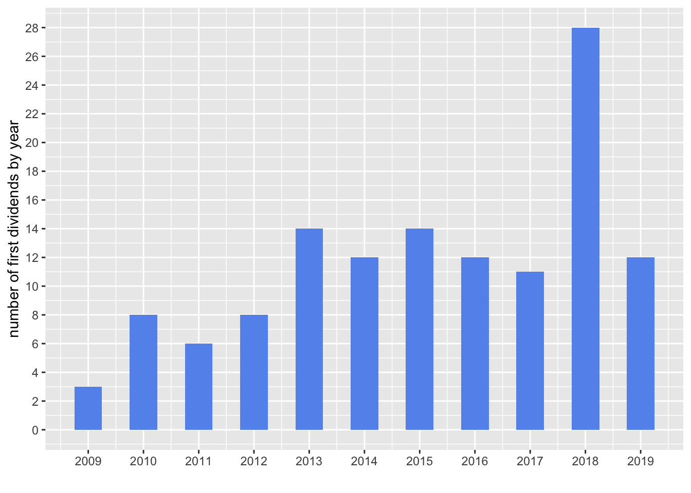
Hmmm, interesting. I expected the numbers to steadily increase year by year as companies became more mature and cash flow positive but that is not the pattern we see in that plot
Now let’s create a quick chart of the last dividend paid by each of these 130 companies, using slice(n()). This time we’ll plot a dot with geom_point().
nasdaq_dividends %>%
  group_by(symbol) %>%
  slice(n()) %>%
  mutate(year = year(date)) %>%
  ggplot(aes(x = year, y = dividends, color = symbol)) +
  geom_point() +
  scale_y_continuous(labels = scales::dollar)  +
  scale_x_continuous(breaks = 2008:2019) +
  labs(x = "", y = "div/share", title = "Nasdaq dividends") +
  theme(legend.position = "none",
plot.title = element_text(hjust = 0.5)) 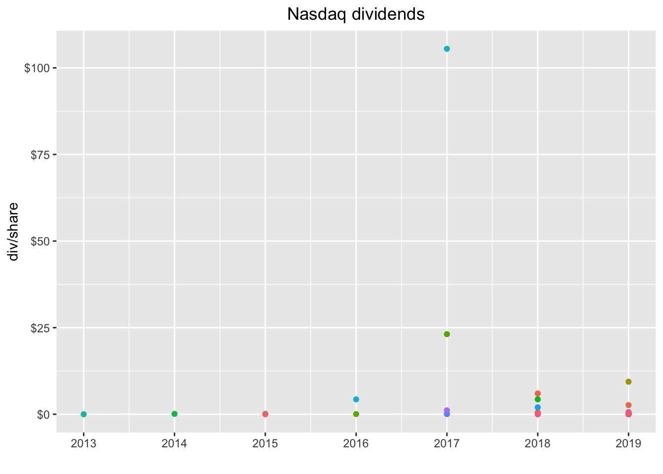
Not quite as useful as a lof of the dots are right on top of eachother. We do see a couple of massive outliers. Let’s add the label for each symbol with geom_label(aes(label = symbol)).
nasdaq_dividends %>%
  group_by(symbol) %>%
  slice(n()) %>%
  ggplot(aes(x = date, y = dividends, color = symbol)) +
  geom_point() +
  geom_label(aes(label = symbol)) +
  scale_y_continuous(labels = scales::dollar)  +
  scale_x_date(breaks = scales::pretty_breaks(n = 10)) +
  labs(x = "", y = "div/share", title = "Nasdaq dividends") +
  theme(legend.position = "none",
plot.title = element_text(hjust = 0.5)) 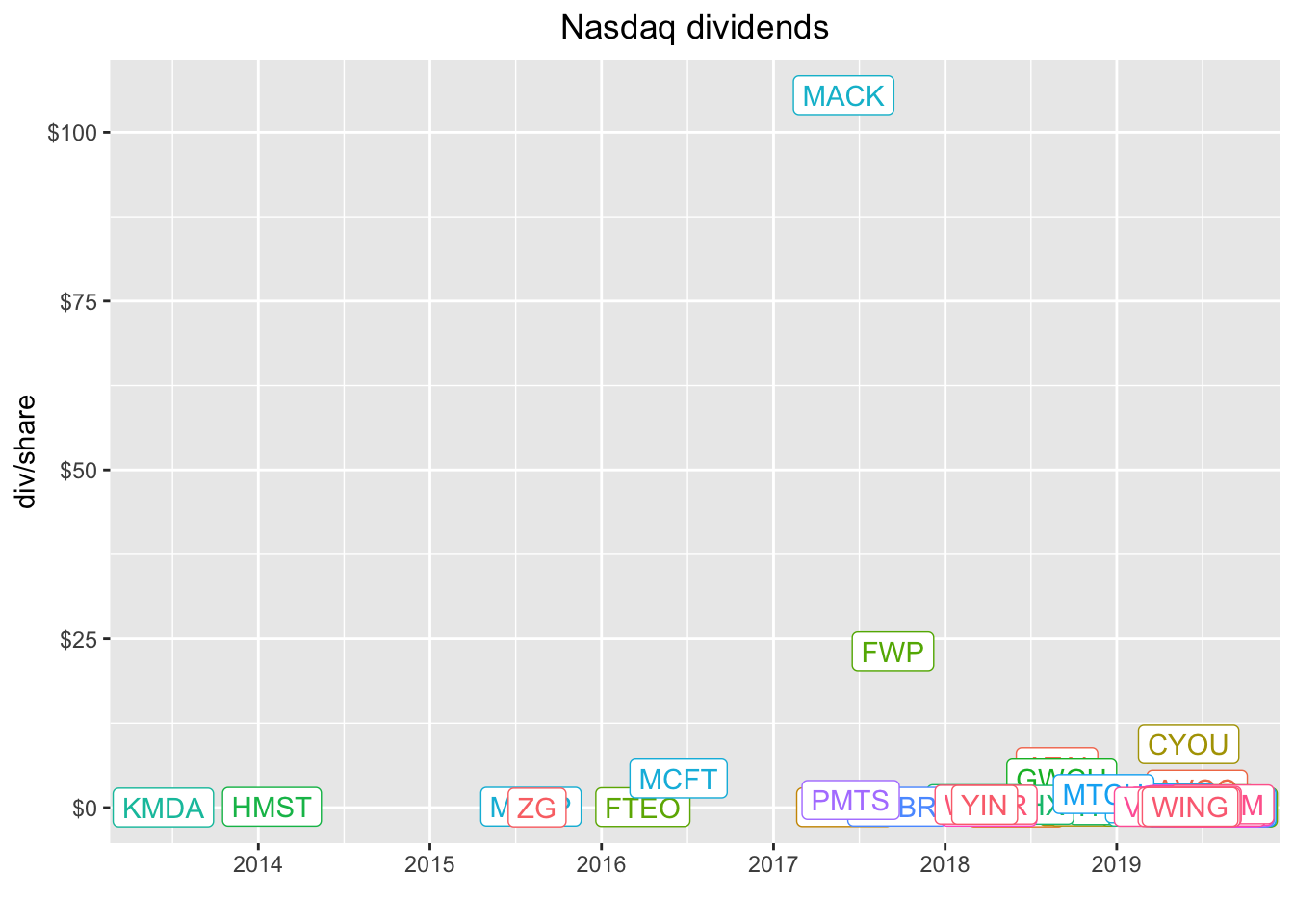
MACK and FWP paid some huge dividends. Let’s investigate.
nasdaq_dividends %>%
  filter(symbol == "MACK" | symbol == "FWP")
# A tibble: 2 x 3
symbol date dividends
<chr> <date> <dbl>
1 MACK 2017-05-30 106.
2 FWP 2017-09-12 23.1These were most likely special dividends of some sort and that might be worth investigating but it’s not our project today so let’s filter those two out of the data and then recreate the plot. Let’s remove the geom_label so we see just the dots again, this time by date instead of year.
nasdaq_dividends %>%
  filter(symbol != "MACK" & symbol != "FWP") %>%
  group_by(symbol) %>%
  slice(n()) %>%
  ggplot(aes(x = date, y = dividends, color = symbol)) +
  geom_point() +
 # geom_label(aes(label = symbol)) +
  scale_y_continuous(labels = scales::dollar)  +
  scale_x_date(breaks = scales::pretty_breaks(n = 10)) +
  labs(x = "", y = "div/share", title = "Nasdaq dividends") +
  theme(legend.position = "none",
plot.title = element_text(hjust = 0.5)) 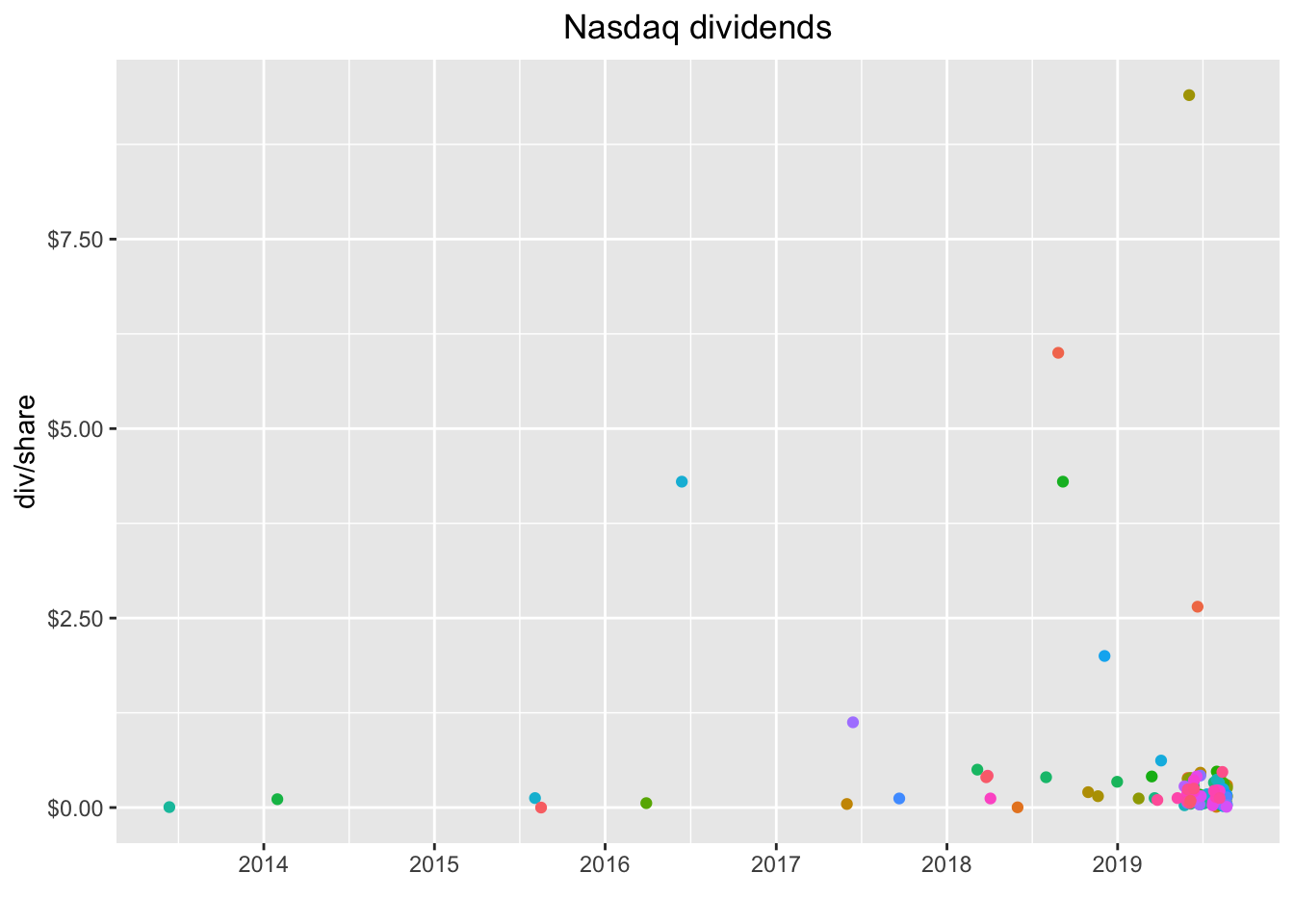
That’s a snapshot of the last dividend paid by each company and we can see the clustering a bit better. Quite a few companies paid their last dividend before 2019, which might indicate it’s not a regular dividend. Let’s check out the entire history of each compan by removing slice(n()).
nasdaq_dividends %>%
  filter(symbol != "MACK" & symbol != "FWP") %>%
  group_by(symbol) %>%
  ggplot(aes(x = date, y = dividends, color = symbol)) +
  geom_point() +
 # geom_label(aes(label = symbol)) +
  scale_y_continuous(labels = scales::dollar)  +
  scale_x_date(breaks = scales::pretty_breaks(n = 10)) +
  labs(x = "", y = "div/share", title = "Nasdaq dividends") +
  theme(legend.position = "none",
plot.title = element_text(hjust = 0.5)) 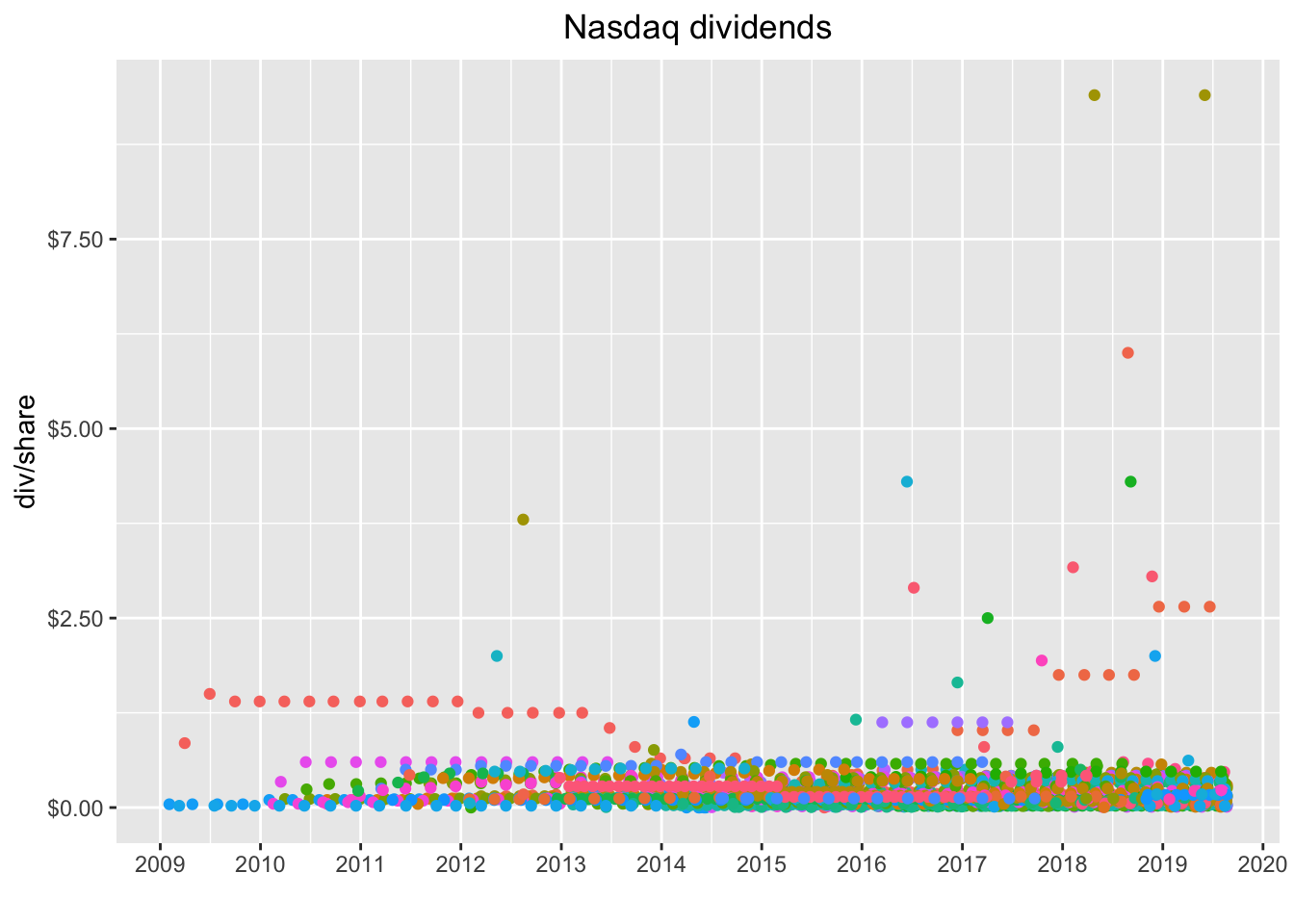
If you’re like me, you’re just itching to hover on, say, that reddish dot between $5 and $7 and see which company it is, maybe even click the dot and isolate it. Good news, we can wrap that chart in a call to ggplotly() and get part of that functionality out of the box. We will need to add the legend back to the plot by removing legend.position = "none".
library(plotly)

ggplotly(
  nasdaq_dividends %>%
  filter(symbol != "MACK" & symbol != "FWP") %>%
  group_by(symbol) %>%
  ggplot(aes(x = date, y = dividends, color = symbol)) +
  geom_point() +
  scale_y_continuous(labels = scales::dollar)  +
  scale_x_date(breaks = scales::pretty_breaks(n = 10)) +
  labs(x = "", y = "div/share", title = "Nasdaq dividends") +
  theme(plot.title = element_text(hjust = 0.5))
)
Hover on that orange-red dot between $5 and $7 and notice it’s the symbol ATAI. If you double click on ATAI in the legend, it will isolate just those dots on the chart. And we can see that this was probably a special dividend.
Now, tt might be nice to have the name of the company and the sector displayed when we mouse hover, instead of just the symbol. Let’s add back the name and sector data by left_join()ing our wrangled data object.
nasdaq_dividends %>%
  left_join(nasdaq_wrangled, by = "symbol") %>%
  head()
# A tibble: 6 x 9
symbol date dividends company last_sale_price market_cap ipo_year
<chr> <date> <dbl> <chr> <dbl> <dbl> <dbl>
1 AVGO 2010-12-13 0.07 Broadc… 272. 108330 2009
2 AVGO 2011-03-16 0.08 Broadc… 272. 108330 2009
3 AVGO 2011-06-15 0.09 Broadc… 272. 108330 2009
4 AVGO 2011-09-15 0.11 Broadc… 272. 108330 2009
5 AVGO 2011-12-15 0.12 Broadc… 272. 108330 2009
6 AVGO 2012-03-15 0.13 Broadc… 272. 108330 2009
# … with 2 more variables: sector <chr>, industry <chr>Once the company name data is joined, we can incorporate into the plot by adding label_tooltip = company to ggplot(aes(...)) and then setting tooltip = "label_tooltip", to alert plotly about the new tooltip data.
ggplotly(
nasdaq_dividends %>%
  filter(symbol != "MACK" & symbol != "FWP") %>%
  left_join(nasdaq_wrangled, by = "symbol") %>%
  group_by(symbol) %>%
  ggplot(aes(x = date, y = dividends, color = symbol, label_tooltip = company)) +
  geom_point() +
  scale_y_continuous(labels = scales::dollar)  +
  scale_x_date(breaks = scales::pretty_breaks(n = 10)) +
  labs(x = "", y = "div/share", title = "Nasdaq dividends") +
  theme(plot.title = element_text(hjust = 0.5)),
tooltip = "label_tooltip"
)
Alright, we have the company name, but we lost the symbol so we won’t know quite where to click on the legend. I think we’d like both the symbol and the company name in tooltip. That means we need to store that informtation somewhere, and might as well add the sector at the same time. Note that we could add any data we want here.
We will use mutate to create a new column that holds our label information. I want to display the date, company and symbol on different lines, so will include line breaks with <br>.
ggplotly(
nasdaq_dividends %>%
  filter(symbol != "MACK" & symbol != "FWP") %>%
  left_join(nasdaq_wrangled, by = "symbol") %>%
  group_by(symbol) %>%
  mutate(info = paste(date,
                  '<br>company:', company,
                  '<br>symbol:', symbol,
                  '<br>div: $', dividends)) %>%
  ggplot(aes(x = date,
             y = dividends,
             color = symbol,
             label_tooltip = info)) +
  geom_point() +
  scale_y_continuous(labels = scales::dollar)  +
  scale_x_date(breaks = scales::pretty_breaks(n = 10)) +
  labs(x = "", y = "div/share", title = "Nasdaq dividends") +
  theme(plot.title = element_text(hjust = 0.5)),
tooltip = "label_tooltip"
)
Note how we can quickly add other information, like the sector, by adding the column sector to the paste string. Indeed, we can paste any column data into that string. There might be a better way to customize the tooltip in plotly - and suggestions most definitely welcome! - but I find this to be a pretty darn good way to add data from our columns.
ggplotly(
nasdaq_dividends %>%
  filter(symbol != "MACK" & symbol != "FWP") %>%
  left_join(nasdaq_wrangled, by = "symbol") %>%
  group_by(symbol) %>%
  mutate(info = paste(date,
                  '<br>company:', company,
                  '<br>sector:', sector,
                  '<br>symbol:', symbol,
                  '<br>div: $', dividends)) %>%
  ggplot(aes(x = date,
             y = dividends,
             color = symbol,
             label_tooltip = info)) +
  geom_point() +
  scale_y_continuous(labels = scales::dollar)  +
  scale_x_date(breaks = scales::pretty_breaks(n = 10)) +
  labs(x = "", y = "div/share", title = "Nasdaq dividends") +
  theme(plot.title = element_text(hjust = 0.5)),
tooltip = "label_tooltip"
)
That was supposed to do it for today, but the July 27th edition of Barron’s has an article called 8 Tech Stocks That Yield Steady Payouts (subscription required as of this writing unfortunately) so my procrastination reading turned into more work for today. Let’s dig into that piece just a bit (If you do peruse that issue, I also recommend the interview with Jeff Montier as well, as he offers an interesting viewpoint on modern monetary theory) Back to the dividend project, the article breaks out 8 tech stock with interesting dividends and mentions QCOM as another stock to watch Let’s create a vector to hold those symbols and then pass to tq_get(get = "dividends").
barrons_tickers <-
  c("IBM", "HPQ", "TXN", "CSCO", "INTC", "ORCL", "AAPL", "MSFT", "QCOM")


barrons_dividends <-
barrons_tickers %>%
  tq_get(get = "dividends")
The article highlights these tech stocks as being attractive primarily because of their dividend history, which is impressive given that they are technology stocks. We can re-use our code above to quickly visualize their dividend histories.
ggplotly(
barrons_dividends %>%
  left_join(nasdaq_wrangled, by = "symbol") %>%
  group_by(symbol) %>%
  mutate(info = paste(date,
                  '<br>company:', company,
                  '<br>sector:', sector,
                  '<br>symbol:', symbol,
                  '<br>div: $', dividends)) %>%
  ggplot(aes(x = date,
             y = dividends,
             color = symbol,
             label_tooltip = info)) +
  geom_point() +
  scale_y_continuous(labels = scales::dollar)  +
  scale_x_date(breaks = scales::pretty_breaks(n = 10)) +
  labs(x = "", y = "div/share", title = "Nasdaq dividends") +
  theme(plot.title = element_text(hjust = 0.5)),
tooltip = "label_tooltip"
)
With just a handful of stocks, our visualization really tells a nice story. We can more clearly see the four annual payments by each company and it pops off the chart that IBM has been raising it’s dividend consistently. Not bad for a company that also owns Red Hat.
Let’s compare the dividend yields for each of these tickers. We’ll grab yesterday’s closing price by calling
tq_get(get = "stock.prices", from = (Sys.Date() - 1)).
barrons_price <-
barrons_tickers %>%
  tq_get(get = "stock.prices", from = ("2019-08-21"))
Now let’s calculate the yearly dividend for each ticker.
We’ll take the most recent quarterly dividend with slice(n()) and multiply by 4 to get an annual estimate.
barrons_dividends %>%
  group_by(symbol) %>%
  slice(n()) %>%
  mutate(total_div = dividends * 4) %>%
  left_join(barrons_price, by = "symbol") %>%
  select(symbol, total_div, close) %>%
  mutate(yield = total_div/close)
# A tibble: 27 x 4
# Groups: symbol [9]
symbol total_div close yield
<chr> <dbl> <dbl> <dbl>
1 AAPL 3.08 213. 0.0145
2 AAPL 3.08 212. 0.0145
3 AAPL 3.08 203. 0.0152
4 CSCO 1.4 48.8 0.0287
5 CSCO 1.4 48.2 0.0291
6 CSCO 1.4 46.6 0.0300
7 HPQ 0.64 19.0 0.0338
8 HPQ 0.64 18.9 0.0338
9 HPQ 0.64 17.8 0.0359
10 IBM 6.48 134. 0.0483
# … with 17 more rowsNext we use left_join() to add our most recent closing price.
barrons_dividends %>%
  group_by(symbol) %>%
  slice(n()) %>%
  mutate(total_div = dividends * 4) %>%
  left_join(barrons_price, by = "symbol")
# A tibble: 27 x 11
# Groups: symbol [9]
symbol date.x dividends total_div date.y open high low close
<chr> <date> <dbl> <dbl> <date> <dbl> <dbl> <dbl> <dbl>
1 AAPL 2019-08-09 0.77 3.08 2019-08-21 213. 214. 212. 213.
2 AAPL 2019-08-09 0.77 3.08 2019-08-22 213. 214. 211. 212.
3 AAPL 2019-08-09 0.77 3.08 2019-08-23 209. 212. 201 203.
4 CSCO 2019-07-03 0.35 1.4 2019-08-21 48.5 48.9 48.4 48.8
5 CSCO 2019-07-03 0.35 1.4 2019-08-22 49.2 49.3 47.9 48.2
6 CSCO 2019-07-03 0.35 1.4 2019-08-23 47.9 48.5 46.4 46.6
7 HPQ 2019-06-11 0.16 0.64 2019-08-21 19.2 19.2 18.9 19.0
8 HPQ 2019-06-11 0.16 0.64 2019-08-22 19.0 19.1 18.8 18.9
9 HPQ 2019-06-11 0.16 0.64 2019-08-23 17.3 18.2 17.1 17.8
10 IBM 2019-08-08 1.62 6.48 2019-08-21 135. 136. 134. 134.
# … with 17 more rows, and 2 more variables: volume <dbl>, adjusted <dbl>And calculate the yield with mutate(yield = total_div/close).
barrons_dividends %>%
  group_by(symbol) %>%
  slice(n()) %>%
  mutate(total_div = dividends * 4) %>%
  left_join(barrons_price, by = "symbol") %>%
  select(symbol, total_div, close) %>%
  mutate(yield = total_div/close)
# A tibble: 27 x 4
# Groups: symbol [9]
symbol total_div close yield
<chr> <dbl> <dbl> <dbl>
1 AAPL 3.08 213. 0.0145
2 AAPL 3.08 212. 0.0145
3 AAPL 3.08 203. 0.0152
4 CSCO 1.4 48.8 0.0287
5 CSCO 1.4 48.2 0.0291
6 CSCO 1.4 46.6 0.0300
7 HPQ 0.64 19.0 0.0338
8 HPQ 0.64 18.9 0.0338
9 HPQ 0.64 17.8 0.0359
10 IBM 6.48 134. 0.0483
# … with 17 more rowsLet’s plot the stocks to show their dividend yields as bar heights.
barrons_dividends %>%
  group_by(symbol) %>%
  slice(n()) %>%
  mutate(total_div = dividends * 4) %>%
  left_join(barrons_price, by = "symbol") %>%
  select(symbol, total_div, close) %>%
  mutate(yield = total_div/close) %>%
  ggplot(aes(x = reorder(symbol, yield), y = yield, fill = symbol)) +
  geom_col(width = .5) +
  labs(x = "") +
  scale_y_continuous(labels = scales::percent)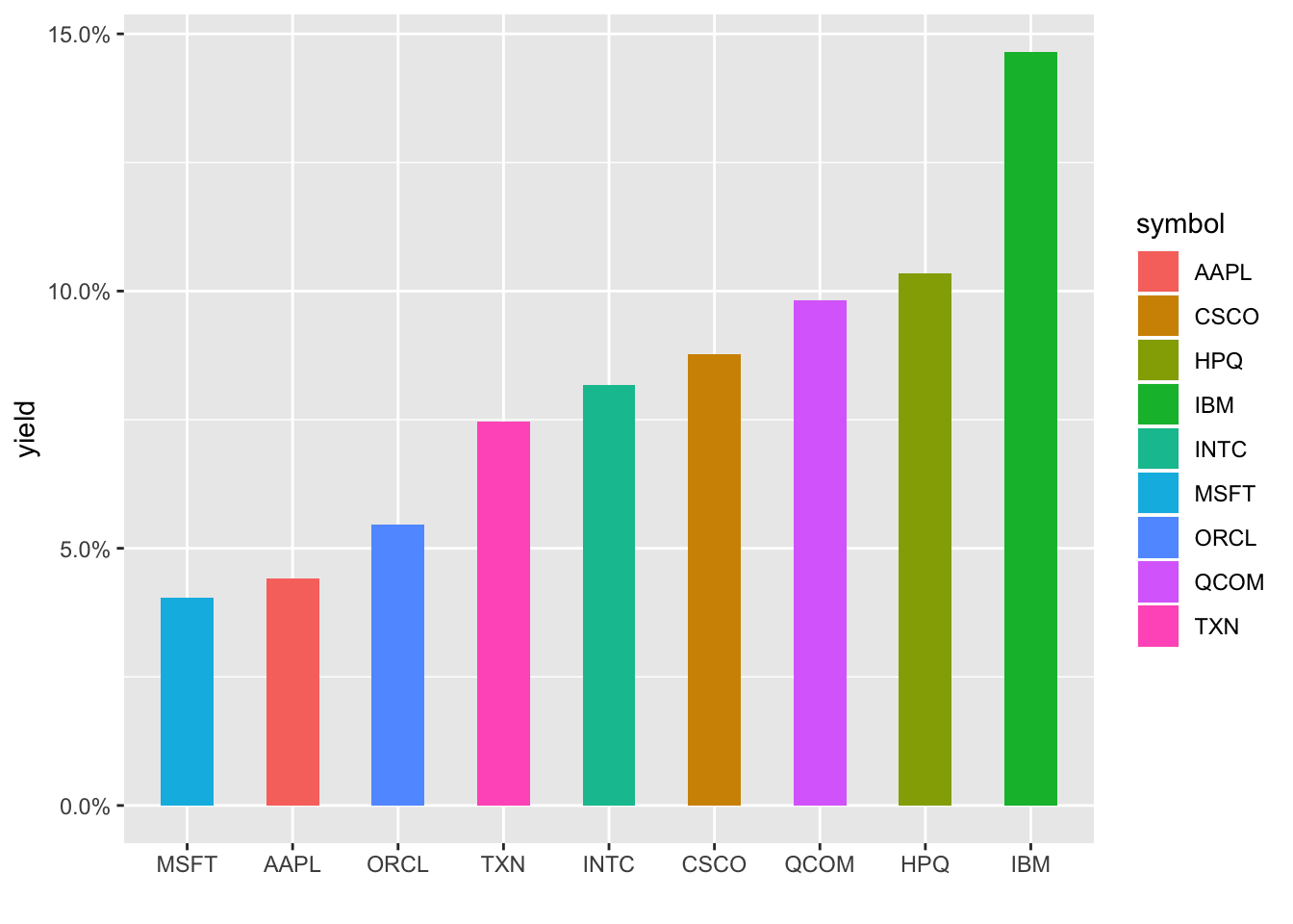
We could wrap this up with a call to plotly but let’s totally change directions and add some animation to our last two charts. Animate a chart? That sounds really hard, I guess we’ll need to loop through the dates and add dots as we go, that sounds like a lot of work…and….boom…gganimate to the rescue!
gganimate package makes this so painless - we just add transition_reveal(date) to the end of the code flow and that’s it! Well, not quite, on my machine, I needed to load the gifski and png packages before any of this works, but then we’re good to go.
library(gganimate)
library(gifski)
library(png)

barrons_dividends %>%
  left_join(nasdaq_wrangled, by = "symbol") %>%
  group_by(symbol) %>%
  ggplot(aes(x = date,
             y = dividends,
             color = symbol)) +
  geom_point() +
  scale_y_continuous(labels = scales::dollar)  +
  scale_x_date(breaks = scales::pretty_breaks(n = 10)) +
  labs(x = "", y = "div/share", title = "Nasdaq dividends") +
  theme(plot.title = element_text(hjust = 0.5)) +
  transition_reveal(date)
Nice!
What about animating our chart that shows just the dividend yield of the 8 tech stocks from Barron’s? Well, we can’t reveal by date here, so we use transition_states(symbol).
barrons_dividends %>%
  group_by(symbol) %>%
  slice(n()) %>%
  mutate(total_div = dividends * 4) %>%
  left_join(barrons_price, by = "symbol") %>%
  select(symbol, total_div, close) %>%
  mutate(yield = total_div/close) %>%
  ggplot(aes(x = reorder(symbol, yield), y = yield, fill = symbol)) +
  geom_col(width = .5) +
  labs(x = "") +
  scale_y_continuous(labels = scales::percent) +
  transition_states(symbol)
Ah, notice it doesn’t respect the reorder in our aes(). Let’s try with an arrange() first, and each column disappears as the next one appears. Let’s use shadow_mark() to keep the previous shapes.
barrons_dividends %>%
  group_by(symbol) %>%
  slice(n()) %>%
  mutate(total_div = dividends * 4) %>%
  left_join(barrons_price, by = "symbol") %>%
  select(symbol, total_div, close) %>%
  mutate(yield = total_div/close) %>%
  arrange(yield) %>%
  ggplot(aes(x = reorder(symbol, yield), y = yield, fill = symbol)) +
  geom_col(width = .5) +
  labs(x = "") +
  scale_y_continuous(labels = scales::percent) +
  transition_states(symbol, wrap = FALSE) +
  shadow_mark()
Hmmm, still not respecting the new order, it’s defaulting to alphabetical. I’m not a huge fan of this typically but let’s create a new column that is symbol converted to a factor and reordered by yield. We have to ungroup() first since symbol is our grouping column and then can call symbol_fct = forcats::as_factor(symbol) %>% fct_reorder(yield).
barrons_dividends %>%
  group_by(symbol) %>%
  slice(n()) %>%
  mutate(total_div = dividends * 4) %>%
  left_join(barrons_price, by = "symbol") %>%
  select(symbol, total_div, close) %>%
  mutate(yield = total_div/close) %>%
  ungroup() %>%
  mutate(symbol_fct = forcats::as_factor(symbol) %>% fct_reorder(yield)) %>%
  ggplot(aes(x = symbol_fct, y = yield, fill = symbol_fct)) +
  geom_col(width = .5) +
  labs(x = "") +
  scale_y_continuous(labels = scales::percent) +
  transition_states(symbol_fct, wrap = FALSE) +
  shadow_mark()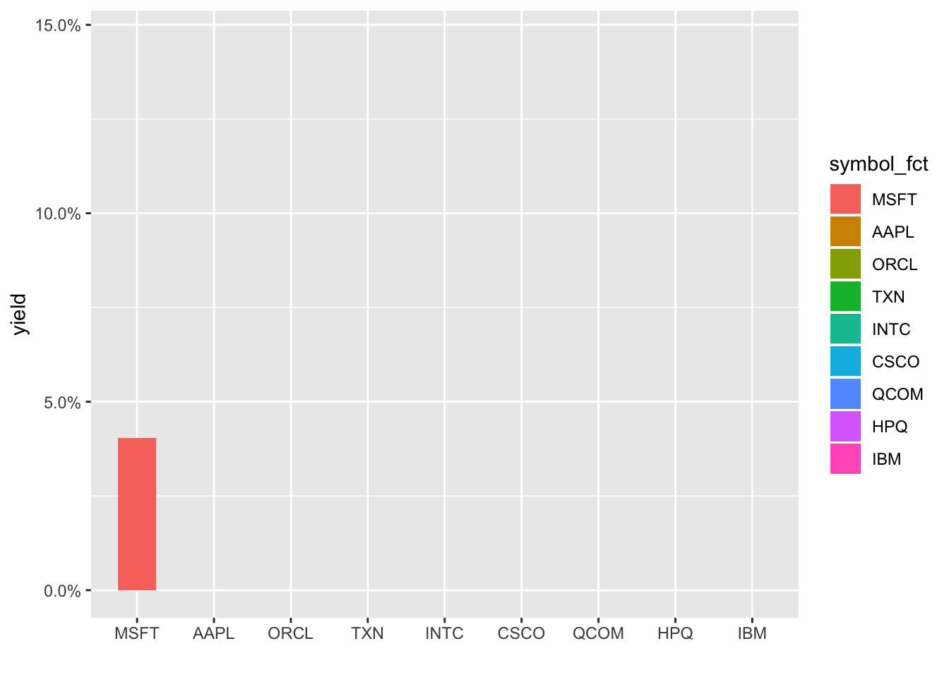
Note that creating those animated gifs take some, about 10-15 seconds each on my RStudio Server Pro instance. And it’s totally fair to quibble that these animations haven’t added any new substance to the charts, they just look cool (R plots can be cool, right?). But if you’ve read this far (thanks!), I might as well subject you to my rant about visualization and communication being just as if not more important than analytical or statistical findings. Most of the consumers of our work are really busy and we’re lucky if they spend 2 minutes glancing at our work. We don’t have long to grab their attention and communicate our message. If an animation helps us, it’s worth spending the extra time on it, even though we were actually ‘done’ with this job many lines of code ago.
Alright, with that:
If you like this sort of code through check out my book, Reproducible Finance with R.
Not specific to finance but several of the stringr and ggplot tricks in this post came from this awesome Business Science University course.
I’m also going to be posting weekly code snippets on linkedin, connect with me there if you’re keen for some R finance stuff.
Thanks for reading and see you next time!