In a series of previous posts, we explored IPOs and IPO returns by sector and year since 2004, then examined the returns of portfolios constructed by investing in IPOs each year, and, thirdly, added a benchmark so that we can compare our IPO portfolios to something besides themselves. Today, we will delve into return attribution to visualize how individual equities have contributed to our IPO portfolios over time.
I won’t review the code again but in those previous posts we covered how to import the prices and calculate the returns for companies that have IPO’d since 2003. We built portfolios out of those companies on a year-by-year basis but we won’t do that today (not yet). Instead we’ll work with this object of individual returns, that has a column for ticker, date, monthly returns and IPO year.
ipo_ticker_returns_updated %>%
  tail()
# A tibble: 6 x 4
ticker date monthly_returns ipo.year
<chr> <dttm> <dbl> <dbl>
1 ZYME 2019-08-30 00:00:00 0.166 2017
2 ZYME 2019-09-30 00:00:00 -0.0691 2017
3 ZYME 2019-10-31 00:00:00 0.392 2017
4 ZYME 2019-11-29 00:00:00 0.262 2017
5 ZYME 2019-12-31 00:00:00 0.0429 2017
6 ZYME 2020-01-31 00:00:00 -0.0297 2017Our task for today is to consider portfolios formed on an annual basis, with an equal weighting to each IPO that occurred that year, and how each individual company has contributed to the returns of that portfolio. This is a specific instantiation of the general topic of returns attribution. We could do this for an ETF by pulling in monthly weights at different time periods but for today we will stick with our portfolio and equal weighting.
Let’s start with our 2014 portfolio. Here are the 248 tickers that IPO’d in 2014.
ipo_ticker_returns_updated %>%
  filter(ipo.year == "2014") %>%
  select(-ipo.year) %>%
  distinct(ticker)
# A tibble: 248 x 1
ticker
<chr>
1 PIH
2 TWOU
3 ABIL
4 ADMS
5 ADVM
6 AFMD
7 AGRX
8 AGFS
9 AGFSW
10 AKBA
# … with 238 more rowsWe have our tickers, our monthly end points and our monthly returns.
To calculate the yearly contributions of each asset to this portfolio we will use the Return.Portfolio() function from Performance Analytics. To do that, we first need to convert our tibble to an xts object. That used to require some gymnastics, but now we can use the tk_xts() function from the timetk package.
We do need to tell the function the name of the column that holds our date index and do so with date_var = date. Note that xts objects do not play well in tidy format, in fact, I don’t think it’s possible to coerce a tidy object like our returns into an xts because it would involve duplicative date indexes. We need to pivot_wider before calling tk_xts().
This is probably a good time to mention that if you’re interested in R for finance/portfolio analytics, it’s worth branching out from the tidyverse to learn about xts and the performanceAnalytics package (quantmod and portfolioAnalytics too!). Shameless plug alert: I cover this extensively in my book, Reproducible Finance with R.
The conversion from tibble to xts can be done with the tk_xts() function from the timetk package. xts likes data in wide format so after the conversion we will pivot_wider() the data.
ipo_port_return_2014_xts <-
ipo_ticker_returns_updated %>%
  select(ticker, date, monthly_returns, ipo.year) %>%
  filter(ipo.year == "2014") %>%
  select(-ipo.year) %>%
  pivot_wider(names_from = "ticker", values_from = "monthly_returns") %>%
  tk_xts(date_var = date)

ipo_port_return_2014_xts %>%
  .[, 1:3] %>%
  tail()
PIH TWOU ABIL
2019-08-30 -0.037623762 0.39687500 -0.153846154
2019-09-30 -0.092592593 -0.08948546 -0.136363636
2019-10-31 0.058049887 0.10104423 -0.280701754
2019-11-29 -0.005572225 0.39135286 -0.070487805
2019-12-31 0.189655172 -0.03809142 -0.161637366
2020-01-31 0.039257246 -0.09253856 0.001564945Now we turn to the Return.portfolio() function. As the name implies, that function will calculate portfolio returns if we pass in the returns of the portfolio constituents. We need to pass in an xts object of returns and a vector of weights if we need one. Since our portfolio is equally balanced, we don’t need to specify a weights vector (we’ll cover that in a follow up post on ETFs). We can also set the rebalance argument to “quarters”.
Return.portfolio(ipo_port_return_2014_xts, rebalance_on = "quarters") %>%
  tail()
portfolio.returns
2019-08-30 -0.048338385
2019-09-30 0.003236286
2019-10-31 -0.001855049
2019-11-29 0.049248147
2019-12-31 0.049846370
2020-01-31 0.084286789That returned monthly portfolio returns but it can do so much more! If we set the verbose argument to TRUE, the function returns tons of useful information.
ipo_port_return_2014_contribution_obj <-
 Return.portfolio(ipo_port_return_2014_xts, verbose = TRUE)
What emerged from that function? A list of 6 xts objects.
ipo_port_return_2014_contribution_obj %>%
  names()
[1] "returns" "contribution" "BOP.Weight" "EOP.Weight"
[5] "BOP.Value" "EOP.Value" The first object is the portfolio returns. Since we passed in monthly returns for each of our tickers, we have gotten back the monthly returns for our portfolio. If this sounds familiar from our call to tq_portfolio() last time, that’s because tq_portfolio() is wrapping the Return.portfolio() function.
The second object is what we are mainly interested today - it is the contribution to portfolio returns for each asset on a monthly basis.
ipo_port_return_2014_contribution_obj$contribution %>%
  .[, 1:3] %>%
  tail()
PIH TWOU ABIL
2019-08-30 -6.428574e-05 0.0011395692 -3.711553e-05
2019-09-30 -1.585351e-04 -0.0003737222 -2.898470e-05
2019-10-31 9.280172e-05 0.0003953647 -5.302118e-05
2019-11-29 -9.384100e-06 0.0016786605 -9.535215e-06
2019-12-31 2.975559e-04 -0.0002129734 -1.904057e-05
2020-01-31 7.264001e-05 -0.0004933849 1.532147e-07Perhaps we’re curious how a certain ticker’s contribution has varied over time? Let’s take TWOU which we access with ipo_port_return_2014_contribution_obj$contribution$TWOU.
library(highcharter)
  highchart(type = "stock") %>%
  hc_title(text = "Contribution over time") %>%
  hc_add_series(ipo_port_return_2014_contribution_obj$contribution$TWOU, name = "TWOU", color = "cornflowerblue")
Next we might want to know how each of our tickers contributed to portfolio return on year-by-year basis. Here is where we tip our cap to the package authors who have included a function called to.period.contributions where we can specify an argument period = years and pass in our object ipo_port_return_2014_contribution_obj$contribution. This will extract the yearly contribution to portfolio returns for each of our tickers.
to.period.contributions(ipo_port_return_2014_contribution_obj$contribution, period = "years") %>%
  .[, 1:3] %>%
  head()
PIH TWOU ABIL
2014-12-31 -5.302085e-04 0.0017753752 0.0000000000
2015-12-31 -9.194306e-05 0.0024151211 0.0000000000
2016-12-30 6.406482e-05 0.0006144747 -0.0027837566
2017-12-29 -2.169925e-04 0.0089861186 -0.0008401801
2018-12-31 -1.099151e-03 -0.0033369718 0.0004541870
2019-12-31 6.234249e-04 -0.0070900383 -0.0006004830Notice how the last column also returns the total portfolio returns for each year.
I want to use ggplot for a few visualizations and that means we need to convert from xts back to a tibble. We do that with tk_tbl(preserve_index = T, rename_index = "date") and then make the data tidy with pivot_longer(-date, names_to = "ticker", values_to = "contribution").
ipo_port_return_2014_contribution <-
to.period.contributions(ipo_port_return_2014_contribution_obj$contribution, period = "years") %>%
  tk_tbl(preserve_index = T, rename_index = "date") %>%
  pivot_longer(-date, names_to = "ticker", values_to = "contribution") %>%
  left_join(company_ipo_sector %>% select(symbol, sector), by = c("ticker" =  "symbol")) %>%
  arrange(date, contribution) %>%
  mutate(sector = case_when(is.na(sector) ~ "Portfolio Return",
                            TRUE ~ sector),
         year = year(date))

ipo_port_return_2014_contribution %>%
  head()
# A tibble: 6 x 5
date ticker contribution sector year
<dttm> <chr> <dbl> <chr> <dbl>
1 2014-12-31 00:00:00 SINT -0.00358 Health Care 2014
2 2014-12-31 00:00:00 CVEO -0.00330 Consumer Services 2014
3 2014-12-31 00:00:00 MR -0.00290 Energy 2014
4 2014-12-31 00:00:00 CRCM -0.00287 Consumer Services 2014
5 2014-12-31 00:00:00 ATEN -0.00286 Technology 2014
6 2014-12-31 00:00:00 MGEN -0.00258 Health Care 2014To take a quick pause and review what we’ve done and what we’ve got now:
- We started with the monthly returns of our tickers that IPO’d in 2014.
- We converted those returns to a wide
xtsobjects. - We passed the
xtsobject toReturn.portfolio(...., verbose = TRUE). - That returned a list of 6 objects, one of which was called
contribution. - We passed that
contributionobject toto.period.contributions(..., period = "years")and got the yearly contribution for each ticker. - We converted those yearly contributions to a tidy tibble.
We have the contribution of 248 equities and we have sector labels for each equity, let’s try some visualization. Here’s a chart that let’s choose a year with filter(year == ....) and then plots each of the 248 equities as point, grouped by sector on the x-axis, with the height of each point equal to the equity’s contribution to portfolio return.
(
ipo_port_return_2014_contribution %>%
  filter(!str_detect(sector, 'Cash|Portfolio') & year == "2015") %>%
  mutate(sector = str_wrap(sector, width = 10)) %>%
  ggplot(aes(x = sector, y = contribution, color = ticker, text = paste(ticker, ": ", round(contribution * 100, 3), "%", sep = ""))) +
  geom_point(show.legend = FALSE, alpha = .5) +
  labs(x = "", y = "", title = "Contribution to Port Return by Sector") +
  scale_y_continuous(labels = scales::percent) +
  theme(axis.text.x = element_text(angle = 60, vjust = .77),
        plot.title = element_text(hjust = .5))
) %>%
  ggplotly(tooltip = "text")
I like that chart, it gives a nice feel for the dispersion and the number of equities in the health care sector. Have a look at TACOW in the consumer services sector - it contributed almost 3% in 2015. Rememember, these portfolios are constructed based on the IPO market. There is no consideration given to making them balanced.
Speaking of sectors, let’s see how each sector has contributed to the total return of this portfolio.
ipo_port_return_2014_contribution %>%
  group_by(sector) %>%
  summarise(total_contr = sum(contribution)) %>%
  arrange(desc(total_contr))
# A tibble: 13 x 2
sector total_contr
<chr> <dbl>
1 Portfolio Return 0.412
2 Technology 0.239
3 Finance 0.0552
4 Miscellaneous 0.0250
5 Consumer Services 0.0246
6 Capital Goods 0.0195
7 Basic Industries 0.0171
8 Public Utilities 0.0141
9 Consumer Non-Durables 0.00840
10 Health Care -0.000655
11 Transportation -0.00263
12 Consumer Durables -0.00316
13 Energy -0.0218 Tech and finance have been the main drivers - let’s chart this info for ease of viewing.
(
  ipo_port_return_2014_contribution %>%
    group_by(sector) %>%
    filter(!str_detect(sector, 'Cash')) %>%
  summarise(total_contr = sum(contribution)) %>%
  arrange(total_contr) %>%
    mutate(sector = str_wrap(sector, width = 13)) %>%
    ggplot(aes(x = reorder(sector, total_contr), y = total_contr, fill = sector, text = paste("sector: ", sector, "<br> contribution: ", round(total_contr, 4) * 100, "%" , sep = ""))) +
    geom_col(width = .5) +
    theme(axis.text.x = element_text(angle = 60, hjust = 1),
          plot.title = element_text(hjust = .5)) +
    labs(x = "", y = "", title = "Contributions to IPO Portfolios by sector") +
    scale_y_continuous(labels = scales::percent_format(), breaks = scales::pretty_breaks(n = 10))
) %>%
  ggplotly(tooltip = "text")
We could generate that same chart for each year to see how different sectors have driven portfolio returns in different years. But why would we do that when we can animate it!
library(gganimate)
library(gifski)
library(png)
ipo_port_return_2014_contribution %>%
    group_by(year, sector) %>%
    filter(!str_detect(sector, 'Cash|Portfolio')) %>%
  summarise(total_contr = sum(contribution)) %>%
  arrange(total_contr) %>%
    mutate(sector = str_wrap(sector, width = 13)) %>%
    ggplot(aes(x = reorder(sector, total_contr), y = total_contr, fill = sector, text = paste("sector: ", sector, "<br> contribution: ", round(total_contr, 4) * 100, "%" , sep = ""))) +
    geom_col(width = .5) +
  geom_label(data = . %>% group_by(year) %>% filter(total_contr == max(total_contr) | total_contr == min(total_contr)), aes(label = sector), show.legend = F) +
    theme(axis.text.x = element_text(angle = 60, hjust = 1),
          plot.title = element_text(hjust = .5)) +
    labs(title = 'Contributions by Sector for {closest_state}', x = "", y =  "") +
    scale_y_continuous(labels = scales::percent_format(), breaks = scales::pretty_breaks(n = 10))  +
  scale_x_discrete(expand = c(.1, .1)) +
  transition_states(year) +
  ease_aes('linear')  +
  enter_fade()+
  exit_fade()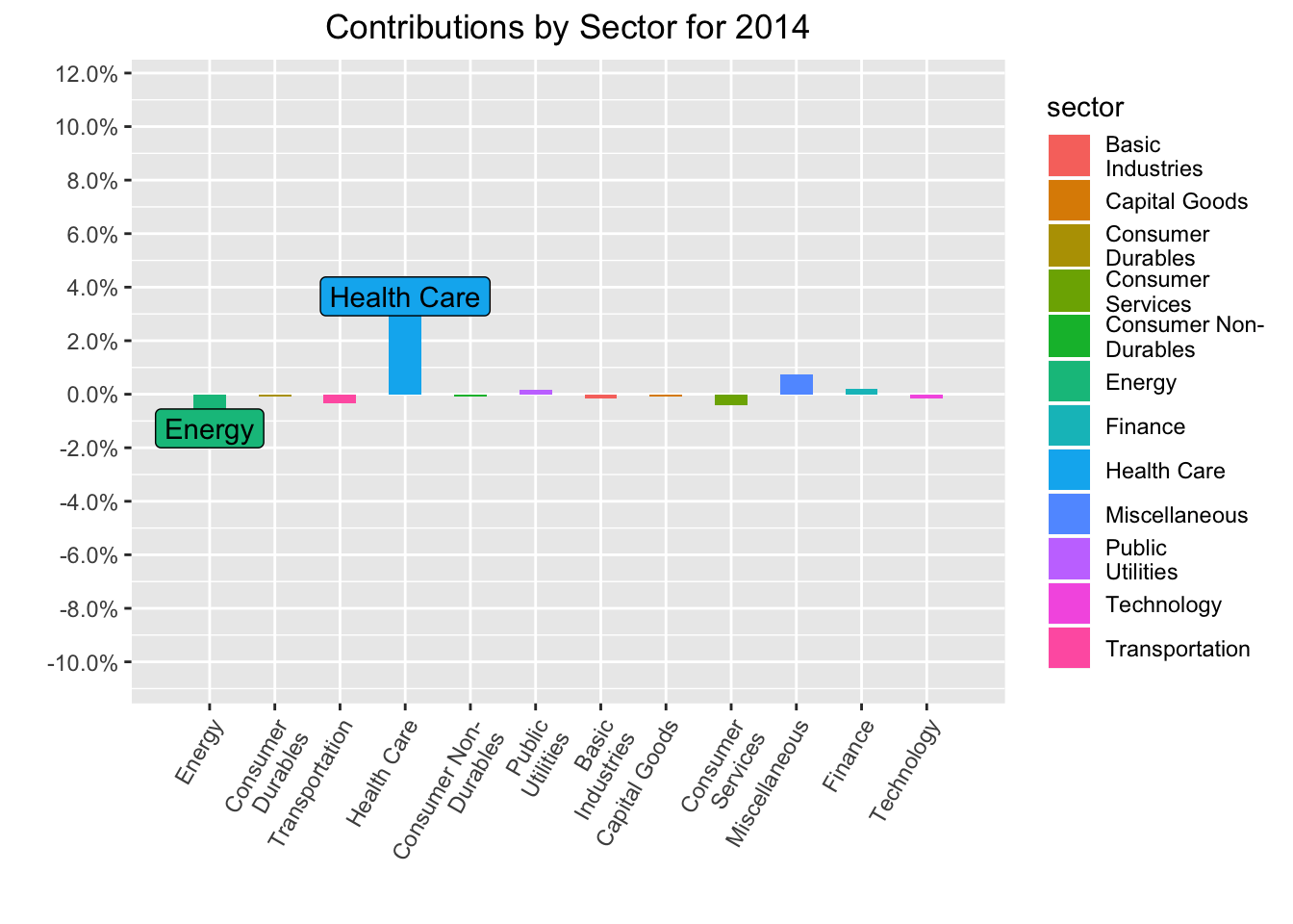
That’s all for today’s addendum.
If you like this sort of code through check out my book, Reproducible Finance with R.
Not specific to finance but I’ve been using tons of code learned at Business Science University course.
I’m also going to be posting weekly code snippets on linkedin, connect with me there if you’re keen for some R finance stuff.
Thanks for reading and see you next time!