Component Contribution Step-by-Step
covariance_matrix <-
  cov(asset_returns_xts)

sd_portfolio <-
  sqrt(t(w) %*% covariance_matrix %*% w)
marginal_contribution <-
w %*% covariance_matrix / sd_portfolio[1, 1]component_contribution <-
marginal_contribution * w components_summed <- rowSums(component_contribution)
components_summed[1] 0.02661184sd_portfolio [,1]
[1,] 0.02661184component_percentages <-
component_contribution / sd_portfolio[1, 1]
round(component_percentages, 3) SPY EFA IJS EEM AGG
[1,] 0.233 0.276 0.227 0.26 0.003Component Contribution a Custom Function
component_contr_matrix_fun <- function(returns, w){
# create covariance matrix
covariance_matrix <-
cov(returns)
# calculate portfolio standard deviation
sd_portfolio <-
sqrt(t(w) %*% covariance_matrix %*% w)
# calculate marginal contribution of each asset
marginal_contribution <-
  w %*% covariance_matrix / sd_portfolio[1, 1]
# multiply marginal by weights vecotr
component_contribution <-
  marginal_contribution * w
# divide by total standard deviation to get percentages
component_percentages <-
component_contribution / sd_portfolio[1, 1]
component_percentages %>%
as_tibble() %>%
gather(asset, contribution)
}percentages_tibble <-
asset_returns_dplyr_byhand %>%
select(-date) %>%
component_contr_matrix_fun(., w)Visualizing Component Contribution
percentages_tibble %>%
  ggplot(aes(x = asset, y = contribution)) +
  geom_col(fill = 'cornflowerblue',
           colour = 'pink',
           width = .6) +
  scale_y_continuous(labels = percent,
                     breaks = pretty_breaks(n = 20)) +
  ggtitle("Percent Contribution to Standard Deviation") +
  theme(plot.title = element_text(hjust = 0.5)) +
  xlab("Asset") +
  ylab("Percent Contribution to Risk")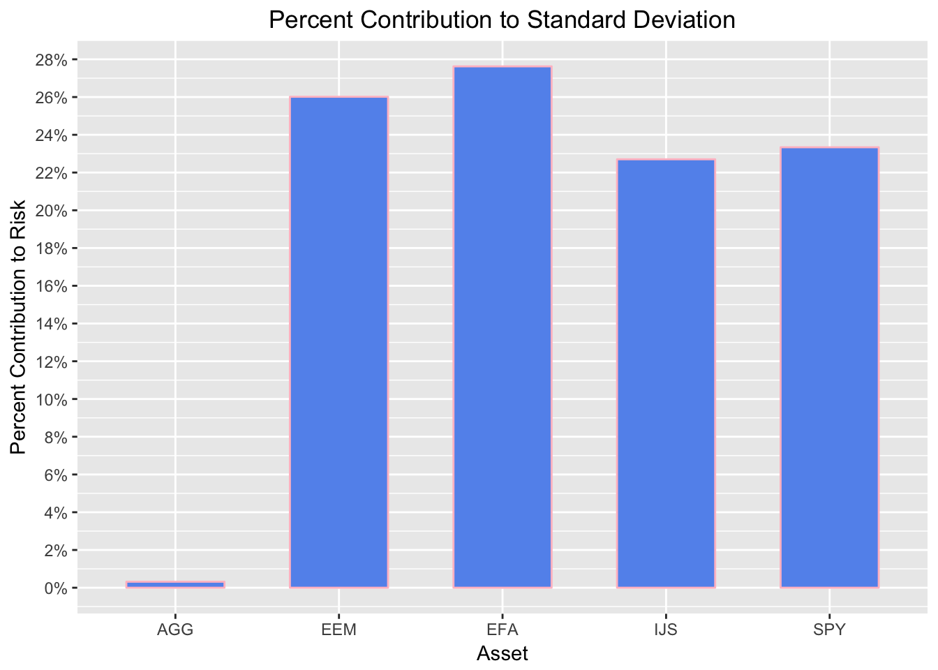
Figure 1: Contribution to Standard Deviation
  percentages_tibble %>%
  mutate(weights = w) %>%
  gather(type, percent, -asset) %>%
  group_by(type) %>%
  ggplot(aes(x = asset,
             y = percent,
             fill = type)) +
  geom_col(position='dodge') +
  scale_y_continuous(labels = percent) +
  ggtitle("Percent Contribution to Volatility") +
  theme(plot.title = element_text(hjust = 0.5))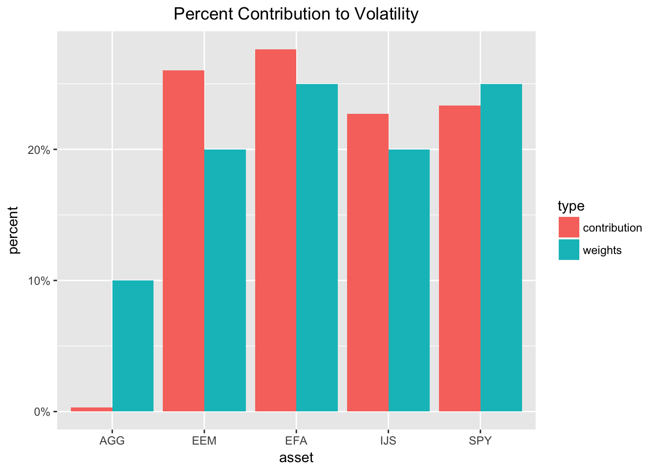
Figure 2: Weight versus Contribution
Rolling Component Contribution to Volatility
interval_sd_by_hand <-
  function(returns_df,
           start = 1,
           window = 24,
           weights){

  # First create start date.
  start_date <-
    returns_df$date[start]

  # Next an end date that depends on start date and window.
  end_date <-
    returns_df$date[c(start + window)]

  # Filter on start and end date.
  returns_to_use <-
    returns_df %>%
    filter(date >= start_date & date < end_date) %>%
    select(-date)

  # Portfolio weights.
  w <- weights

  # Call our original custom function.
  # We are nesting one function inside another.
  component_percentages <-
   component_contr_matrix_fun(returns_to_use, w)

  # Add back the end date as date column
  results_with_date <-
    component_percentages %>%
    mutate(date = ymd(end_date)) %>%
    select(date, everything()) %>%
    spread(asset, contribution) %>%
    # Round the results for better presentation.
    mutate_if(is.numeric, function(x) x * 100)
}
Run our function
window <- 24

portfolio_vol_components_tidy_by_hand <-
  # First argument:
  # tell map_df to start at date index 1
  # This is the start argument to interval_sd_by_hand()
  # and it is what map() will loop over until we tell
  # it to stop at the date that is 24 months before the
  # last date.
  map_df(1:(nrow(asset_returns_dplyr_byhand) - window),
         # Second argument:
         # tell it to apply our rolling function
         interval_sd_by_hand,
         # Third argument:
         # tell it to operate on our returns
         returns_df = asset_returns_dplyr_byhand,
         # Fourth argument:
         # supply the weights
         weights = w,
         # Fifth argument:
         # supply the rolling window
         window = window)

tail(portfolio_vol_components_tidy_by_hand)
# A tibble: 6 x 6
date AGG EEM EFA IJS SPY
<date> <dbl> <dbl> <dbl> <dbl> <dbl>
1 2017-07-31 0.133 26.8 26.4 22.4 24.2
2 2017-08-31 0.182 26.6 27.0 21.8 24.5
3 2017-09-30 -0.0396 25.6 26.4 23.9 24.2
4 2017-10-31 0.0321 25.3 25.7 24.8 24.2
5 2017-11-30 0.0853 26.7 25.4 25.7 22.1
6 2017-12-31 0.0138 26.1 25.2 26.4 22.3 portfolio_vol_components_tidy_by_hand %>%
gather(asset, contribution, -date) %>%
group_by(asset) %>%
ggplot(aes(x = date)) +
geom_line(aes(y = contribution,
color = asset)) +
scale_x_date(breaks =
pretty_breaks(n = 8)) +
scale_y_continuous(labels =
function(x) paste0(x, "%"))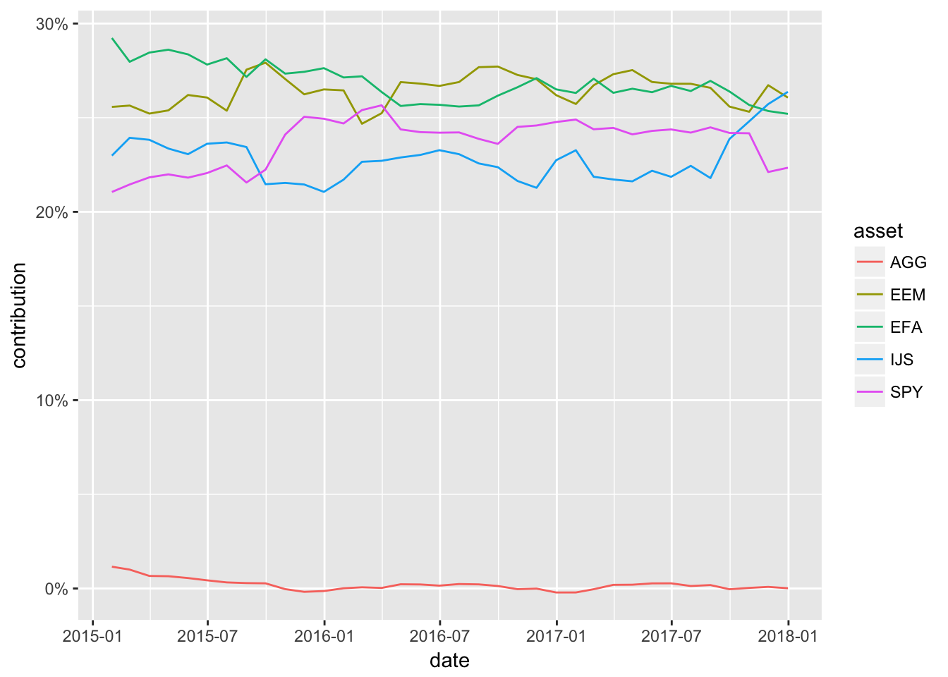
Figure 3: Component Contribution ggplot
portfolio_vol_components_tidy_by_hand %>%
    gather(asset, contribution, -date) %>%
    group_by(asset) %>%
ggplot(aes(x = date,
           y = contribution)) +
geom_area(aes(colour = asset,
              fill= asset),
          position = 'stack') +
  scale_x_date(breaks =
                   pretty_breaks(n = 8)) +
  scale_y_continuous(labels =
                    function(x) paste0(x, "%"))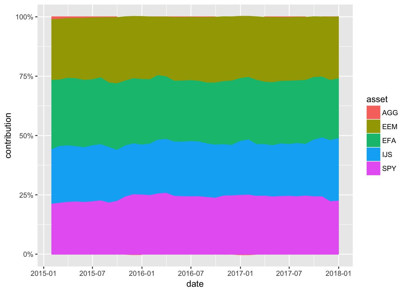
Figure 4: Stacked Component Contribution ggplot
portfolio_vol_components_tidy_xts <-
  portfolio_vol_components_tidy_by_hand %>%
  tk_xts(date_var = date,
         silent = TRUE)
Line Highcharter
  highchart(type = "stock") %>%
  hc_title(text = "Volatility Contribution") %>%
  hc_add_series(portfolio_vol_components_tidy_xts[, 1],
                name = symbols[1]) %>%
  hc_add_series(portfolio_vol_components_tidy_xts[, 2],
                name = symbols[2]) %>%
  hc_add_series(portfolio_vol_components_tidy_xts[, 3],
                name = symbols[3]) %>%
  hc_add_series(portfolio_vol_components_tidy_xts[, 4],
                name = symbols[4]) %>%
  hc_add_series(portfolio_vol_components_tidy_xts[, 5],
                name = symbols[5]) %>%
  hc_yAxis(labels = list(format = "{value}%"),
      max = max(portfolio_vol_components_tidy_xts) + 5,
      min = min(portfolio_vol_components_tidy_xts) - 5,
      opposite = FALSE) %>%
  hc_navigator(enabled = FALSE) %>%
  hc_scrollbar(enabled = FALSE) %>%
  hc_add_theme(hc_theme_flat()) %>%
  hc_exporting(enabled = TRUE) %>%
  hc_legend(enabled = TRUE)
Stacked Higharter
highchart() %>%
  hc_chart(type = "area") %>%
  hc_title(text = "Volatility Contribution") %>%
  hc_plotOptions(area = list(
     stacking = "percent",
     lineColor = "#ffffff",
     lineWidth = 1,
     marker = list(
       lineWidth = 1,
       lineColor = "#ffffff"
       ))
     ) %>%
  hc_add_series(portfolio_vol_components_tidy_xts[, 1],
                name = symbols[1]) %>%
  hc_add_series(portfolio_vol_components_tidy_xts[, 2],
                name = symbols[2]) %>%
  hc_add_series(portfolio_vol_components_tidy_xts[, 3],
                name = symbols[3]) %>%
  hc_add_series(portfolio_vol_components_tidy_xts[, 4],
                name = symbols[4]) %>%
  hc_add_series(portfolio_vol_components_tidy_xts[, 5],
                name = symbols[5]) %>%
  hc_yAxis(labels = list(format = "{value}%"),
      opposite = FALSE) %>%
  hc_xAxis(type = "datetime") %>%
  hc_tooltip(pointFormat =
"<span style=\"color:{series.color}\">
{series.name}</span>:<b>{point.percentage:.1f}%</b><br/>",
             shared = TRUE) %>%
  hc_navigator(enabled = FALSE) %>%
  hc_scrollbar(enabled = FALSE) %>%
  hc_add_theme(hc_theme_flat()) %>%
  hc_exporting(enabled = TRUE) %>%
  hc_legend(enabled = TRUE)