To readers of the book, there was an error in the book code where I missed a group_by(asset). Thanks very much to a kind reader for pointing this out! I have corrected the code below at line 223.
Kurtosis in the xts World
kurt_xts <-
 kurtosis(portfolio_returns_xts_rebalanced_monthly$returns)
Kurtosis in the Tidyverse
kurt_tidy <-
  portfolio_returns_tq_rebalanced_monthly %>%
  summarise(
  kurt_builtin = kurtosis(returns),
  kurt_byhand =
  ((sum((returns - mean(returns))^4)/length(returns))/
  ((sum((returns - mean(returns))^2)/length(returns))^2)) - 3) %>%
  select(kurt_builtin, kurt_byhand)
kurt_tidy %>%
mutate(xts = kurt_xts)## # A tibble: 1 x 3
## kurt_builtin kurt_byhand xts
## <dbl> <dbl> <dbl>
## 1 0.457 0.457 0.457Visualizing Kurtosis
portfolio_density_plot <-
  portfolio_returns_tq_rebalanced_monthly %>%
  ggplot(aes(x = returns)) +
  stat_density(geom = "line",
               alpha = 1,
               colour = "cornflowerblue")

median <-
  median(portfolio_returns_tq_rebalanced_monthly$returns)
mean <-
  mean(portfolio_returns_tq_rebalanced_monthly$returns)

shaded_area_data <-
  ggplot_build(portfolio_density_plot)$data[[1]] %>%
  filter(x < mean)

median_line_data <-
  ggplot_build(portfolio_density_plot)$data[[1]] %>%
  filter(x <= median)

sd_pos <-
  mean +
  (2* sd(portfolio_returns_tq_rebalanced_monthly$returns))
sd_neg <-
  mean -
  (2* sd(portfolio_returns_tq_rebalanced_monthly$returns))

sd_pos_shaded_area <-
  ggplot_build(portfolio_density_plot)$data[[1]] %>%
  filter(x > sd_pos )

sd_neg_shaded_area <-
  ggplot_build(portfolio_density_plot)$data[[1]] %>%
  filter(x < sd_neg)

  portfolio_density_plot +
  geom_area(data = sd_pos_shaded_area,
            aes(x = x, y = y),
            fill="pink",
            alpha = 0.5) +
  geom_area(data = sd_neg_shaded_area,
            aes(x = x, y = y),
            fill="pink",
            alpha = 0.5) +
  scale_x_continuous(breaks = pretty_breaks(n = 10)) +
  geom_area(data = sd_pos_shaded_area,
            aes(x = x, y = y),
            fill="pink",
            alpha = 0.5) +
  geom_area(data = sd_neg_shaded_area,
            aes(x = x, y = y),
            fill="pink",
            alpha = 0.5) +
  geom_segment(data = shaded_area_data,
               aes(x = mean,
                   y = 0,
                   xend = mean,
                   yend = density),
               color = "red",
               linetype = "dotted") +

  annotate(geom = "text",
           x = mean,
           y = 5,
           label = "mean",
           color = "red",
           fontface = "plain",
           angle = 90,
           alpha = .8,
           vjust =  -1.75) +

  geom_segment(data = median_line_data,
               aes(x = median,
                   y = 0,
                   xend = median,
                   yend = density),
               color = "black",
               linetype = "dotted") +

  annotate(geom = "text",
           x = median,
           y = 5,
           label = "median",
           fontface = "plain",
           angle = 90,
           alpha = .8,
           vjust =  1.75) +
  scale_x_continuous(breaks = pretty_breaks(n = 10))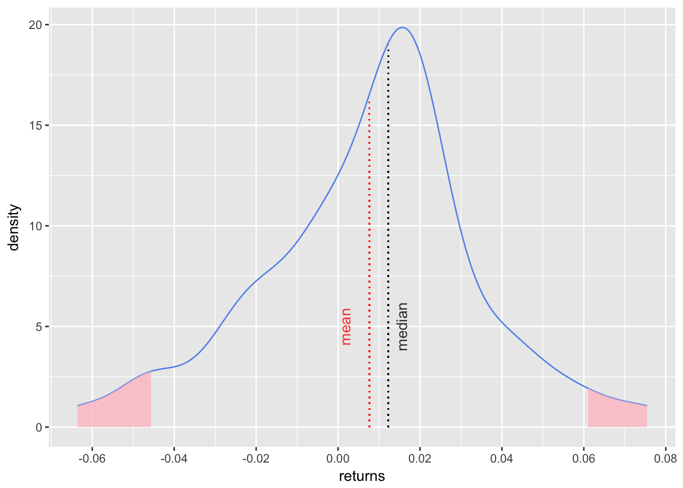
Figure 1: Skewness ggplot
asset_returns_long %>%
  # The following line group_by(asset) is not in the book!
  # It was added after a tip from a very kind reader. I will post a full explanation of why it is needed and why it was missing to begin with. Mea culpa!
  group_by(asset) %>%
  summarize(kurt_assets = kurtosis(returns)) %>%
  add_row(asset = "Portfolio",
          kurt_assets = kurt_tidy$kurt_byhand)%>%
  ggplot(aes(x = asset,
             y = kurt_assets,
             colour = asset)) +
  geom_point() +
  geom_text(
        aes(x = "Portfolio",
            y =
              kurt_tidy$kurt_byhand + .06),
              label = "Portfolio",
          color = "cornflowerblue") +
  # alternate geom_text()
  # Here's a way to label all the points
  # geom_text(aes(label = asset),
  #          nudge_y = .04)
  labs(y = "kurtosis")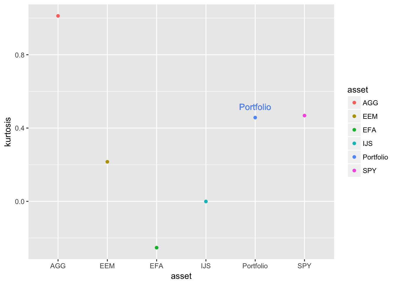
Figure 2: Asset and Portfolio Kurtosis Comparison
Rolling Kurtosis in the xts World
window <- 24

rolling_kurt_xts <-
  rollapply(portfolio_returns_xts_rebalanced_monthly,
            FUN = kurtosis,
            width = window) %>%
  na.omit()
Rolling Kurtosis in the tidyverse with tibbletime
kurt_roll_24 <-
  rollify(kurtosis,
          window = window)

roll_kurt_tibbletime <-
  portfolio_returns_tq_rebalanced_monthly %>%
  as_tbl_time(index = date) %>%
  mutate(kurt = kurt_roll_24(returns)) %>%
  select(-returns) %>%
  na.omit()
Rolling Kurtosis in the tidyquant World
rolling_kurt_tq <-
  portfolio_returns_tq_rebalanced_monthly %>%
  tq_mutate(select = returns,
            mutate_fun = rollapply,
            width      = window,
            FUN        = kurtosis,
            col_rename = "kurt") %>%
  select(-returns) %>%
  na.omit()
rolling_kurt_tq %>%
mutate(xts = coredata(rolling_kurt_xts),
tbltime = roll_kurt_tibbletime$kurt) %>%
mutate_if(is.numeric, funs(round(.,3))) %>%
tail()## # A tibble: 6 x 4
## date kurt xts tbltime
## <date> <dbl> <dbl> <dbl>
## 1 2017-07-31 0.604 0.604 0.604
## 2 2017-08-31 0.835 0.835 0.835
## 3 2017-09-30 1.22 1.22 1.22
## 4 2017-10-31 2.13 2.13 2.13
## 5 2017-11-30 2.22 2.22 2.22
## 6 2017-12-31 3.38 3.38 3.38Visualizing Rolling Kurtosis
highchart(type = "stock") %>%
  hc_title(text = "Rolling 24-Month kurtosis") %>%
  hc_add_series(rolling_kurt_xts,
                name = "Rolling 24-Month kurtosis",
                color = "cornflowerblue") %>%
  hc_yAxis(title = list(text = "kurtosis"),
           opposite = FALSE) %>%
  hc_xAxis(title = list(text = "")) %>%
  hc_navigator(enabled = FALSE) %>%
  hc_scrollbar(enabled = FALSE) %>%
  hc_add_theme(hc_theme_flat()) %>%
  hc_exporting(enabled = TRUE)
Figure 3: Rolling Kurtosis Highcharter
rolling_kurt_tq %>%
  ggplot(aes(x = date, y = kurt)) +
  geom_line(color = "cornflowerblue") +
  scale_y_continuous(breaks = pretty_breaks(n = 8)) +
  scale_x_date(breaks = pretty_breaks(n = 8)) +
  ggtitle("Rolling 24-Month Kurtosis") +
  theme_update(plot.title = element_text(hjust = 0.5))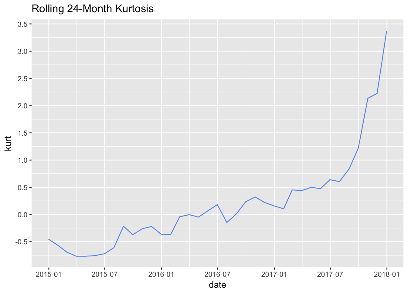
Figure 4: Rolling Kurtosis ggplot